


15:49Claude responded: Bookmark this curated list of 101 data visualization websites — covering charts, code, maps, inspiration, tools, and free resources for designers and coders al…Bookmark this curated list of 101 data visualization websites — covering charts, code, maps, inspiration, tools, and free resources for designers and coders alike.
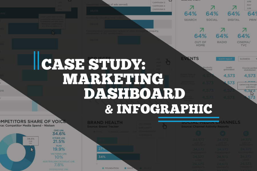
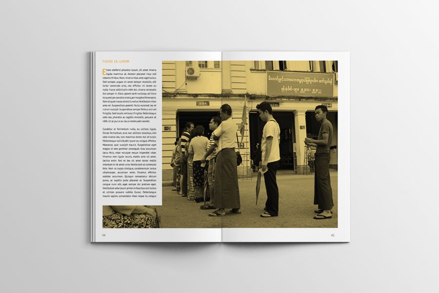
A case study on a Tableau dashboard, infographic and data design project for the marketing team at Victoria University.

See the 2026/2027 guide to the best data visualization conferences in North America, Australia, Asia, and Europe. Use this year's conference guide as a travel planner. So get out, travel, meet new people, and learn more about what makes data visualization such a creative and interesting area to work in.
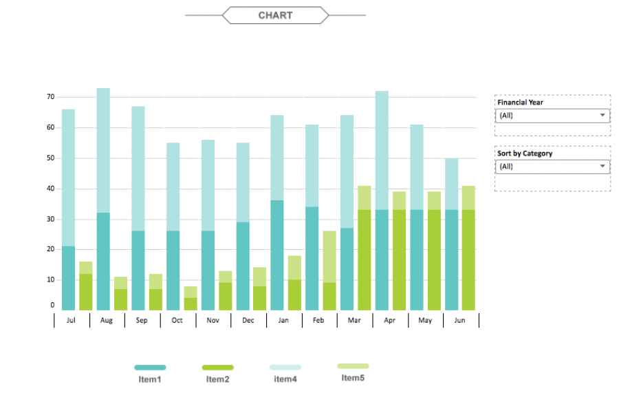
The aim for this project was to create an interactive dashboard, utilizing Tableau, to convey the data that had been collected over the financial year. Check out this financial firm's reporting suite.
See 3 great tips for designing dashboards. Learn the strategic approach to visualizing your data through dashboard systems designed for humans.
Data Visualization Brand Guidelines for Tableau, Microsoft Excel, Highcharts & Infographics As we have seen on projects time and time again, data scientists and data designers have two separate capabilities.
Case Study: A Long Infographic Report Design We recreated a long research report with an infographic style, using charts and graphs to convey the data they’d collected, over the period

See Tableau dashboards examples in the wild. We've tracked down the best example of dashboard design done in Tableau. Get inspired.
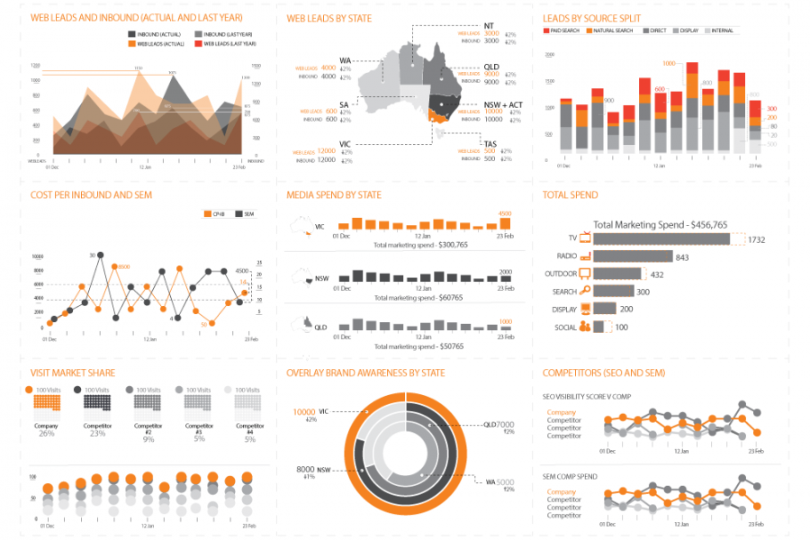
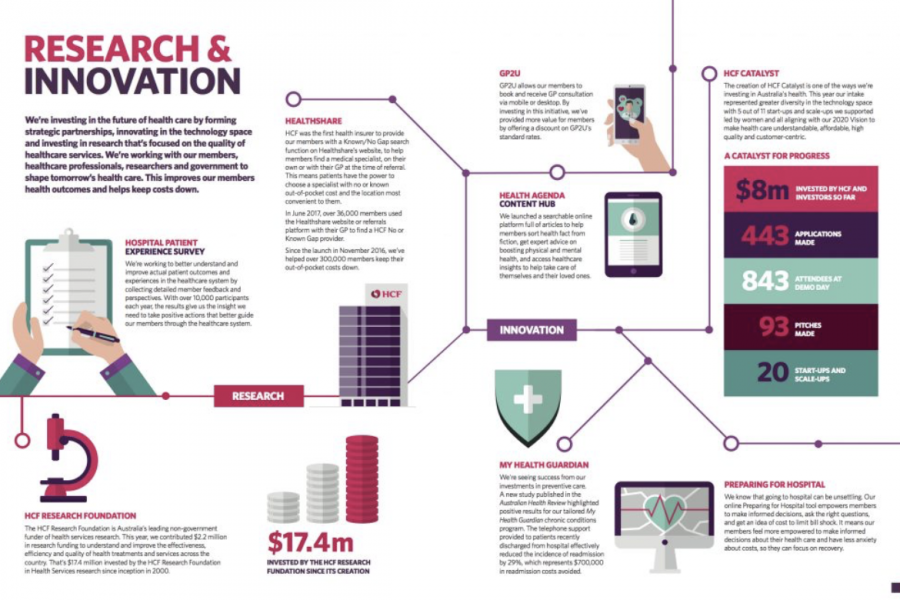
With Datalabs’ help, at a Chief Marketing Officer’s level, reporting is now a unified dashboard — simple and insightful. An online healthcare and insurance company came to Datalabs with a