


Make your data viz understandable and memorable. Use the techniques of repetition, alignment, and symmetry to your advantage. See visual examples and skill up.
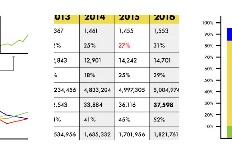
Stop using tables in your reporting. Seriously, there are better ways to visualize data. Here are three: »
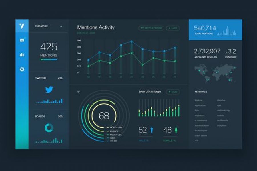
See 3 great tips for designing dashboards. Learn the strategic approach to visualizing your data through dashboard systems designed for humans.

Six Reasons to Gift Skills Training to Your Employees The Benefits to Both Individuals and Businesses as a Whole At the Datalabs Agency, we’re firm believers in hiring great people

The Use of Repetition, Alignment, & Symmetry in Data Visualization Design shows in clear examples how these design principles can be use in data viz and infographics. Learn something new.

How Do Professional Data Visualizers Design Business Intelligence Dashboards? Most professionals aren’t trained data visualizers. You might be a business analyst, data scientist, or an expert in another field who

Design Thinking Meets Data Science The term “Big Data” has gained lots of attention in recent years. Want to know what the sexiest job of the 21st century is? It’s

The Art of Photography and The Science of Data Visualization In design, it is always good to be visual. “Our brain processes images 60,000 times faster than reading text.” –

The Use of Hierarchy in Data Visualization A Good Design is More Than Creative, It Has to be Strategic. An experienced designer should have a decent understanding of the human

How to Tell a Story With Data Visualization Ideas and examples you can use in your organization to create a data-driven narrative The idea of collecting and storing massive amounts

Telling Stories With Data: From Simplification to Persuasion and Reporting. The Most Common Questions From Our Data Visualization Workshops. We can run our Data Visualization Workshops anywhere in the world,