hello@datalabsagency.com
logo
Datalabs Agency
En
  • De
  • Ar
0
logo
  • Data Training
    • Our Six Main Workshops
      • Introduction to Data Visualization: Tools & Techniques Workshop
      • Designing Great Business Dashboards Workshop
      • Infographics & Report Design Workshop
      • Creative Data Presentations with PowerPoint
      • Visual Storytelling for Government Workshop
      • Creative Power BI Dashboard Design
    • Online Courses
      • An Introduction to Data Visualization & Storytelling
      • Designing Great Dashboards
  • Data Design
    • Style Guides
      • Power BI Style Guides
      • Tableau Style Guides
    • Animated Data Videos
    • Maps & Cartography
    • Interactive Infographics
    • Power BI Dashboards Designs
    • Tableau Dashboards Designs
    • Infographic Reports
    • Interactive Data Visualizations
    • Digital Annual Reports & Microsites
  • Case Studies
  • Shop
    • Ecommerce Products
      • Power BI Templates
      • Power BI Theme and Style Guide
      • An Introduction to Data Visualization and Storytelling Course
      • Designing Great Dashboards Course
      • Data Visualization Consultant
  • Login
  • Contact
    • About
      • Otto Ottinger
      • Blog
Excel Circle Art 0
Excel Data Visualisation Artwork
11 April 2016
Dashboard Examples 0
Infographic Dashboards
19 April 2016
Articles
Infographic Report Design
April 11, 2016 by Datalabs in Articles

Case Study: A Long Infographic Report Design

We recreated a long research report with an infographic style, using charts and graphs to convey the data they’d collected, over the period the report covered.

Client: University Of Sydney – Electoral Integrity Project

Timeframe: 4-6 weeks

Tools: Tableau, Adobe Illustrator & InDesign

Chapter Page Report
Data Visualisation Report

Spider Chart Infographic
Image Page Design

Table of Contents Design

What?

Datalabs were brought onboard by the Electoral Integrity Project, to reimagine and redesign their report into something that would delight and impress the reader. The report was a based on the previous years research (2014-2015) project, examining the integrity of elections in over 160 countries world wide. Research had been collated in a text document/report, with data in collected in Excel.

Why?

The full infographic report came in at over 50 pages, and as a data heavy report, it was important that the integrity of the information collected was available. It also required a level of ‘information design’ and graphic design, to increase the usability and readability. The university wanted to maintain the volume and detail of a traditional reporting document, but give it a visual style and modern aesthetic, that would increase the engagement with both content and data.’

There was particular care given to the data design, as the information was going to be viewed by experts, the media, and the general public, and therefore it needed to satisfy all audiences.

How?

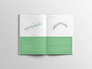
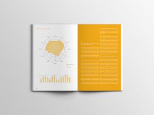
The project design was done in illustrator, and the layout was done with InDesign. The tables and graphs were made in Tableau, and then redesigned in Illustrator, to give a more polished look and feel.

When?

The project took around six weeks in total, which included three drafts and revisions. It was a print document so extra time was needed on formatting, and layout, that usually would not be necessary on a web based version.

0 Comments
  • Adobe Illustrator
  • Adobe InDesign
  • Australia
  • education
  • Excel
  • infographics
  • politics
  • Tableau
  • universities
  • University of Sydney
  • visual reports
0 Like!
Share
Datalabs

Data Visualization Training: Workshops & Courses

Shop Online for Data Visualization

  • Image of a man using our Power BI templates to design a report
    Power BI Templates
    Select options
  • Image of our custom Power BI Theme on a computer
    Power BI Theme and Style Guide
    Select options
  • An Introduction to Data Visualization and Storytelling Course
    An Introduction to Data Visualization and Storytelling Course
    Add to cart
  • Photo of a data visualization consultant advising clients and helping solve design issues.
    Data Visualization Consultant
    Buy product
  • Designing Great Dashboards Course
    Designing Great Dashboards Course
    Add to cart

Style Guides for Data?

A photo of our data viz style guide for Microsoft Power BI

Data Visualization & Storytelling Group Workshops

Contact Us

  • This field is for validation purposes and should be left unchanged.

From Our Blog

  • 8 Incredible Examples of Interactive Data Visualization
  • Data Analytics Conferences 2024 & 2025
  • Data Visualization & Design Conferences 2024 & 2025
  • Case-study: Intranet Dashboard Design for Nestlé
  • Dashboard Tips: 3 Alternatives To Using A Data Table
  • Data Visualization Training
  • Brand Guidelines for Data
  • Online Courses & Products
© 2024 Data Arts Pty Ltd
logo

We noticed you're visiting from United Kingdom (UK). We've updated our prices to Pound sterling for your shopping convenience. Use United States (US) dollar instead. Dismiss