


The Data Visualization Format of the Year: The Interactive Calculator A Great Example to Show You How It’s Done This year has seen some great data visualizations. From interactive maps,
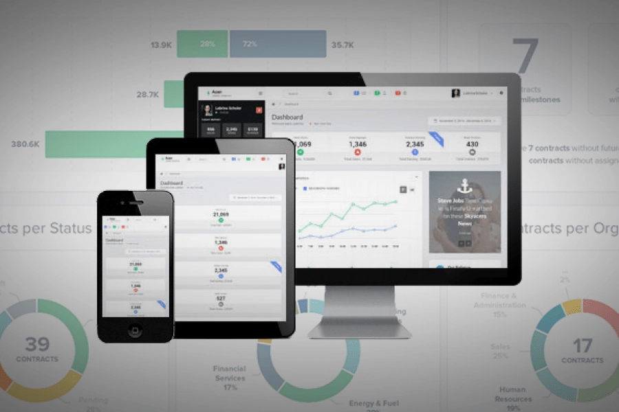
6 of the Best Marketing Dashboards … And Why Your Business Needs One! Tired of tiny details and endless numbers on your marketing strategy report? Tired of constantly opening new tabs
“A Golden Age of Interface Design is coming. The creative and visual direction of data design can be inspiring and creative. Let’s make sure it is. Here’s a vision and