


15:49Claude responded: Bookmark this curated list of 101 data visualization websites — covering charts, code, maps, inspiration, tools, and free resources for designers and coders al…Bookmark this curated list of 101 data visualization websites — covering charts, code, maps, inspiration, tools, and free resources for designers and coders alike.

We’ve curated a list of gold-standard interactive data visualizations which we hope will inspire you to try it for yourself. May your data never be boring.

The difference between wasted training budget and transformed team capability comes down to seven key factors most organizations overlook. Learn what to demand from data storytelling trainers—from customization using your actual data to post-workshop support—before you make your next hiring decision.
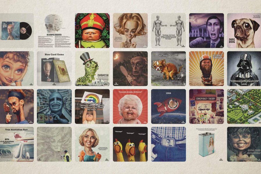
The Datalabs Agency is happy to announce the launch of its AI animation studio underneath the brand Oddtoe. As regular guests of the Datalabs website might recognize, Oddtoe provides much of the illustrated artwork and social media imagery for the agency.
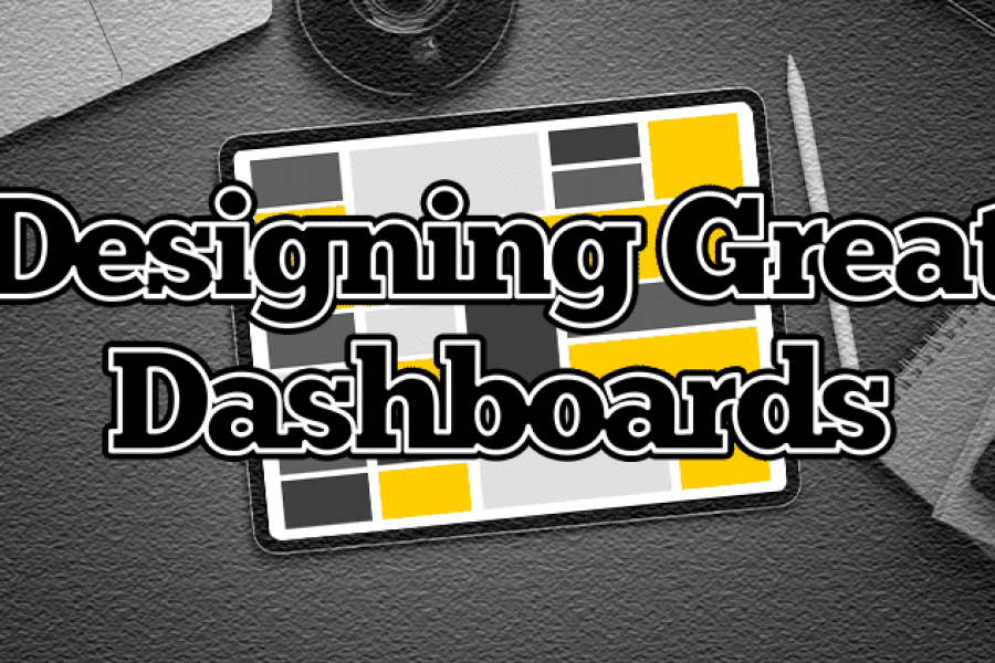
How Do Professional Data Visualizers Design Business Intelligence Dashboards? Most professionals aren’t trained data visualizers. You might be a business analyst, data scientist, or an expert in another field who
The Key to Data Storytelling: Creating Captivating Dashboards & Infographics “Those who tell stories rule society.” – Plato In the past, the role of a data scientist or analyst is simple
Animation & Motion Graphics are Great for Conveying Insights & Complex Ideas How can such complex, abstract, and intangible information be conveyed in an easy-to-understand and interesting manner? The answer:

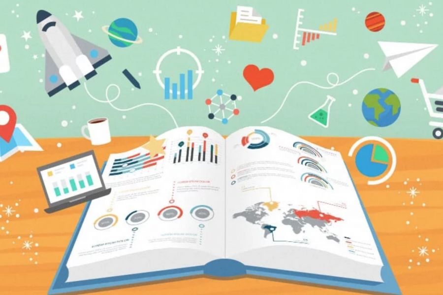
How to Tell a Story With Data Visualization Ideas and examples you can use in your organization to create a data-driven narrative The idea of collecting and storing massive amounts
What Makes for Great Data Visualization and Why? Data visualization can be a powerful way to communicate. When done right, it delivers information with both the weight of respected research,
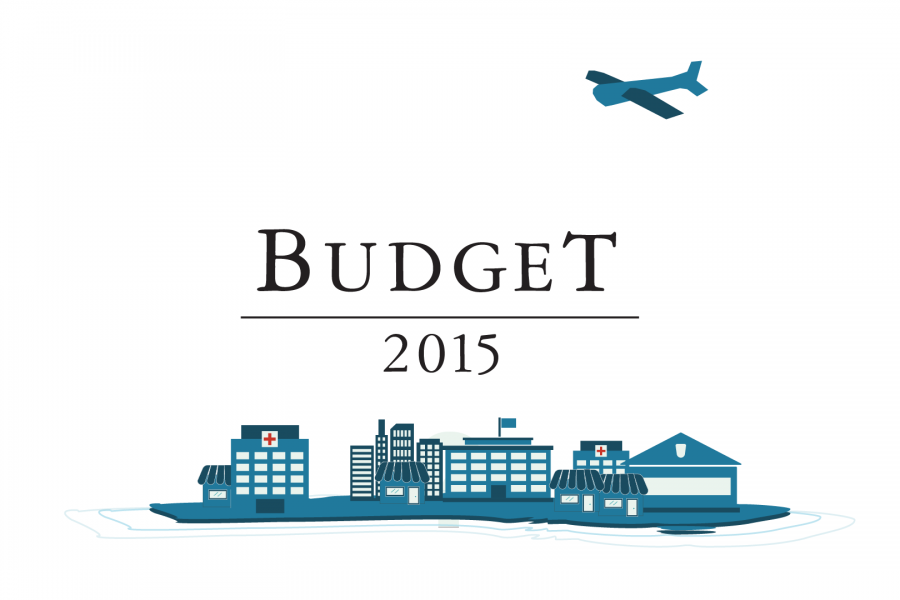
Datalabs is proud to show our work with the Federal Department of the Treasury for the 2015 Budget. Datalabs was hired in April to animate three videos, visualising the overview