


A case study on a Tableau dashboard, infographic and data design project for the marketing team at Victoria University.
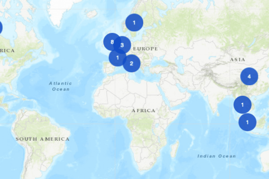
An Interactive Mapping Project for the University of Melbourne’s Business School. This interactive map shows former students, faculty/alumni, programs, and partnerships that potential students could engage with around the world.
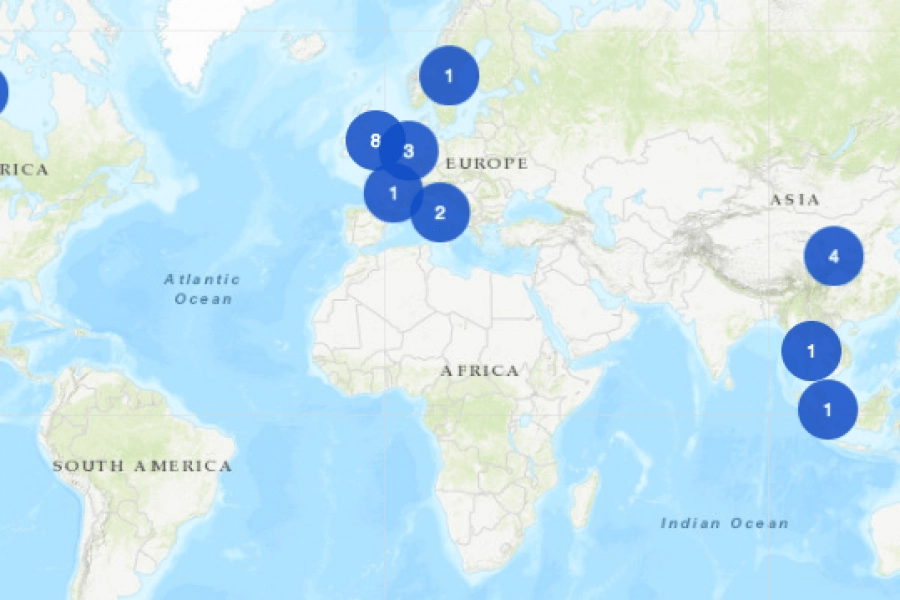
The Datalabs Agency was commissioned to turn the list of the University of Melbourne’s partners and connections around the world into an interactive map that would sit on the home page of their site.
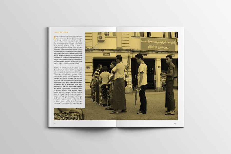
Case Study: A Long Infographic Report Design We recreated a long research report with an infographic style, using charts and graphs to convey the data they’d collected, over the period