

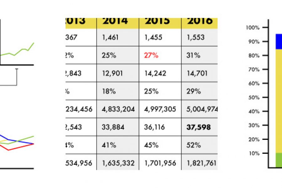
Stop using tables in your reporting. Seriously, there are better ways to visualize data. Here are three: »
Brand Guidelines for Data: The Data Visualization Format of the Year (First Place) Formatting All Data Visualization with Best Practice Principles In 2023, the visual branding of data has only

Five Common Mistakes People Make in Data Visualization The best way to learn is to make mistakes. That still rings true in terms of designing data visualization. Even the most

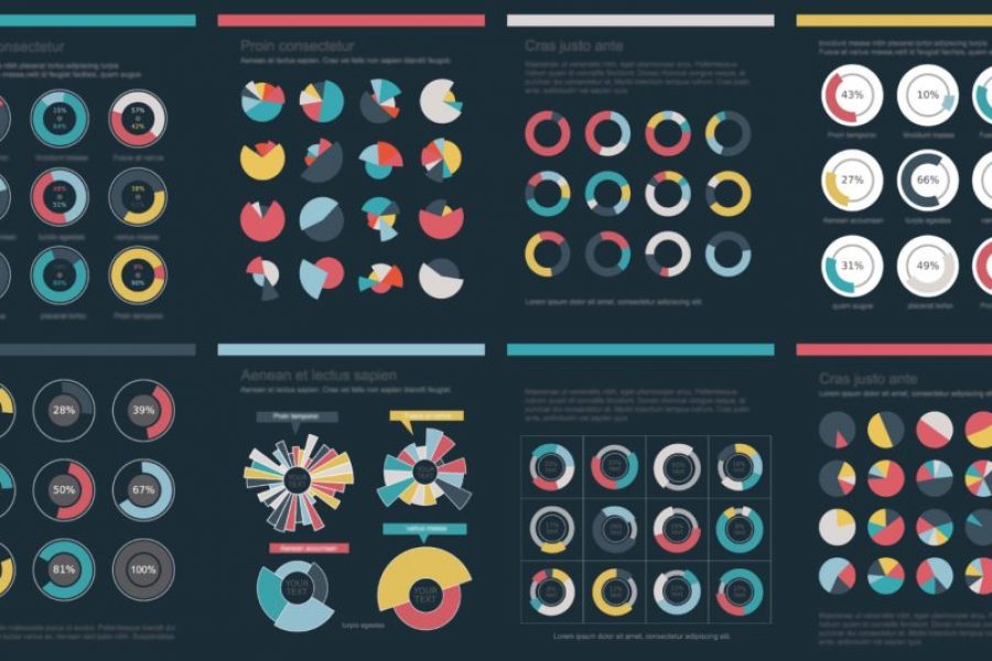
Our Opinion On Pie Charts …or the Case For and Against the Pie Chart. If there’s a list of controversial charts types in this world, then assume the pie chart

What Makes for Great Data Visualization and Why? Data visualization can be a powerful way to communicate. When done right, it delivers information with both the weight of respected research,
What to Look for in a Data Visualisation Agency? Data visualization is a powerful way to communicate new and complex information. When done right, it can deliver your message with

What is Good Data Visualisation? An Infographic We think Nathan Yau of flowingdata.com gets to the heart of why we visualize data – data visualization helps us make and share