


Data Visualization Websites — 101 of the Best Resources
Ideas, inspiration blogs, people, tools, and more!
We’ve searched and searched to bring you 101 data visualization websites that showcase the best in data design resources, software, and online training. Most are free (or freemium); all are totally useful. If we’ve missed anything great, be sure to add it in the comments!
From the complete newbie to seasoned designers and coders, we hope there’s something for everyone. Some of what we have is technical, some instructional; there’s software and then there are heaps of free resources like image libraries that help complement great data design.
So, without further ado, in no particular order, here are our picks for the best data visualization websites:
Articles & Great Blogs
These data visualization websites should have a bookmark in your browser.

1. The Do’s & Dont’s of Infographic Design – This post from Smashing Magazine shows some of the key things to do and definitely those you should not do to your lovely infographic.
2. Brewer Palettes – A great introduction on how to pick colour palettes for the best effect and why. We’ve included quite a few tools for choosing colour pallets later on in this post so getting your theory down first is a good idea.
3. D3 in Depth – A free, modern, comprehensive guide to D3.js by Peter Cook, structured exactly like an interactive ebook. Covers selections, scales, axes, layouts, geographic projections and more — picking up where Scott Murray’s classic O’Reilly text left off.
4. Should You Build a Micro Website? 8 Pros and Cons – We’re pretty firmly in the “‘do it!’ camp”, but we also know that microsites aren’t magic and if your content is boring on paper, dressing it up in a microsite probably won’t change that. Lean Labs lays out a fair, current breakdown of when microsites work — and when they’re a costly mistake.
5. How to Choose the Right Chart or Graph for Your Data – If you want your data to be read and understood, you first need to know how to present your data. This guide will take you through everything you need to know about charts versus graphs and your data.
6. How to Make Infographics – A Beginner’s Guide – You can thank The Guardian for this one. This article will take you through the very basics of infographics and data visualization. It’s a great resource if you’re still learning the data viz ropes.
Charts
To reference charts and graphs, keep these data visualization websites on file.
7. Data Viz Catalogue – If you’re looking for inspiration, alternative chart types, or you’re trying to find the right chart for a difficult report, then check out Data Viz Catalogue. It’s got a library of charts, from simple to complex that can answer most chart- and graph-related questions.
8. The Pudding – A visual essay journal that publishes some of the most ambitious and beautifully crafted data stories on the web. If you want to see what excellent data visualisation looks like in 2026 — interactive, journalistic, and technically inventive — this is the bookmark to keep.
9. AmCharts – Another JavaScript library, this one has a handy little WordPress plugin that you can then edit and embed the code with a shortcode.
10. HighCharts – This JavaScript library has a myriad of interactive chart types. It also features a free license for non-commercial use.
11. Ploty.ly – With its free version, this web-based interface allows you to create simple interactive charts based on d3.js.
12. Apache ECharts – A fully open-source charting library now maintained by the Apache Foundation. Dozens of chart types, blazing-fast rendering, and excellent documentation — easily one of the most powerful free charting tools available today.
Maps, Cartography & Geographical Data
The best sites and resources for making digital maps
13. Leaflet – The lightweight, open-source JavaScript library that has become the de facto standard for interactive web maps. Small, fast, mobile-friendly, and with a huge plugin ecosystem — exactly what Modest Maps set out to be, but actively maintained.
14. Polymaps – A JavaScript library for image and vector maps. This one is a little more technical but is a super cool resource for making web-based interactive and layered maps.
15. Datawrapper Academy: Maps – A practical guide to making good choropleth, symbol, and locator maps, written by working data journalists. If you want to go from raw geographic data to a publishable map without writing code, this is the most useful tutorial library on the web.
16. Carto (formerly CartoDB) – Our go-to option for interactive maps. Has a paid version but is one of the best mapping libraries out there.
17. Mapbox – With their help, Mapbox boast you can ‘add location into any application with our mapping, navigation, and location search SDKs’.
18. Esri ArcGIS Online – The industry-standard cloud GIS platform. Build interactive maps, dashboards, and story-maps with hosted data and a polished web interface — the natural home for the kind of interactive atlas work InstantAtlas pioneered.
19. Mapline – A great, simple mapping tool designed for non-technical users, with an Excel-friendly interface that lets you go from spreadsheet rows to a clustered, colour-coded interactive map in a couple of clicks.
20. Flourish – A no-code visualisation studio that makes interactive maps, charts, and scrollytelling stories from spreadsheet data. Free for public use, and widely adopted by newsrooms — a much more capable successor to the “easy mapping in Excel” category.
People
Data visualizers that we think you should know about

21. David McCandless – One of the biggest names in the data viz world, David is known for his book Information Is Beautiful and his work with The Guardian UK.
22. Stephen Few – Best known for his work on dashboards and how to consume information from a business analytics view.
23. Nicholas Felton – Information and infographic designer with some particularly cool work in annual reporting.
24. Alberto Cairo – writer, artist, podcaster.
25. Nathan Yau – Author of Flowing Data, data visualizer, and statistician whose work often focuses on large-scale statistical data and how to visualize it through technology like R & Tableau.
26. Edward Tufte – Pioneer and prolific writer in the data visualization and information design fields (arguably its founder or first champion).
27. Hans Rosling – A statistician and physician who can inspire anyone to fall in love with data visualization. Check out his TED talks for a massive hit of data viz inspiration.
Inspiration
Check these 9 resources and data visualization websites and get inspired.
28. InformationIsBeautiful.net – David McCandless, mentioned above, is a data viz heavyweight who notes his pet hate is pie charts. Here, you won’t find a single one. Instead, browse this stunning site where David and his team “distill the world’s data, information, and knowledge into beautiful and useful graphics & diagrams.” Take a look, get inspired, and get back to your own data viz making!
29. 20 Animated and Interactive Infographics You Have To See – As the title of this one suggests, you just have to see these infographics. You have to. Quick! Go now! Hurry!
30. Information is Beautiful Awards: Interactive – A curated annual showcase of the world’s best interactive data visualisations, judged by the likes of David McCandless and Maria Popova. The best single page on the web to see what’s possible right now.
31. Tableau Viz of the Day – The best use of Tableau, updated each and every day.
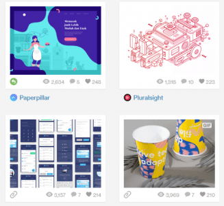
32. CoolInfographics.com – Just a great blog dedicated to some pretty cool infographics.
33. Behance.net – An Adobe venture, this site is like a big online gallery dedicated to discovering and showcasing new work.
34. Creative Bloq – Dedicated to all things art and design inspiration, this link will take you right to 100 great infographics.
35. Pinterest – Sounds obvious but this really is an amazing way to search and catalogue great ideas or inspirations. The link goes to one of our boards so you can see how we use it in the agency.
36. Twitter – See what the Twitterverse is saying by tracking the ever-popular #dataviz hashtag.
Infographics
Make your own infographics — 7 software sites for data visualization
37. Piktochart – Get visual and make your own infographics with this easy online tool.
38. Venngage – A free, online template-based tool to help you make your own infographics.
39. Canva – An easy drag-and-drop tool. Free, too!
40. Easel.ly – A place to create and share your visual ideas with the world.
41. VisualCV – Ever wanted to create a visualised version of your resume? VisualCV is the modern, actively maintained replacement, with parsing that survives applicant tracking systems and dozens of templates that won’t make a recruiter wince.
42. Infogram.com – Create infographics and charts online.
43. Visme.co – … You get the drill.
Images
Find the imagery for your next infographic or data viz project.
44. Pixabay – Hosts a bunch of free photos, images, and backgrounds for all your data viz needs!
45. Canva – Canva offers a whole array of free stock photos; check them out here.
46. Dribble – An online image gallery, popular with designers to upload their own content and discover the world’s.
47. Pinterest – We know what you’re thinking… Everyone and their mother has a Pinterest. So? It’s still a great tool when it comes to data viz!
48. Weheartit – Get inspired by everyone else’s favourite collections.
49. Pearltrees – Organise all your favourite images and interests using this handy online tool.
50. Designschool.canva – Check out this Canva blog for a list of 73 sites to find free images for your site or blog.
Articles/Talks
Keep informed about data visualization through these sites.
51. Martin Krzywinski Brewer Palettes – This thorough explanation takes you through everything you need to know about Brewer palettes.
52. Observable Plot – The free, modern, browser-based home for learning data visualisation by example. Plot is the high-level grammar that sits on top of D3, and Observable’s notebooks let you fork, edit, and republish other people’s work — the closest thing to a working ebook for web visualisation today.
53. What Is a Microsite? Definition, Examples, and Best Practices – If you’ve ever asked this question, this guide answers it with up-to-date examples and a clear explanation of when a microsite earns its keep versus when it just fragments your SEO.
54. The Best Stats You’ll Ever See – This TED talk, presented by the great late Hans Rosling will make you fall in love with all things stats, big data, and data viz. All. Over. Again.
55. The Beauty of Data Visualisation – If you’re still doubting the importance and magic of numbers, this TED talk is ought to get you re-inspired.
56. Making Data Mean More Through Storytelling – Who says YouTube is just for cat videos??
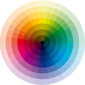
Colour
A rainbow of options — our picks for your next data visualization colour palettes.
57. Choosing Colours for Data Visualisation – This easy ten-pager will give you a great headstart when it comes to picking colours for your project or design.
58. The Psychology of Color in Marketing and Branding – A handy, well-researched visual guide to ensure your colour-to-emotion choices hold up. Written by Help Scout and updated regularly — the modern equivalent of the old “Color Emotion Guide” infographic that was floating around in 2013.
59. A Friendly Guide to Colors in Data Visualizations – Another guide for colours in data viz. Now more friendly!
60. Colorpicker for Data – This fun little tool helps you visualize your colour choices. A great way of passing the time… Uh, we mean, choosing the right colours for the project you’re working on.
61. Color Oracle – Designed for the colour impaired, Color Oracle is a free – and fabulous – colour blindness simulator.
62. Coolors – Scheme with colours, you designer, you. Coolors generates harmonious palettes in seconds, lets you lock the ones you love, and exports straight to Adobe, Figma, or CSS — the most-used palette tool on the web today.
63. Color Hunt – Browse beautiful colour palettes for inspiration for your own projects.
Microsites
Here are our picks for great resources about microsites, our favorite places to display data visualization.
64. 15 of the Best Microsite Examples – A current showcase of microsites that actually use 2025-era design and interactive techniques, with notes on why each one earned its standalone domain.
65. Microsite.com – Build your first microsite with the help of, you got it, microsite.com!
66. Build an Engaging Interactive Microsite – This blog will take you through the steps needed to create an engaging and interactive microsite.
67. 17 Great Microsite Examples for Driving Buyer Interest – Get learnin’!
Guides and How-Tos
We love typography. These are great sites for fonts to use in data visualization design.
68. How to Read Your Website Source Code and Why It’s Important – If you’re building your own site, this guide should prove quite helpful.
69. Beginners Guide to Learn Data Visualization – If you’re a newbie, this how-to is for you!
70. Storytelling with Data: Chart Guide – Cole Nussbaumer Knaflic’s free chart-by-chart guide to picking and refining the right visualisation. It’s DataViz101, from one of the most-read teachers in the field.
71. How To Credit Images on Your Website – A handy visual guide if you’re ever unsure.
72. 5 Brilliant Microsites and Why They’re So Effective – If you’re in need of knowing the hows and whys and not just the here they ares when it comes to microsites, this is a must-read.
73. Introduction to Data Visualisation: Chart Dos and Donts – And now you know.
Fonts
We love typography. These are great sites for fonts to use in data visualization design.

74. Get Started With Google Fonts API – Get the Google run-through, straight from the official developer docs. Covers embedding, performance, variable fonts, and self-hosting — everything you need to use Google Fonts properly on the web.
75. Google Fonts – … And then get with Google.
76. Font Pair – A handy little helper for Google Fonts, Font Pair will pair different Google Fonts together.
77. Font Space – Never try and pick between Arial and Arial Black again. Find and download a huge library of free fonts, sortable by licence, mood, and style.
78. DaFont – Another library of free fonts for your choosing!
79. Urban Fonts – Fonts that are urban. No country-dwellers allowed.
80. Free Font – We love free, don’t you?
81. Font Squirrel – Free fonts – and for commercial use, too! No free squirrels, though. :/ Disappointed.
82. 1001 Free Fonts – Just 1001 free fonts. There may be more. Who knows? (There are definitely more.)
Tools
Tool, software, reference sites — we recommend these links.
83. Tableau – If you don’t already know the name, get used to it. Tableau is the heavyweight data viz champion of the world, and its products and software can help companies and data visualizers alike.
84. Qlik Sense – If you’re a charts person, Qlik is still one of the heavyweight visual analytics platforms. The product page shows what Qlik Sense actually does, with live demo dashboards you can poke at — though using it does come with a price. The price is money.
85. Fusion Charts – If you’re a charts man, or woman, Fusion Charts is for you, offering you ‘full control over the aesthetics and behaviour’ of your charts. While it’s not free, there is a free trial version of this software.

86. NodeBox – Offering a whole family of tools, NodeBox is an open-source project of data viz goodies for all your creative needs.
87. R-Project – If you’re all about stats and graphics, this tool is for you. R is free software and describes itself as “a language and environment for statistical computing and graphics”. It also likes long walks on the beach.
88. ColorZilla – A browser extension for Chrome and Firefox, ColorZilla will bring a little colour into your life.
89. Mockaroo: How to Generate Test Data – Are you in need of test data? Mockaroo’s own documentation walks you through generating realistic, schema-aware fake datasets — perfect for prototyping dashboards and demos without exposing real numbers.
90. The Coding Train – Ever wanted to learn how to code? Or do you need to know? Learn how with the help of YouTube videos.
91. Mockaroo – A random data generator and an API mocking tool, Mockaroo lets you create custom CSV, JSON, SQL, and Excel datasets to test and demo your software.
92. Pixlr – An online photo editor, Pixlr runs via web apps and features free fonts and free graphics.
93. Whimsical – If you want to make a chart, we won’t stop you — Whimsical offers a beautifully designed diagramming canvas for flowcharts, mind maps, and wireframes, with a generous free tier.
Code
Don’t be afraid of these data visualization websites — coding is your friend.

94. Building Your First Webpage – Learning to Code – If coding is something you need or want to do for your website, this guide will teach you how to get started.
95. Chroma.js – A tiny JavaScript library for ‘dealing with colours’, Chroma.js allows you to read and convert colours from a wide range of formats, analyse and manipulate colours, while also allowing linear and bezier interpolation in different colour spaces. Pretty cool, right?
96. Vega-Lite – Vega-Lite is the modern open-source spiritual successor to SIMILE Widgets — a high-level grammar of interactive graphics that lets you declare a chart in JSON and get an interactive web visualisation. Maintained by the University of Washington, used everywhere.
97. RAWGraphs – For all things spreadsheets, RAWGraphs allow you to copy and paste your data, choose a visual model, explore your data visualization, then export it ready to go!
98. Dygraphs – Use this open-source JavaScript charting library to explore and interpret your datasets.
99. Two.js – A renderer-agnostic two-dimensional drawing API for the web, with SVG, Canvas, and WebGL outputs. The modern replacement for BonsaiJS — actively maintained, well documented, and used by creative coders and data artists alike.
100. Google Charts – Use the simplicity and ease of Google to bring your data to your website with Google Charts.
And, drum roll, please…
For last but not least, we have, at long last, reached no. 101 in our list of 101 brilliant, amazing, useful, glorious, fan-tas-tic-o data visualization websites…
101. The Datalabs Agency – Your one-stop shop for all your data visualization needs. 😉
Thanks for checking out our list of the best data visualization websites and resources. We’d love to hear which sites you find useful, and which resources you find indispensable.