

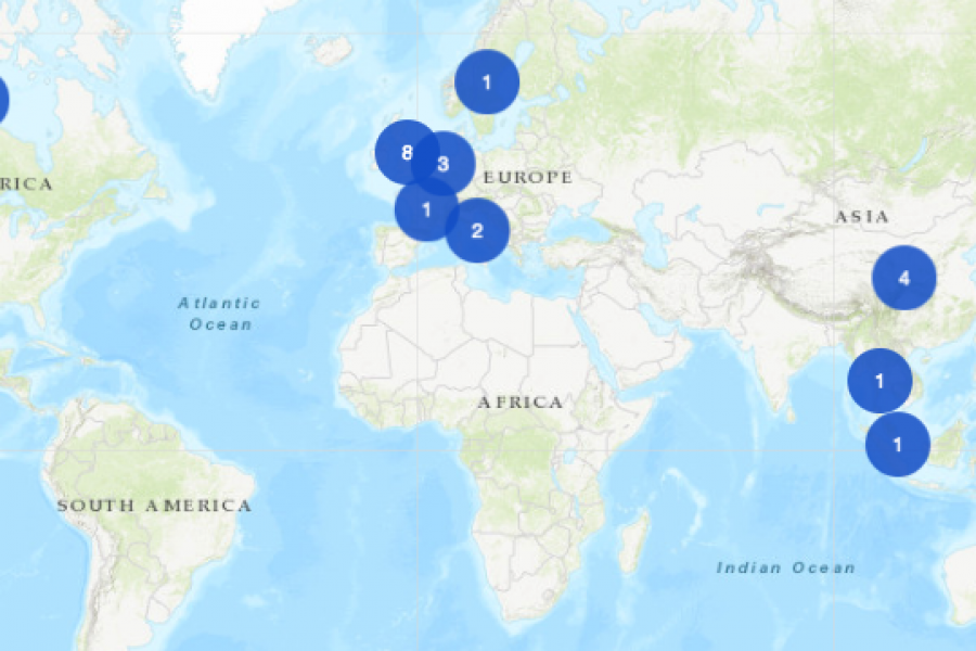
An Interactive Mapping Project for the University of Melbourne’s Business School. This interactive map shows former students, faculty/alumni, programs, and partnerships that potential students could engage with around the world.


How Do Professional Data Visualizers Design Business Intelligence Dashboards? Most professionals aren’t trained data visualizers. You might be a business analyst, data scientist, or an expert in another field who