

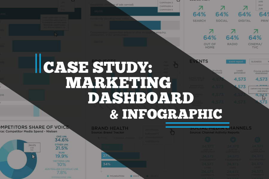
A case study on a Tableau dashboard, infographic and data design project for the marketing team at Victoria University.

Make your data viz understandable and memorable. Use the techniques of repetition, alignment, and symmetry to your advantage. See visual examples and skill up.
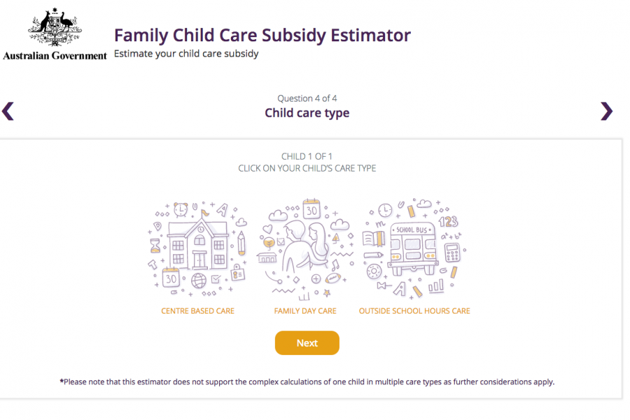
The Datalabs Agency was engaged to help Australia's Department of Education provide a clean and simple user interface in which parents and carers of children could estimate the amount of money they may be entitled to receive.
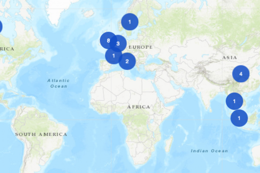
An Interactive Mapping Project for the University of Melbourne’s Business School. This interactive map shows former students, faculty/alumni, programs, and partnerships that potential students could engage with around the world.
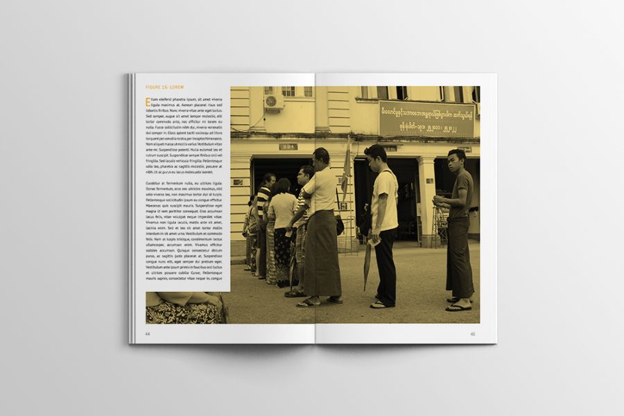
Case Study: A Long Infographic Report Design We recreated a long research report with an infographic style, using charts and graphs to convey the data they’d collected, over the period