Data Visualization Style Guides

Get strategic and design your company’s branded guidelines for all formats of your reporting.

We design data visualization style guides for business intelligence dashboards, print & PDF reports, presentations, and web applications.

Your Data Needs Design.

Get a Data Visualization Style Guide

Analysts aren’t designers. And data science is different than data design.

We should know. Datalabs employs both the left and right brainers. We know it’s a rare individual that has both the skills to extract insights from complex data sets and then can turn heads with a beautiful visual story.

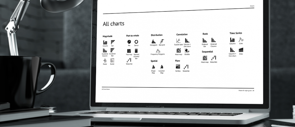
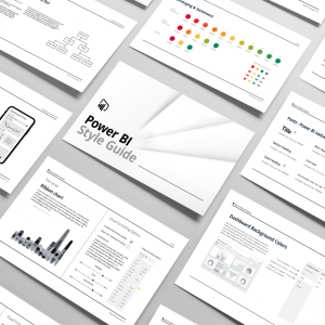
So give your data team a data visualization style guide, a visual blueprint that bridges the gap between art and science, between left and right brain thinking.

We create data visualization style guides using best practice techniques from our own data visualization work, giving you a style guide that defines the best possible use of data visualization in your reporting & analytics.

The Datalabs Agency specializes in designing brand guidelines for these five software programs: Tableau Style Guides, Power BI Style Guides, D3/Highcharts Style Guides, Microsoft PowerPoint Style Guides, and Infographic Report Style Guides.

Stacked bar chart page from our Tableau style guide

Datalabs are Tableau specialists, who now offer style guides that cover reporting, functionality & data design specifically for Tableau products. We can create unique, scalable and hosted Tableau resources that simplify and unify your organisations reporting.

A photo of our data viz style guide for Microsoft Power BI

Get your Power BI developers to design like data vsiaulizers. Our Microsoft Power BI Style Guides gives them the proper visual framework to design dashboards with your corporate brand guidelines and using best-practice data visualization techniques.

Image module

Microsoft PowerPoint is ubiquitous in the business world and as a tool for visually communicating data, it’s in need of proper design style guides. The Datalabs Agency knows how to get the best of this software, and our PowerPoint Style Guides are proof of that.

Image of a Page in Our Infographic Reports Style Guide

Infographics are everywhere. Now they’re influencing business reporting. The Datalabs Agency balances the need for a common brand design for your print & PDF reports with the need of scalable creativity for your infographic designs. Does your brand have a style guide for your team of report designs? If not get an Infographic Report Style Guide from Datalabs today!

Image module

We create UI style guides covering all standard and non-standard interactive chart types, themes, best practices, color, highlights, and icon sets. We cover standard usage, and also web application design best practices.

Style Guides for a Variety of Data Visualization Formats

Data visualization comes in many forms, so do our style guides.

The Datalabs Agency has the most comprehensive set of data visualization style guides. Collect ’em all — style guides for interactive data, BI dashboards (Tableau & Power BI), infographics, and reports, along with the traditional Excel graphs and charts displayed through PowerPoint.

Everyone is on the Same Page

Even with staff working remotely, everyone now works from one set of data design guidelines.

Data Viz Standards & Best Practices

Lift up the expectations for great data designs by showing a new benchmark and communicating best practice data visualization in your style guide.

Confirm Your Colors, Fonts, & Icons

Get the core of your brand into all of your future reporting. Give as much care to your data as you do to your marketing & comminications collateral.

Dashboard Grids & Reports Layouts

Think before you visualize. Secure your white space, design responsively, and structure your story — do all this with your new grid system.

The Best in Charts & Graphs

Stamp out chartjunk, reduce the clutter in your charts and graphs, and prioritize the charts your organization deems ‘worthy’.

User Interface & User Experience Design

Finally get your team to think about the user of your reports, dashboards, and presentations. Incorporate audience personas, UI components, and sections about interactive user experience in your style guides.

Data Visualization Style Guides for Companies and Government

Want to work with professionals on your company’s data visualization style guides?

Contact us here at the Datalabs Agency and learn more about our branded guidelines for visual data.

  • This field is for validation purposes and should be left unchanged.

Shop for Yourself

Want to Get Better at Data Visualization Yourself?

Take a course. Train your team. Buy design resources. Get to the next level.

-49% Sale!
Image
Image
Image
Image
Get trained to visualize data and tell better stories.
$45
-49% Sale!
Image
Image
Image
Image
Finally, a course that shows you what you need to know.
$45