


Interactive Storytelling with Infographics

Interactive Infographics

Experience data plus information design...

Creating Interactive Infographics with HTML5

Engage Your Audience With An Interactive Visual Experience

An interactive infographic showing isometric buildings and tree

Interactive infographics are designed to allow your audience to “play”, control, and see information in the form of online, animated graphics. Interactive charts, maps & cartography, and infographics embedded with multimedia can create a rich and unique experience.

A higher-order form of visual content, interactive infographics have a bright future as a format for digital communication and reports. As the web world grows more visual, the Datalabs Agency thinks this is inevitable:  the flat infographics of today will evolve into interactive infographics tomorrow. The reason is simple: they are more engaging than their static cousins. Their design needs to consider how your audience will behave with the interactive structure of your story.


Want to know what style of infographic is best for you?

Then click the link and…

Designing Engaging Interactive Infographics

Designing an interactive visual experience can be complex. But through our simple design process, Datalabs takes the complexity away for our clients. Through a series of questions, our interaction designers tease out how your audience can get the most engaging and insightful experience with your information. Questions like:

  • Image
    How will your audience discover the interactivity of the infographic?
  • Image
    What information is shown when they roll over the data, the content?
  • Image
    How is this additional information designed, presented?
  • Image
    How will the graphics move, fade, enlarge?
  • Image
    …and finally: How will navigating across the interface work?

Our designers are trained to create memorable experiences with each graphic we create. Our process for interactive design, much like our process for infographic report design, is the key to great work and happy clients.

Datalabs & Interactive Infographics

Datalabs specialises in data and information design. Interactive infographics are one of the great formats produced by Datalabs’ data visualisers. We can design process graphics, organisational charts, flow diagrams. We can visualise big ideas and difficult-to-explain concepts. We can solve your business problem, visually, and let your audience love it by making it into an interactive infographic for your intranet, corporate communications event, or company website.

A New Forms for Infographics

…to be usable on all modern web browsers. We’ll show you our sketch work, design a prototype, then let you — the client — play with the infographic design. Once you’re satisfied, we’ll move your interactive infographic into programming. We code our interactive infographics in HTML5, CSS3, and JavaScript.

So communicate in a modern, visual way: think about infographics and think about them designed interactively. Contact us at Datalabs when you do. Your audience will appreciate it.

Take a course. Use our design resources. Get to the next level.

Want to Get Better at Data Visualization Yourself?

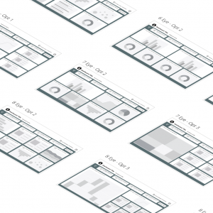
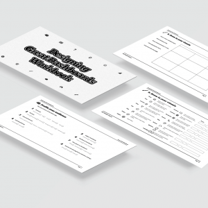
Get the best grids, layouts, navigation, and UI components for your dashboards.
Price range: $790 through $1,390
-31% Sale!
Image
Image
Image
Image
Get trained to visualize data and tell better stories.
Original price was: $129.Current price is: $89.
-31% Sale!
Image
Image
Image
Image
Finally, a course that shows you what you need to know.
Original price was: $129.Current price is: $89.

Questions & Answers

Interactive Infographics

An infographic the audience can play with — controlling what they see, filtering, and moving through information as online animated graphics rather than a fixed image.

Charts, maps and cartography, and infographics with multimedia embedded in them. Combining those is what makes the experience rich rather than merely clickable.

In HTML5, so they run in a browser with no plugin and work as part of a page, a report or a microsite.

Not always — a single clear message is often better served by one strong static image. Interactivity earns its place when there is more than one story in the data and different readers want different parts of it. The Datalabs Agency is a Melbourne-based data visualization consultancy founded in 2012 that delivers corporate training workshops (Power BI, Tableau, data storytelling), dashboard design, and BI style guides for clients including Mercedes-Benz, Adidas, and UPS.

Skill-up you and your company colleagues.

Looking for Team Training in Infographic Design & Storytelling?

Photo of a PowerPoint Workshop training room with data visuallization slide projected on a screen

The Best Training Workshops

See the type of team training we do.

Data viz, infographics, dashboards, PowerPoint, and more »
Office with a Dashboard Workshop Graphic on the Wall

Team Workshop: Intro to Data Viz & Storytelling

Learn the fundamentals and advance to the next level.

Our introductory workshop is perfect for all skill sets.
Data-Visualization workshop training image of a presentation of charts next to a company escalator

Team Training: Creative Visualization in PowerPoint

Present data like an expert, tell stories like a pro.

Set a new benchmark for your company’s presentations.