

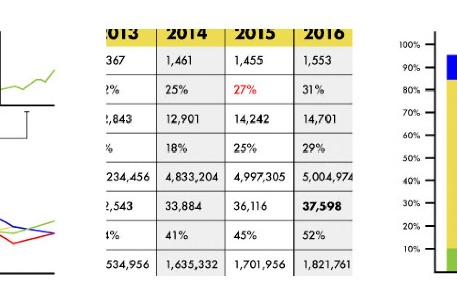
Stop using tables in your reporting. Seriously, there are better ways to visualize data. Here are three: »

Data Visualization Websites — 101 of the Best Resources Ideas, inspiration blogs, people, tools, and more! We’ve searched and searched to bring you 101 data visualization websites that showcase the

From the dreaded pie chart to the often-misunderstood Sankey diagram, we'll geek out on more data viz guidance, updating this list of categories and types. So bookmark this page and sign up for our data visualization newsletter to keep your data design brain well fed.
Brand Guidelines for Data: The Data Visualization Format of the Year (First Place) Formatting All Data Visualization with Best Practice Principles In 2023, the visual branding of data has only
6 of the Best Marketing Dashboards … And Why Your Business Needs One! Tired of tiny details and endless numbers on your marketing strategy report? Tired of constantly opening new tabs

6 Examples of NPS Charts: How to Best To Visualize a Net Promoter Score Love it, hate it (or neither…) – Net Promoter Score (NPS) is a key success measure

Excel Data Visualization Artwork Project. Creating beautiful, artistic work exclusively in Excel. We were tasked by a digital agency to create something different for their client, using only the Microsoft product
8 More Common Types of Data Visualization Following up on our previous list of 15 Types of Data Visualization, which you can find here, we’ve come up with 8 more