Infographic Designer Freelance

Looking for a freelance infographic designer to hire? See our work here at Datalabs. About the Infographic Designer role: Our Infographic Designers are the agency’s creative visualisers and graphic designers,

Share
Get Sorted with Data Visualization Brand Guidelines

Data Visualization Brand Guidelines for Tableau, Microsoft Excel, Highcharts & Infographics As we have seen on projects time and time again, data scientists and data designers have two separate capabilities.

Share
Data Visualizer & Coder

Datalabs is looking for a Full Time Data Visualizer with experience in designing in Adobe Illustrator, as well as coding in JavaScript, CSS, and HTML. Presentation, public speaking skills also

Share
What is a Microsite vs a Website?

What is a microsite & what are they used for? A look at what makes a good microsite, how they differ to a website & some great examples. In previous

Share
Infographic Report Design

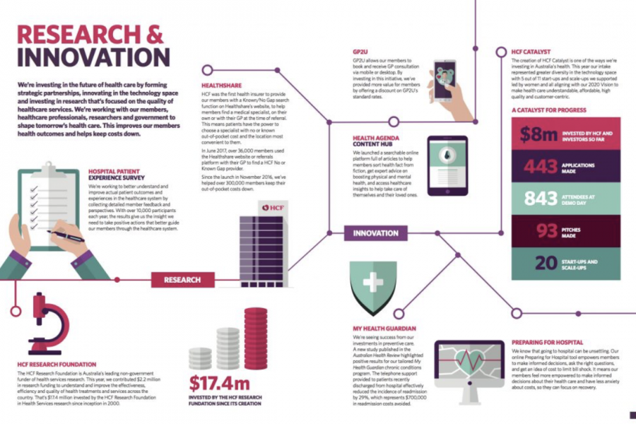
Case Study: A Long Infographic Report Design We recreated a long research report with an infographic style, using charts and graphs to convey the data they’d collected, over the period

Share
Digital Annual Report Designs That Don’t Suck

Examples of Digital Annual Reports That Don’t Suck A handful of forward-thinking companies and non-profits have begun to turn the routine production of a digital annual report into an opportunity

Share
Better Decisions Through Visual Analytics.

Empowering Employees to Make Better Decisions Through Visual Analytics. “Seeing is believing, but sometimes the most real things in the world are the things we can’t see”,  –  The Polar

Share
Big Data Infographic Report

Big Data Infographic Report A recent report by SAP finds that the so-called power of Big Data has yet to be unlocked by decision makers. Datalabs has designed an infographic

Share
CPA Australia Infographics

CPA Australia Infographics & Infographic Reports From data discovery to design Datalabs worked with CPA Australia to distill the insights from their Corporate Governance report on the Asian Pacific Region.

Share
Xero Infographic Report Designed by Datalabs

Xero Infographic Report Designed by Datalabs At Datalabs, we create data visualisations for a range of clients and business types. We love what we do, but we can’t help but

Share
Sales Reports & Dashboards

Salespeople and their managers are extremely time-poor and extremely focused on their job: selling. They don’t have a lot of time to read through endless sales reports or to click

Share
Annual General Meetings & Annual Reports

Corporate Communications Problem A lot of time, effort, and money go into producing corporate communications collateral like annual reports and annual general meeting presentations for analysts and shareholders. The problem

Share