


15:49Claude responded: Bookmark this curated list of 101 data visualization websites — covering charts, code, maps, inspiration, tools, and free resources for designers and coders al…Bookmark this curated list of 101 data visualization websites — covering charts, code, maps, inspiration, tools, and free resources for designers and coders alike.
The Data Visualization Format of the Year (Runner Up): The Interactive Map With best-practice examples You may have already seen that this year’s best data visualization format winner was declared:

The Datalabs Agency was commissioned to turn the list of the University of Melbourne’s partners and connections around the world into an interactive map that would sit on the home page of their site.
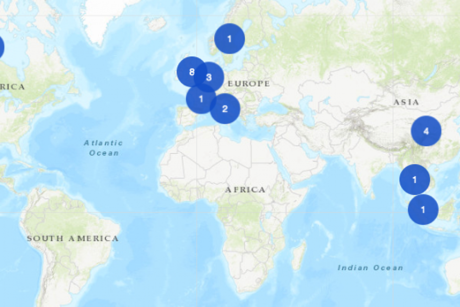
An Interactive Mapping Project for the University of Melbourne’s Business School. This interactive map shows former students, faculty/alumni, programs, and partnerships that potential students could engage with around the world.
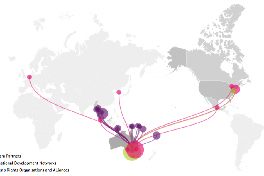
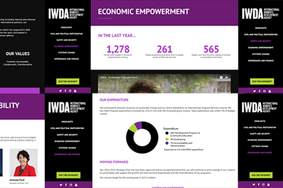
Looking for what data visualization can do for your website? Check out this live example of an interactive map developed for International Women's Development Agency.
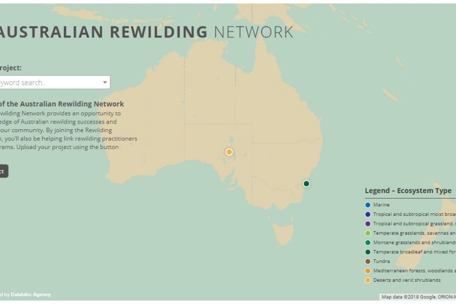
Mapping Intelligence: Helping Wildlife in Australia About the Rewilding Mapping Project The interactive map is designed with d3 and Google Maps Showcases the current projects the organization is working on
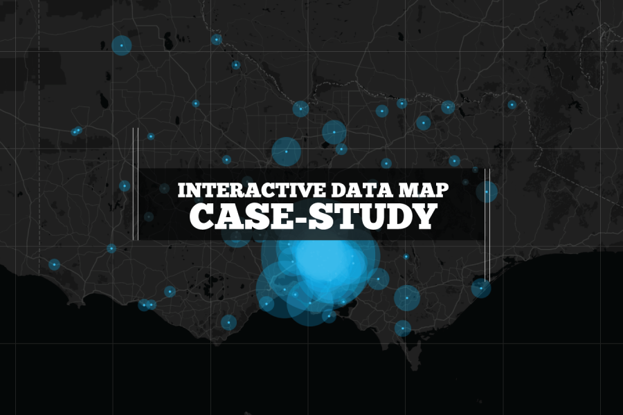
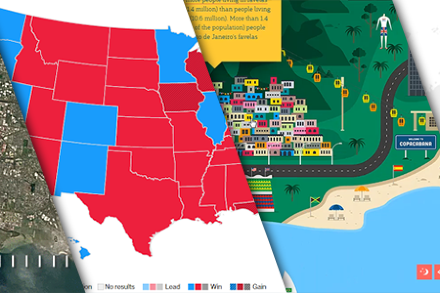
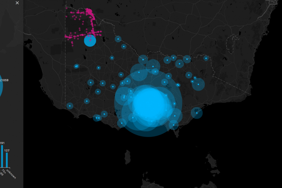
We built this interactive map as a use-case for interactive/explorable maps. It's UI and easy-of-use is a case study of how data visualization can make better sense of geographical data. Certainly better than a table in a spreadsheet!
Considering going digital with your annual report? Do it! Here's an example of what interactivity and a non-profit organization's 'year in numbers' looked like after they ditched paper and went digital.
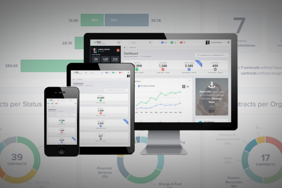
6 of the Best Marketing Dashboards … And Why Your Business Needs One! Tired of tiny details and endless numbers on your marketing strategy report? Tired of constantly opening new tabs

See Tableau dashboards examples in the wild. We've tracked down the best example of dashboard design done in Tableau. Get inspired.