Tableau Dashboards Examples in the Wild
Examples of the Best Tableau Dashboards We've Found on the Web
Tableau is a data visualization tool making it possible for just about anybody to create interactive, real-time dashboards, infographic reports, and amazing data charts. With the launch of Tableau 9.0 earlier this year, the data dashboards are making leaps and bounds into the mainstream.
In any sector you can name, there is a need to capture and analyze data, but historically, data dashboards have been out of reach for most organizations. Tableau changes that by making data visualization non-technical and affordable. With features that include interactivity, filtering, highlighting, and the ability to combine multiple data sources, there are millions of ways this technology can be used. To celebrate that fact, we’ve tracked down real-life examples of Tableau dashboards in the wild.
Examples below
Example of Tableau Dashboards for Finance
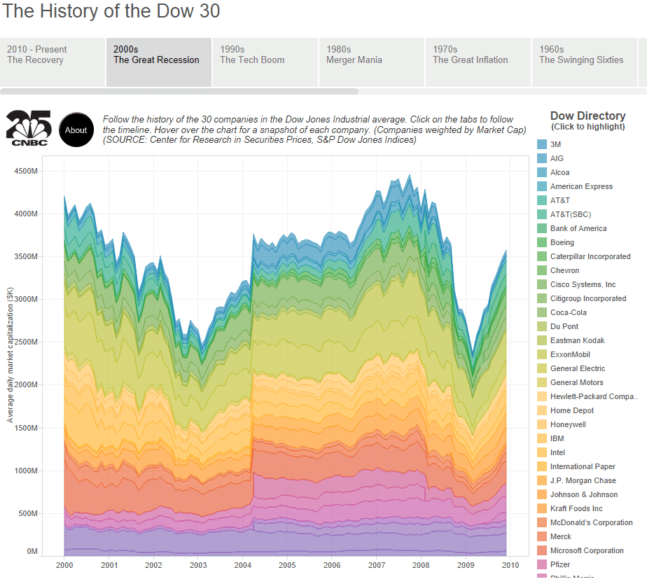
CNBC's History of the DOW 30
Drawing on an incredible database, this dashboard tracks the performance of the 30 companies in the Dow Jones industrial average, over the last 100 years. Booms, busts, and recoveries are mapped in plain sight, and the dashboard makes it possible to view the data decade by decade or to isolate individual companies.
Social Media Tableau Dashboards
Tapestry Data Storytelling Conference 2014 on Twitter
At the Tapestry Data Storytelling Conference, keynote speeches and short story presentations were captured by over 2,100 original tweets and re-tweets published during the sessions. Ramon Martinez of Health Intelligence used Tableau to create this simple but instructive twitter dashboard to chart the conversation. His dashboard is simple but instructive and demonstrates some of the many ways that social media activity can be visualized using Tableau.
Example of Tableau Dashboards in the Energy Sector
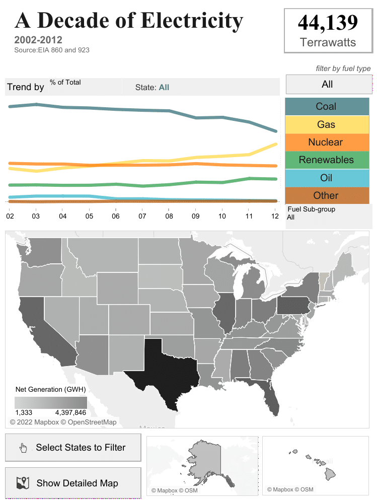
EIA Data on Energy Generation 2002-2012
Of all the Tableau dashboard examples we’ve seen, this interface stands out because of its simplicity. It allows users to explore how the power industry in the United States has changed over the past decade. Built by Robert Rouse with Tableau, it draws on EIA energy generation data, filterable by fuel type and by state. It’s a great example of how Tableau can help shed light on complex figures in a complex industry.
Real Estate Tableau Dashboards
Zillow's Data Dashboard
Real Estate company Zillow recently launched a new platform to improve the accuracy of listings and give real estate brokers access to better reporting tools. The Zillow Data Dashboard is built on Tableau and demonstrates how powerful the software can be in the hands of experts. Zillow’s dashboard enables single-click publishing of real estate listings, automatic updates to listings every 15 minutes, and daily reports for brokers to track how listings perform.
Government Services Tableau Dashboard
United States' Food Stamps Program Analysis
This fascinating dashboard captures data on the benefits available to people on the United States’ Supplemental Nutrition Assistance Program (otherwise known as food stamps). Built by Anya A’Hearn, it was inspired by Panera CEO Ron Shaich, who spent a week trying to survive on the SNAP food and beverage budget of $4.50 a day. The dashboard not only helps users understand the demographics of those on the Program, but allows them to manipulate the data to see what their family would receive if they ever needed food stamps — a powerful way to communicate important data about government services.
Social Good Tableau Dashboard
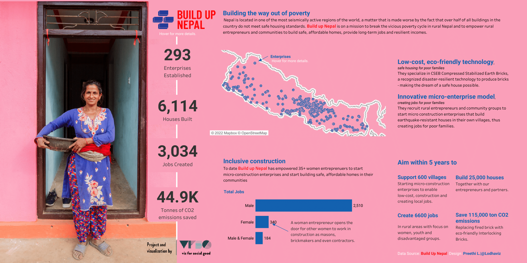
Build Up Nepal #VizforSocialGood (VOTD) by Preethi L.
What I like about this Tableau dashboard design is it’s data storytelling and visual communication. It looks like it could slot right into a magazine as an infographic and have the same effect. This designer wants to get a message out to their audience on an important issue. Sometimes, especially for the general public, you can’t do that with just charts as it’s just not that interesting. Through using photography, the reader is brought into that world and automatically associates with more empathy. You’ve got their interest.
Dashboards are developing so quickly, the traditional pie charts and tables with filters may not be enough anymore. This is an especially good example for its diversity, using photography, typography, charts and diagrams. The hard work has gone into only showing what’s truly important to the narrative and presenting it appropriately. These dashboard platforms offer so much more like icons, animation, and videos. Perhaps consider more diversity in your next dashboard where relevant and surprise your colleagues. They’ll be pleased.
Sports Analysis Tableau Dashboard
Kobe career scoring radial by Jeff Plattner
*Squints at image and asks if Tableau dashboard or poster artwork* Yes, this is indeed in Tableau of the late great Kobe Bryant’s career points. Sure, your finance executive summary dashboard is probably completely different so why reference this? Well, at Datalabs we take reference from any form of beautiful design as there is always something to learn, steal from and use yourself 😉Consider the color coding of the small dots in the radial chart where out of all of them you can quickly identify his best games. Impressive! Plus, take a look at the heading. Everyone likes good typography if they know it or not, so pay attention to the title and have it stand out. Finally, as you drool over it’s beauty, consider the use of negative space (blank space on the page). This allows the user to not get overwhelmed by the level of information and therefore get a better understanding of what’s being shown – science fact! In 2006 he scored a whopping 2,832 points whilst we at Datalabs were writing a blog similar to this.
Arts Industry Tableau Dashboard
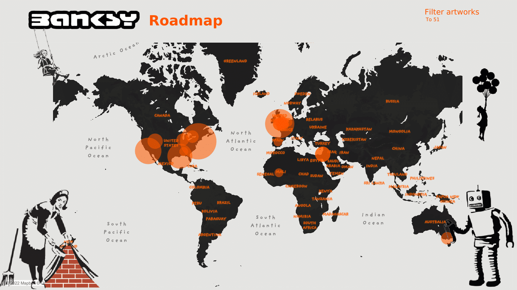
Banksy Roadmap by André Oliveira
Isn’t this cool! An interactive Tableau dashboard showing the locations of each Banksy artwork. I especially love two elements of this. One is the branding. The dashboard look and feel compliments the topic perfectly. It almost looks like graffiti art itself. A key point I address in our data visualization workshops is to only add stylistic elements (animation, images, a stylistic typography) if it is in context with the visual topic. Try to avoid adding something just because it looks “cool”. The second element is the map, (of course!). I love the style but mainly want to point out how it basically sits alone on the dashboard. The designer/developer could have easily added multiple other charts to this dashboard but chose to let the map sit alone and have the real estate it demands and deserves. This dashboard is beautiful in its simplicity and functionality. Click on a location and it will take you to a zoom in and show you a journey to visit each site.
An Example of a Sales Tableau Dashboard
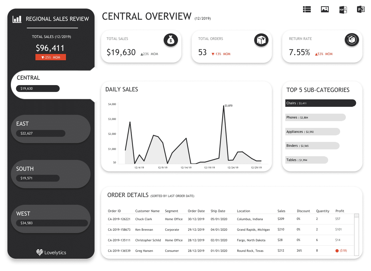
Central Overview by Lovelytics
Alright, let’s bring it back down to Earth. I understand most readers won’t be looking to design wall art but something more like the dashboard above. And what a fine dashboard it is. If you know us at Datalabs, we’re a simple folks who always tend for a black, white and grey dashboard. What that does is let the charts show the insight through shapes and numbers only, which is all that’s needed. Color should be added secondary and most of the time is just a brand element. This is pleasing on the eye for many reasons. It’s not cramming everything in but allows for spacing the elements. The layout is neat and organised. The navigation and typography is very simple, neat, and therefore creates a positive user experience. If you want a better reaction from those you’re trying to impress, add your sales numbers into a design like this. It might even soften the blow of presenting poor sales numbers 😉
These Examples of Tableau Dashboards Show the Future
In summary, Tableau dashboard designs have expanded past the traditional chart visualizations into including much more. They are now like any good website or application design. This is because in our fast paced digital world, our audience have little time and high expectations. Now you know a bit more of what is achievable with Tableau, we encourage you to find reference points in magazines, websites and dare I say art. Talk to us at Datalabs about our Designing Great Dashboards Workshop or design review sessions.
