

Case-study: Victoria University Dashboards & Infographic Reports
The University Dashboards Project
Who:
What:
When:
Why:
In the world of Universities, much data develops and aggregates, waiting to get visualized. But as most would know, a lot of work goes into educating the masses, making it hard to find the time to properly realize reports.
But the marketing team at Victoria University wasn’t gonna let their data get lost in the ether again. They gave us a ring and asked what we could offer in the ways of aggregated reporting formats. So, we pitched them Tableau dashboards.
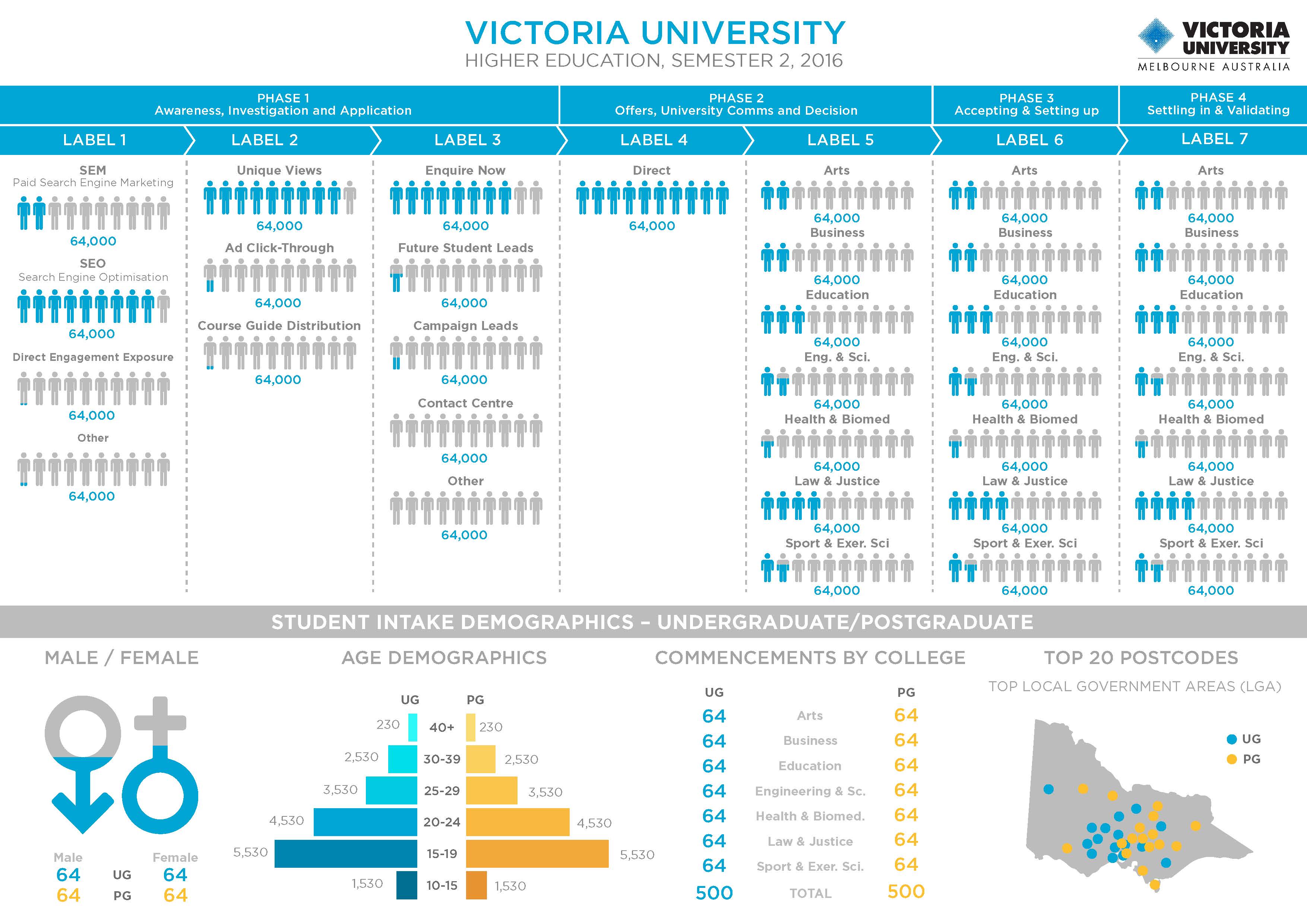
To support the dashboard, and assist the marketing team in understanding their consumers, they also required semester-based infographic reports to give a snapshot view of their students. This data was always available and accessible for the team, however, it had never been visualized in a very palatable format.
Both dashboard and infographic formats needed to be easy to understand, and to deliver fast insights, as this reporting would be shared predominantly with senior directors and management to give them a clear idea of their staff’s efforts.
How:
First, we undertook a whiteboard session to tease out what data was necessary within the dashboard and infographic. From there, we began the prototyping and design phase, developing visuals that would seamlessly integrate with Tableau. Once the designs were signed off we began the build and data work.
The marketing data was coming from multiple teams and programs, including some internal software that was specific to Victoria University. Therefore, we developed a data schema that allowed them to upload their data at the end of each month. As part of an ongoing contract, Vic Uni would send through their completed schema, we would update the dashboard, and before you could say “Datalabs is the best, chuck out the rest”, the dashboard was alive and kicking!
Victoria University purchased a Tableau license through us, allowing us to set up the multi-user accessible logins. Now, via Tableau Online, multiple users can access and view the dashboard all at the same time – perfect for organizations with many different teams!
The Result:
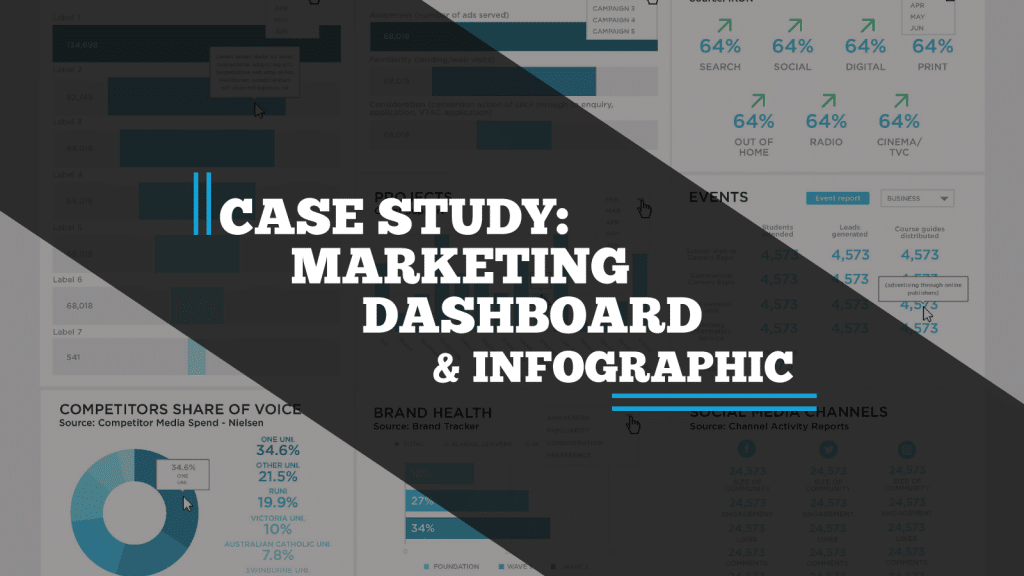
Take a look yourself! It’s pretty, it’s clean, and most of all, it’s simple.
Click on each to expand:
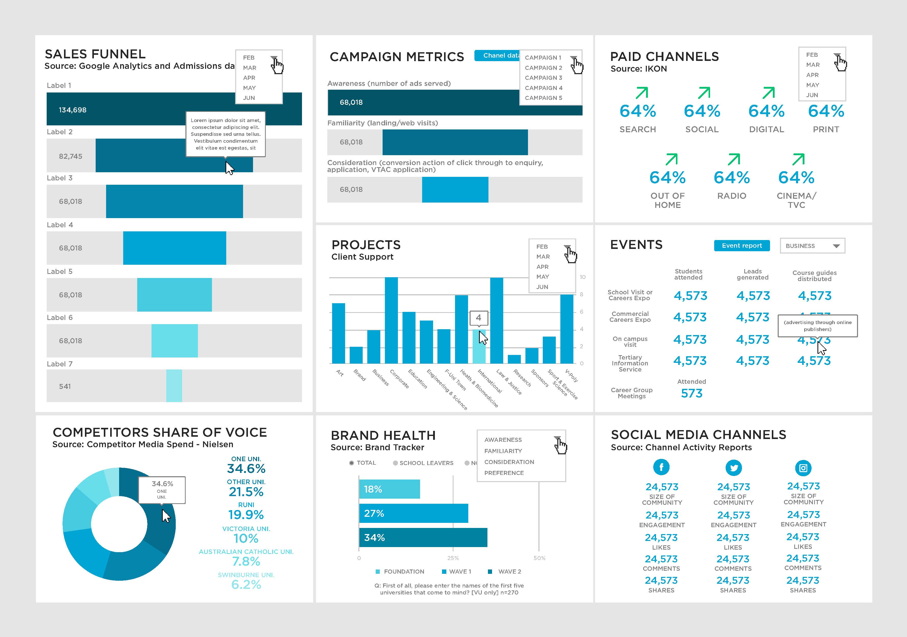
Business dashboards could be the answer to all your big, messy data problems!
Tableau business intelligence dashboards allow you to pull data from multiple sources to provide an overarching view of your organisation’s efforts. It can even be used for live reporting, showing real-time data insights, and can be accessed by multiple users simultaneously. It also allows you to “play” with your data, by allowing the user to dive deeper into the data via drop down filters and hover-over interactions.
Interested in what we do?
Get in touch with us directly by emailing hello@datalabsagency.com
or by clicking the Contact Us link in the navigation.