


15:49Claude responded: Bookmark this curated list of 101 data visualization websites — covering charts, code, maps, inspiration, tools, and free resources for designers and coders al…Bookmark this curated list of 101 data visualization websites — covering charts, code, maps, inspiration, tools, and free resources for designers and coders alike.

We’ve curated a list of gold-standard interactive data visualizations which we hope will inspire you to try it for yourself. May your data never be boring.
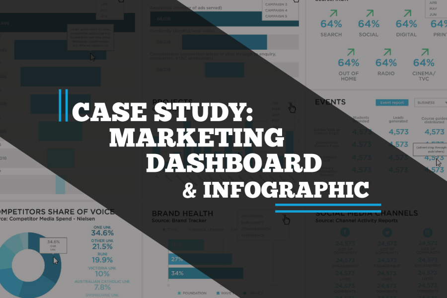
A case study on a Tableau dashboard, infographic and data design project for the marketing team at Victoria University.

Make your data viz understandable and memorable. Use the techniques of repetition, alignment, and symmetry to your advantage. See visual examples and skill up.

The Data Analytics and Data Science Conferences Guide 2026/2027 is your one-stop shop for conferences you actually want to go to. These are great conferences in cool cities.

See the 2026/2027 guide to the best data visualization conferences in North America, Australia, Asia, and Europe. Use this year's conference guide as a travel planner. So get out, travel, meet new people, and learn more about what makes data visualization such a creative and interesting area to work in.

The difference between wasted training budget and transformed team capability comes down to seven key factors most organizations overlook. Learn what to demand from data storytelling trainers—from customization using your actual data to post-workshop support—before you make your next hiring decision.
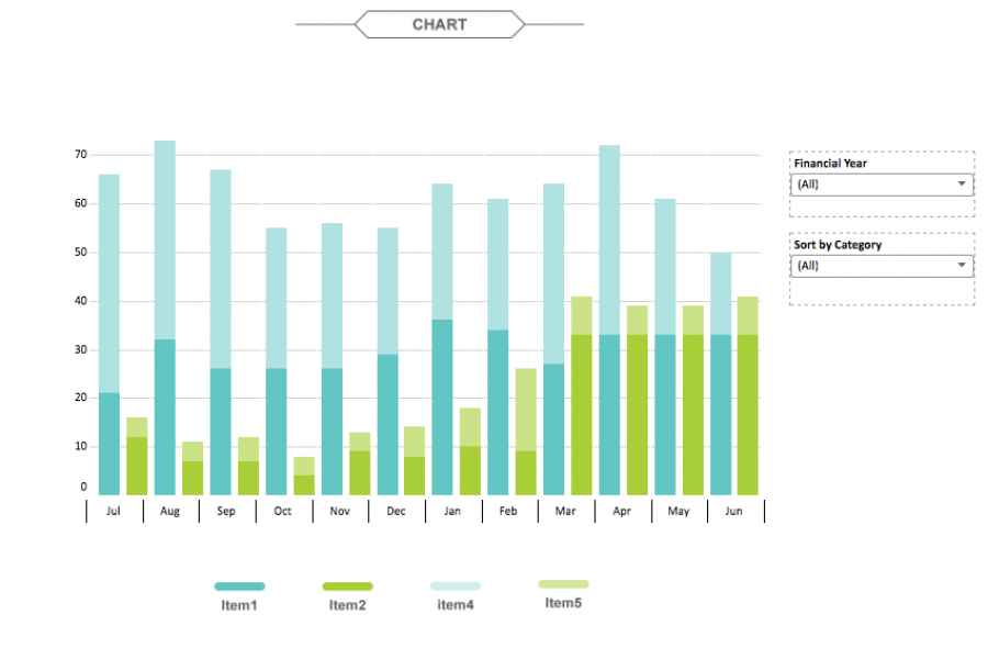
The aim for this project was to create an interactive dashboard, utilizing Tableau, to convey the data that had been collected over the financial year. Check out this financial firm's reporting suite.
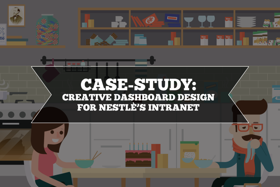
Nestlé's aim was to develop an easy-to-use, visually engaging experience that would help to make Nestlé employees’ jobs easier, and therefore, more enjoyable. The Datalabs Agency designed and developed a fun Intranet portal in response.
Stop using tables in your reporting. Seriously, there are better ways to visualize data. Here are three: »
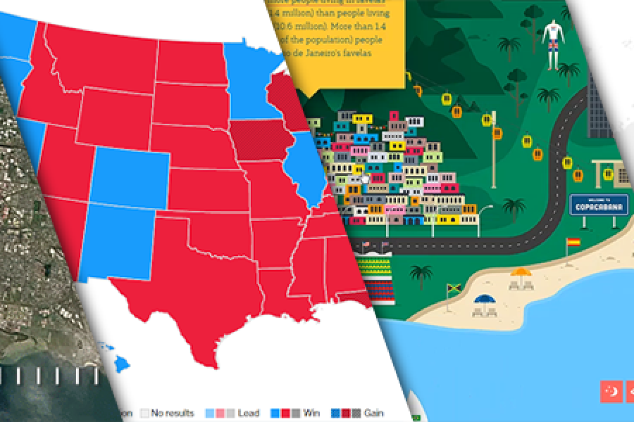
The Data Visualization Format of the Year (Runner Up): The Interactive Map With best-practice examples You may have already seen that this year’s best data visualization format winner was declared:
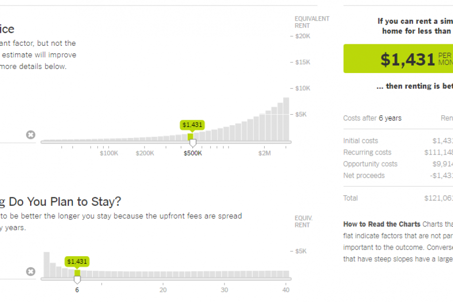
The Data Visualization Format of the Year: The Interactive Calculator A Great Example to Show You How It’s Done This year has seen some great data visualizations. From interactive maps,