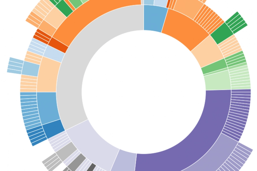
Monash Heath wanted a time-based interactive data visualization to show the pathway of a patient’s journey through the healthcare system. We used Adobe Illustrator, Excel, HTML, JavaScript, and CSS to come up with this digital experience.

6 Examples of NPS Charts: How to Best To Visualize a Net Promoter Score Love it, hate it (or neither…) – Net Promoter Score (NPS) is a key success measure

4 Marketing Analytics Trends That Will Kill It In 2016 As digital marketing continues to evolve and marketers gear up for 2016, here are the 4 analytics trends that we


