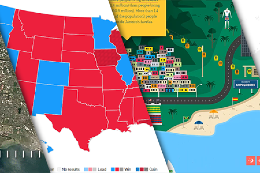
The Data Visualization Format of the Year (Runner Up): The Interactive Map With best-practice examples You may have already seen that this year’s best data visualization format winner was declared:
Filter by:
Tags
- 2015
- 2016
- A.T. Kearney
- ABS
- Accenture
- accounting
- Adobe Illustrator
- Adobe InDesign
- Adobe Photoshop
- Africa
- Agile
- agriculture
- Alan Kohler
- analysts training
- analytics
- animation
- annual reports
- ANZ
- Apple
- art
- artificial intelligence
- asia
- audiences
- Australia
- Australian Bureau of Statistics
- automation
- automotive
- bad data visualization
- Bain and Company
- Bangledesh
- banking
- best practices
- big data
- bloomberg
- Booz and Company
- Budget
- business intelligence
- C Suite
- calculators
- chart types
- Chief Marketing Officer
- china
- climate change
- cloud
- color theory
- CommBank
- conference
- conferences
- consultancy
- consumer goods
- content marketing
- content marketing metrics
- corporate branding
- corporate communications
- corporate governance
- courses
- CRM
- customer satisfaction
- d3
- data
- data dashboads
- data dashboards
- data journalism
- data scientists
- data security
- Data Visualisation
- data visualization
- Deakin University
- Deloitte
- Department of Education and Training
- Department of the Treasury
- design thinking
- digital systems
- Donald Trump
- economics
- education
- Elon Musk
- employment
- energy
- environment
- Europe
- events
- Excel
- explainer videos
- EY
- Eyeo
- Federal Government
- finance
- financial reporting
- flash
- food supplies
- formats
- futurism
- Google AdWords
- Google Analytics
- government
- graph types
- graphic-design
- great data visualizers
- Harvard Business Review
- healthcare
- Hilary Clinton
- Hollywood
- Hong Kong
- human resources
- Iceland
- IEEE
- illustration
- image formats
- Indonesia
- infographics
- information design
- innovation
- interactive content
- Interactive Microsite
- intern
- internet of things
- internships
- intranet
- Investment banking
- IWDA
- javascript
- Joe Hockey
- KDD
- KISSmetrics
- KPMG
- L.E.K. Consulting
- las vegas
- Laws of Attraction
- lead generation marketing
- legislation
- Liberals
- logistics
- Los Angeles
- machine learning
- macroeconomics
- Malaysia
- Malofiej World Summit
- mapping
- market research
- marketing
- marketing automation
- marketing channels
- marketing research
- marketing systems
- McKinsey and Company
- media
- medicine
- Melbourne office
- Microsoft
- Minority Report
- Mixpanel
- Monash University
- Monitor Group
- motion graphics
- NAB
- new features
- New York Times
- New Zealand
- nonprofits
- North America
- online training
- onsite training
- outsourcing
- pattern recognition
- photography
- policy announcements
- politics
- Power BI
- PowerPoint
- predictive analytics
- presentation design
- processing
- PwC
- RBA
- real estate
- remote learning
- research
- resources
- retirement
- return-on-marketing-investment
- RMIT
- Roland Berger Strategy Consultants
- sales effectiveness
- sales reporting
- San Francisco
- SAP
- science
- SEEK
- SEM
- SEO
- shareholders
- Singapore
- social media analytics
- Socialbakers
- software
- south-korea
- sports
- spotlight
- state of victoria
- statistics
- storytelling
- strategy
- strategy projects
- systems visualisation
- Tableau
- Thailand
- timelines
- tips and tricks
- tools
- traffic
- transformation projects
- transportation
- Treasury Minister
- Udemy
- UI design
- universities
- University of Sydney
- university students
- user experience design
- user interface design
- Victoria University
- video
- videos
- Vietnam
- visual analytics
- visual reports
- web applications
- WestPac
- wordpress
- workshop
- workspaces
- year in review
© 2023 Data Arts Pty Ltd


