


15:49Claude responded: Bookmark this curated list of 101 data visualization websites — covering charts, code, maps, inspiration, tools, and free resources for designers and coders al…Bookmark this curated list of 101 data visualization websites — covering charts, code, maps, inspiration, tools, and free resources for designers and coders alike.

The difference between wasted training budget and transformed team capability comes down to seven key factors most organizations overlook. Learn what to demand from data storytelling trainers—from customization using your actual data to post-workshop support—before you make your next hiring decision.
What Is The Business Case for Infographics? How You Prove The Value In Better Communication, Information Design & Reporting Your business has data and information. And your business needs to

Monash Heath wanted a time-based interactive data visualization to show the pathway of a patient’s journey through the healthcare system. We used Adobe Illustrator, Excel, HTML, JavaScript, and CSS to come up with this digital experience.

From the dreaded pie chart to the often-misunderstood Sankey diagram, we'll geek out on more data viz guidance, updating this list of categories and types. So bookmark this page and sign up for our data visualization newsletter to keep your data design brain well fed.

Looking for a freelance infographic designer to hire? See our work here at Datalabs. About the Infographic Designer role: Our Infographic Designers are the agency’s creative visualisers and graphic designers,

The Key to Data Storytelling: Creating Captivating Dashboards & Infographics “Those who tell stories rule society.” – Plato In the past, the role of a data scientist or analyst is simple
Data Visualization Brand Guidelines for Tableau, Microsoft Excel, Highcharts & Infographics As we have seen on projects time and time again, data scientists and data designers have two separate capabilities.
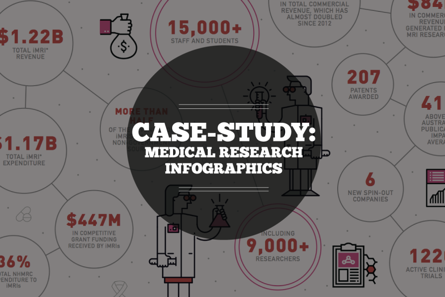
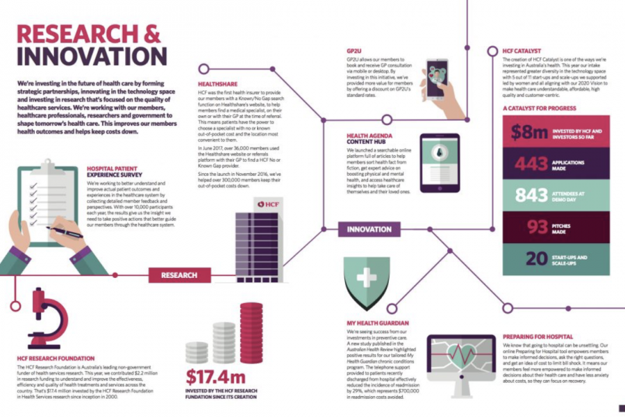
Case Study: Medical Research Infographic Who: Association of Australian Medical Research Institutes What: Summary Report Infographic When: August 2016 Why: The team at the Association of Australian Medical Research Institutes

6 Examples of NPS Charts: How to Best To Visualize a Net Promoter Score Love it, hate it (or neither…) – Net Promoter Score (NPS) is a key success measure