

Brand Guidelines for Data: The Data Visualization Format of the Year (First Place) Formatting All Data Visualization with Best Practice Principles In 2023, the visual branding of data has only
Looking for a freelance infographic designer to hire? See our work here at Datalabs. About the Infographic Designer role: Our Infographic Designers are the agency’s creative visualisers and graphic designers,
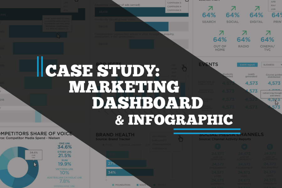
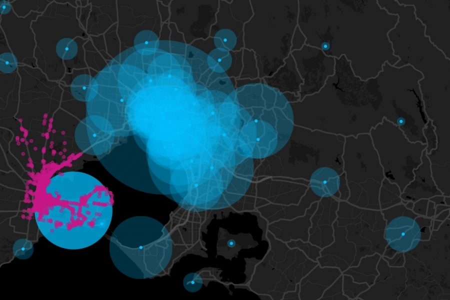
A case study on a Tableau dashboard, infographic and data design project for the marketing team at Victoria University.
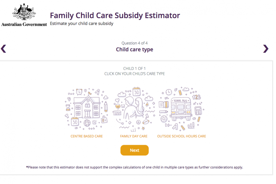
The Datalabs Agency was engaged to help Australia's Department of Education provide a clean and simple user interface in which parents and carers of children could estimate the amount of money they may be entitled to receive.
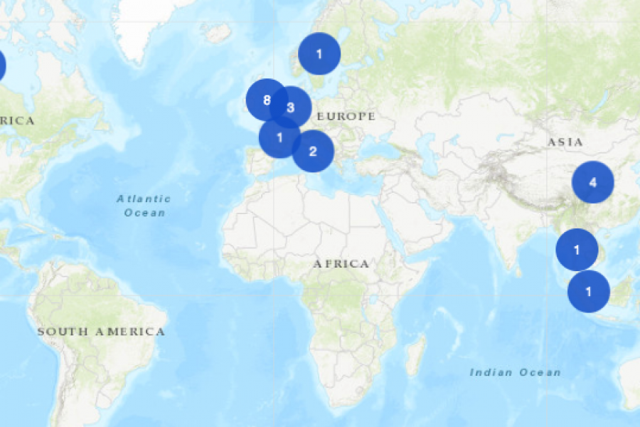
An Interactive Mapping Project for the University of Melbourne’s Business School. This interactive map shows former students, faculty/alumni, programs, and partnerships that potential students could engage with around the world.

The Department of Education and Training needed a clean and simple user interface to assist in the communications strategy for the Australian Government’s New Child Care Package. This interactive tool was a hit with parent's in need of some numbers.
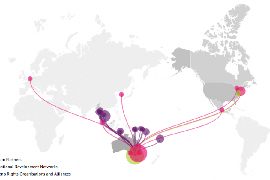
Looking for what data visualization can do for your website? Check out this live example of an interactive map developed for International Women's Development Agency.
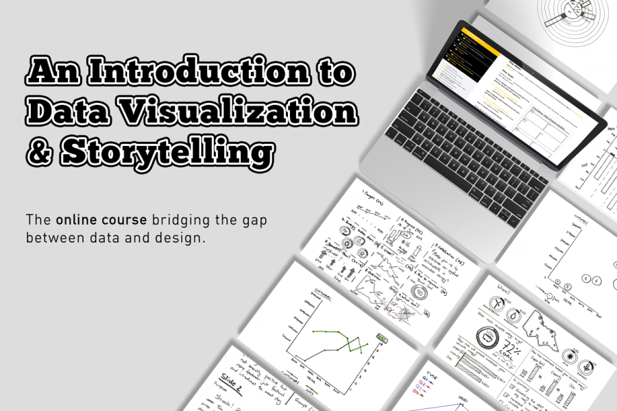
The Datalabs Agency has NEWS! Online Data Visualization and Storytelling Course Launch Hello, data friends! Click here for the “Introduction to Data Visualization & Storytelling Course”. We’ve been working hard

Our List of Data Visualization Conferences in 2018 Get out of your diary and get excited because it’s going to be a big year for data viz! We’ve rounded up

5 Benefits You Can Only Get From a Data Viz Workshop When it comes to getting the most out of your data, a face-to-face tutorial has advantages over your average
Top 5 Data Visualization Trends If you’re wondering what we can expect in data viz this year, you’re in the right place. When it comes to data visualization, your audience