

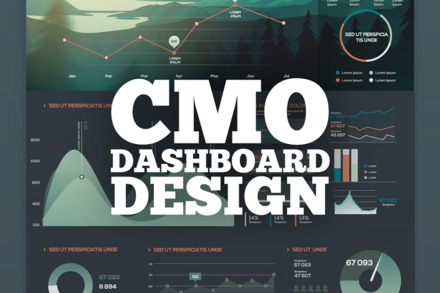
Recruiting a Chief Marketing Officer in a data-driven world isn’t easy. Heads of corporate marketing often rise through the ranks without the scientific or technological background needed today. This presentation
“A Golden Age of Interface Design is coming. The creative and visual direction of data design can be inspiring and creative. Let’s make sure it is. Here’s a vision and
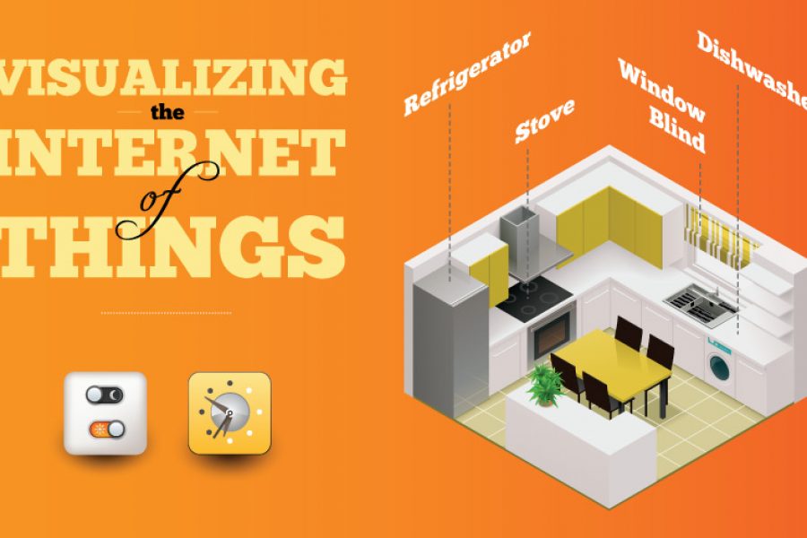
No Chief Data, Chief Digital, or Chief Marketing Officer will be spared the deluge of data coming from the Internet of Things (IoT). I propose the challenge initially isn’t a

How to Tell a Story With Data Visualization Ideas and examples you can use in your organization to create a data-driven narrative The idea of collecting and storing massive amounts

What is a microsite & what are they used for? A look at what makes a good microsite, how they differ to a website & some great examples. In previous
Data Visualization and the Big Three Strategy Consulting and Big Four Accounting Firms How does a creative data visualization and visual analytics agency get along with the ‘suits’? Combing through

A Killer Microsite & Interactive Web Design Experience That Will Inspire You! Microsite and interactive data tool that is the future of data design If a good infographic tells a story, then

Monash Heath wanted a time-based interactive data visualization to show the pathway of a patient’s journey through the healthcare system. We used Adobe Illustrator, Excel, HTML, JavaScript, and CSS to come up with this digital experience.
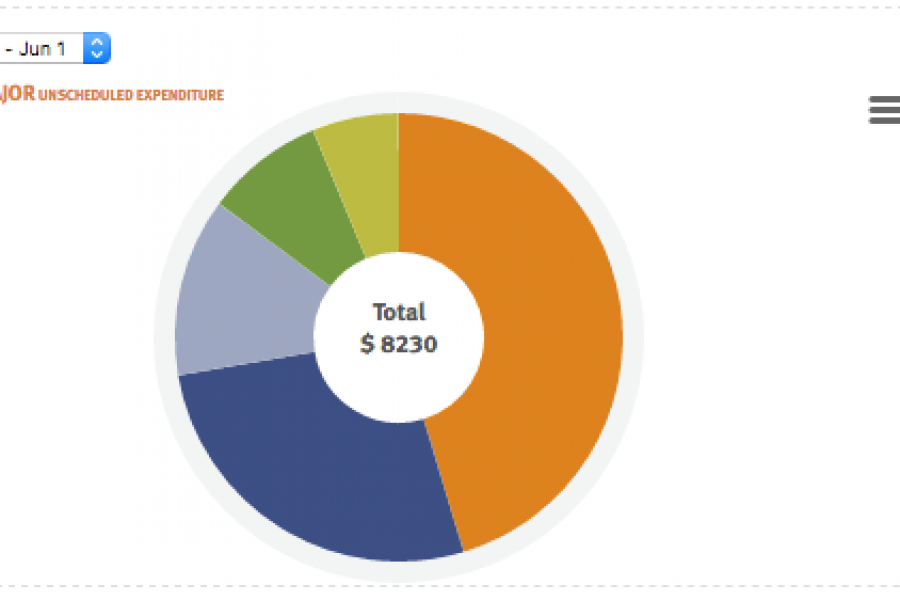
Financial Operations & Reporting BI Dashboards A Business Dashboard for Reviewing Financial Risk Our client offers vehicle fleet leasing and management, Australia-wide, and internationally. Their solutions are time-saving and cost-effective, as well

5 Tips For Designing a Great Dashboard Not all dashboards are created equal – here’s how to get it right from the designers at the Datalabs Agency. Infographic dashboards are

Telling Stories With Data: From Simplification to Persuasion and Reporting. The Most Common Questions From Our Data Visualization Workshops. We can run our Data Visualization Workshops anywhere in the world,
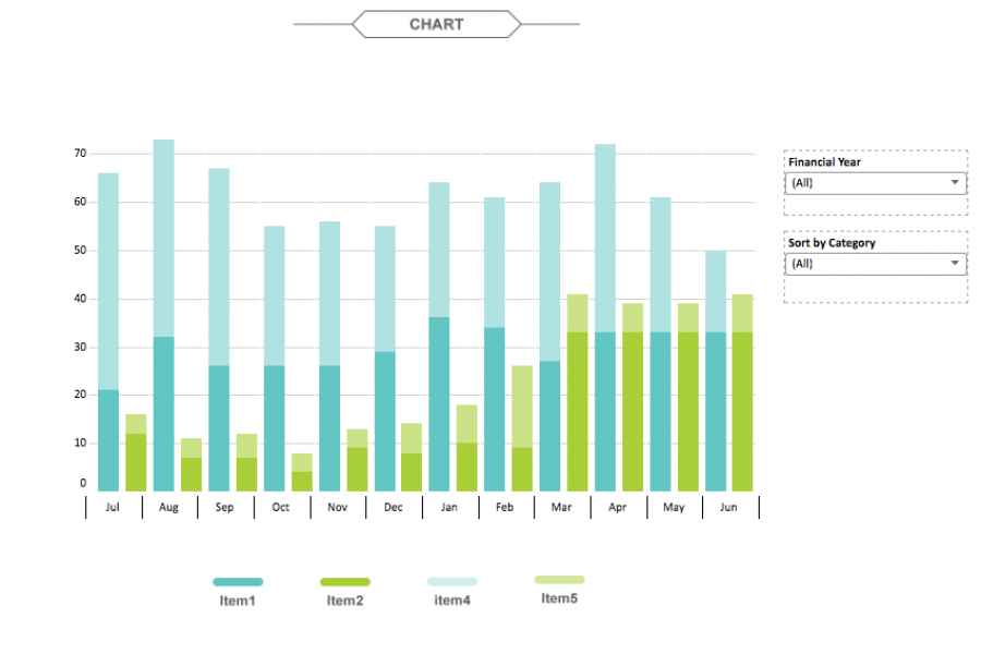
The aim for this project was to create an interactive dashboard, utilizing Tableau, to convey the data that had been collected over the financial year. Check out this financial firm's reporting suite.