


From the dreaded pie chart to the often-misunderstood Sankey diagram, we'll geek out on more data viz guidance, updating this list of categories and types. So bookmark this page and sign up for our data visualization newsletter to keep your data design brain well fed.
10 Data Viz Guys & Gals to Follow on Instagram Want constant #inspo on your #insta? Follow these awesome data visualizers to keep you motivated. 1. Mona Chalabi Mona Chalabi

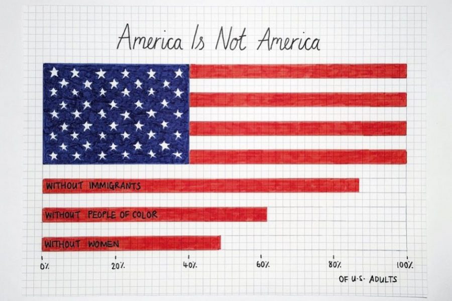
There are some tricks to making your data viz understandable and memorable, that is, by using repetition, alignment, and symmetry to your advantage.

We’ve curated a list of gold-standard interactive data visualizations which we hope will inspire you to try it for yourself. May your data never be boring.
Looking for a freelance infographic designer to hire? See our work here at Datalabs. About the Infographic Designer role: Our Infographic Designers are the agency’s creative visualisers and graphic designers,
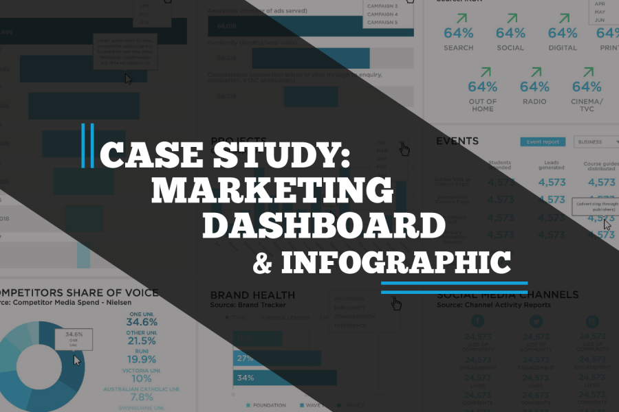
A case study on a Tableau dashboard, infographic and data design project for the marketing team at Victoria University.
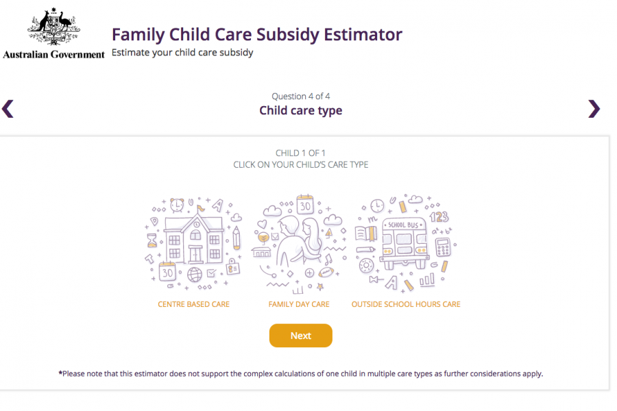
The Datalabs Agency was engaged to help Australia's Department of Education provide a clean and simple user interface in which parents and carers of children could estimate the amount of money they may be entitled to receive.
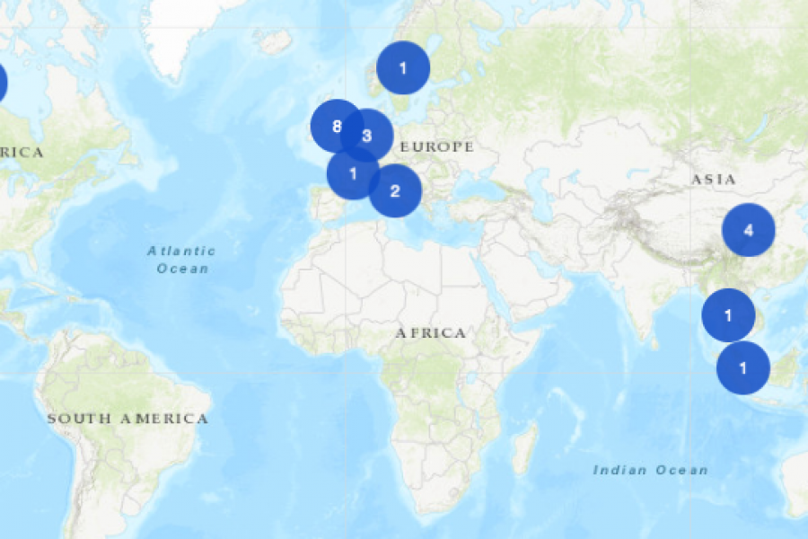
An Interactive Mapping Project for the University of Melbourne’s Business School. This interactive map shows former students, faculty/alumni, programs, and partnerships that potential students could engage with around the world.
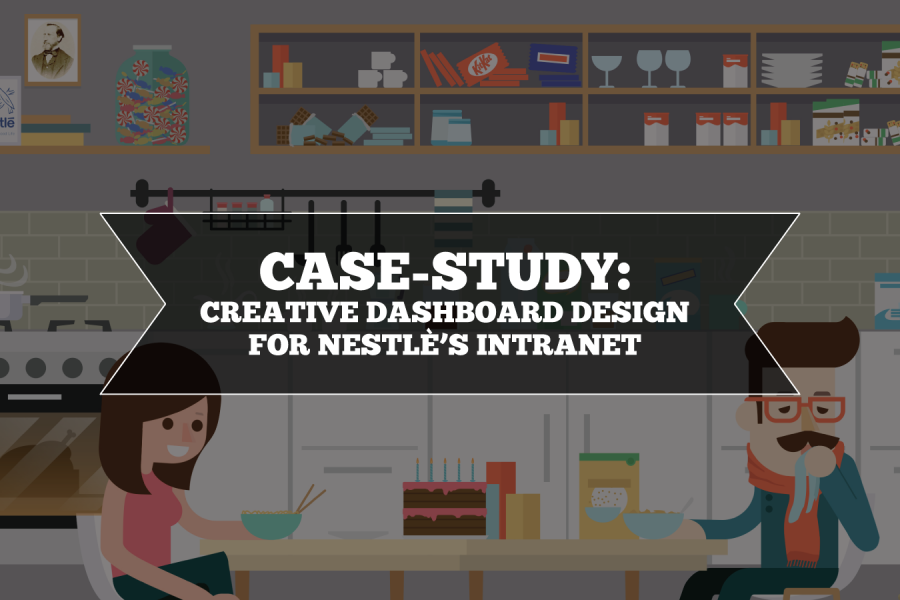
Nestlé's aim was to develop an easy-to-use, visually engaging experience that would help to make Nestlé employees’ jobs easier, and therefore, more enjoyable. The Datalabs Agency designed and developed a fun Intranet portal in response.

The Department of Education and Training needed a clean and simple user interface to assist in the communications strategy for the Australian Government’s New Child Care Package. This interactive tool was a hit with parent's in need of some numbers.