


What Makes A Great Year in Review? A list of our most favorite digital annual report content elements for 2017 Almost everyone produces a Year-In-Review and most of those still
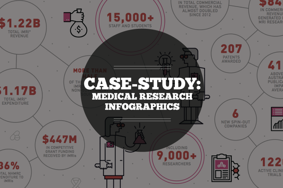
Case Study: Medical Research Infographic Who: Association of Australian Medical Research Institutes What: Summary Report Infographic When: August 2016 Why: The team at the Association of Australian Medical Research Institutes

Datalabs is looking for a Full Time Data Visualizer with experience in designing in Adobe Illustrator, as well as coding in JavaScript, CSS, and HTML. Presentation, public speaking skills also
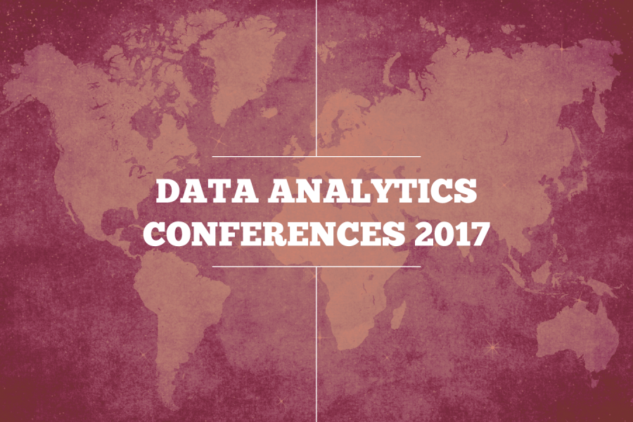
Our List of Data Analytics Conferences for 2017 In today’s Age of the Internet data is everywhere – and every day brings more data. In fact, the amount of data readily
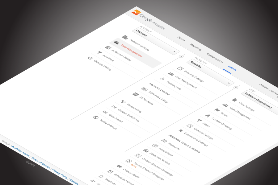
How To: Using Google Analytics as a Marketing Tool and Ultimate Decision Maker How to use Google Analytics We all know of Google Analytics, but ‘How to Use Google Analytics’

Digital Marketing Dashboards & Systems Visualizations The Common Digital Marketing Problem No matter what industry, we’ve heard the same underlying problems in our clients’ marketing operations. Key questions that could

Do You Know What Your Digital Marketing System Looks Like? (Like, physically, looks like?) Imagine a Network of Veins, Valves, and Organs — all labeled for clarity, informing everyone who
Six Questions Content Marketers Should Ask of Their Google Analytics Data Understanding the Value and ROI of Content is Imperative to Modern Marketing Analytics. Here are some great ways to
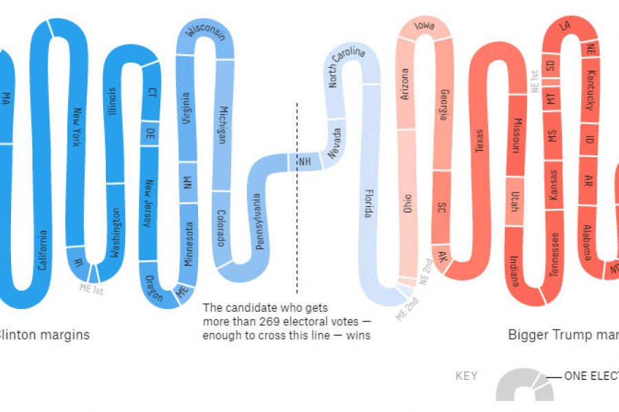
With the dust now beginning to settle, let’s take a different look into the past US Election… Politics and outcomes aside, American elections bring with them an enormous responsibility to
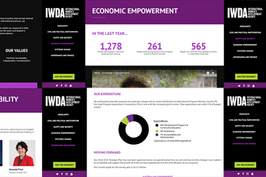
Considering going digital with your annual report? Do it! Here's an example of what interactivity and a non-profit organization's 'year in numbers' looked like after they ditched paper and went digital.
6 of the Best Marketing Dashboards … And Why Your Business Needs One! Tired of tiny details and endless numbers on your marketing strategy report? Tired of constantly opening new tabs

6 Examples of NPS Charts: How to Best To Visualize a Net Promoter Score Love it, hate it (or neither…) – Net Promoter Score (NPS) is a key success measure