

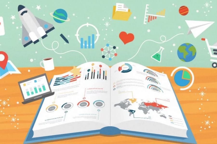
The Key to Data Storytelling: Creating Captivating Dashboards & Infographics “Those who tell stories rule society.” – Plato In the past, the role of a data scientist or analyst is simple
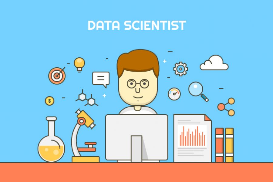
Design Thinking Meets Data Science The term “Big Data” has gained lots of attention in recent years. Want to know what the sexiest job of the 21st century is? It’s
The Future of Marketing Analytics The digital revolution today has brought disruption. Marketers have to think smart – and fast. Combined with the increasing and always-changing consumer expectations, decisions have
Data Visualization Brand Guidelines for Tableau, Microsoft Excel, Highcharts & Infographics As we have seen on projects time and time again, data scientists and data designers have two separate capabilities.
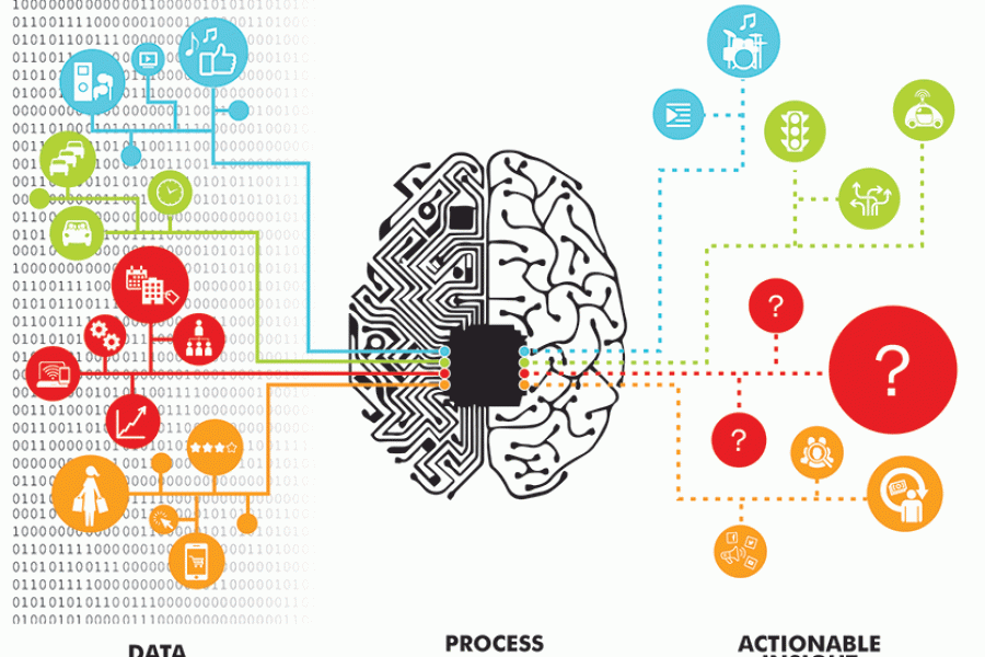
Animation & Motion Graphics are Great for Conveying Insights & Complex Ideas How can such complex, abstract, and intangible information be conveyed in an easy-to-understand and interesting manner? The answer:

Phew, can you believe it’s April already! Maybe they’re right when they say time runs faster as you get older. Even though the year has whizzed by, it’s never too
Our Data Visualization Basics A Data Visualization Primer Let’s look at some data visualization basics. In today’s technologically advanced age, we are overwhelmed with data every day – not all

Our List of Data Visualization Conferences in 2018 Get out of your diary and get excited because it’s going to be a big year for data viz! We’ve rounded up

5 Benefits You Can Only Get From a Data Viz Workshop When it comes to getting the most out of your data, a face-to-face tutorial has advantages over your average
Top 5 Data Visualization Trends If you’re wondering what we can expect in data viz this year, you’re in the right place. When it comes to data visualization, your audience
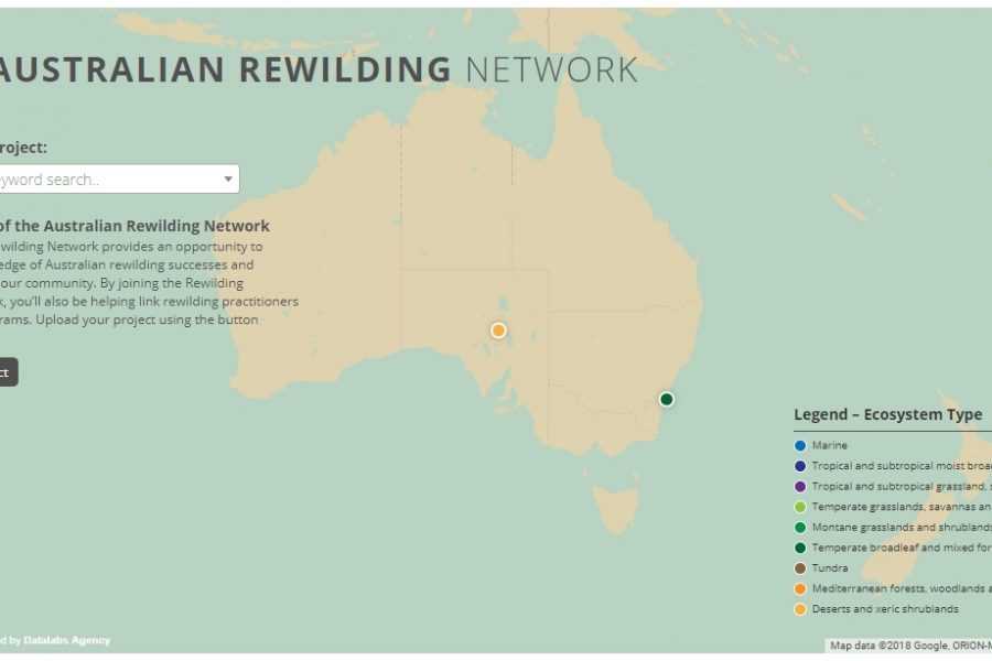
With an interactive map now live on their website, Rewilding Australia has increased the amount of interactive media on its site tenfold. Check out the cartographic experience.

Your Guide to Marketing Conferences in 2018 It’s going to be a big year…