


Tableau Launches Four New Exciting Features If you haven’t figured it out, we are OBSESSED with data visualization, dashboarding, and data discovery. One of our favorite BI tools, Tableau, recently

Five Common Mistakes People Make in Data Visualization The best way to learn is to make mistakes. That still rings true in terms of designing data visualization. Even the most
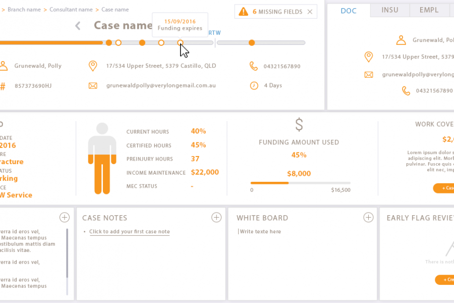
Our client engaged Datalabs to design a best-in-class dashboard and user interface for their frontline staff’s main workstation. Check out the infographic look in this data visualization case study.
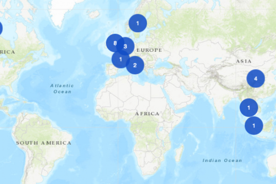
The Datalabs Agency was commissioned to turn the list of the University of Melbourne’s partners and connections around the world into an interactive map that would sit on the home page of their site.
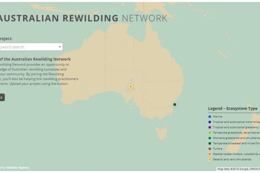
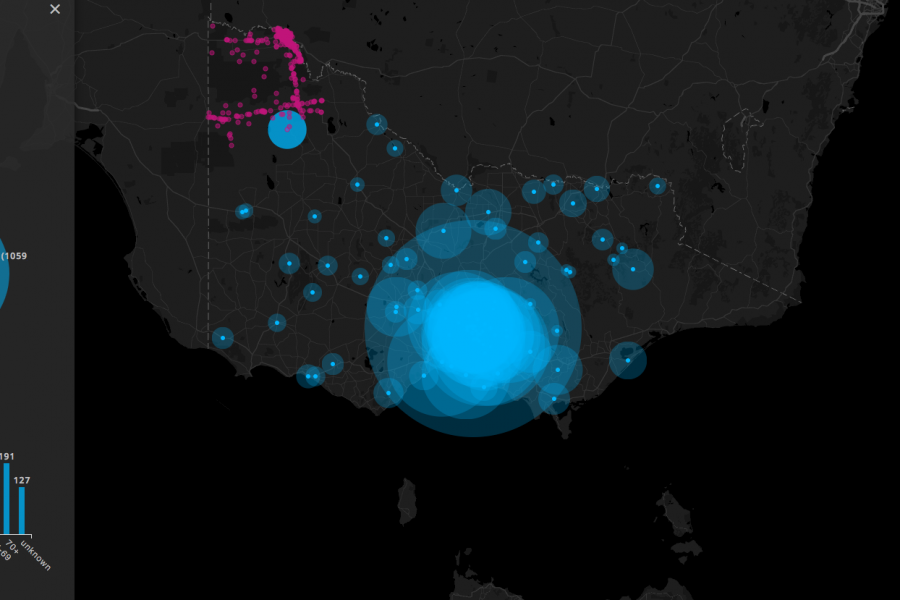
Mapping Intelligence: Helping Wildlife in Australia About the Rewilding Mapping Project The interactive map is designed with d3 and Google Maps Showcases the current projects the organization is working on
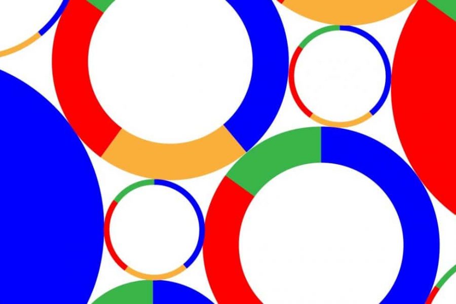
Our Opinion On Pie Charts …or the Case For and Against the Pie Chart. If there’s a list of controversial charts types in this world, then assume the pie chart

The Best People to Follow on Twitter for #DataViz We’ve gathered a list of 20 of our favourite data-viz people to follow on Twitter. Twitter is a pretty magical place.
Our List of Data Analytics Conferences for 2018 If you haven’t already seen it, our guide to your year of data viz conferences for 2018 is up now. And while there
Find Out What’s On at Tableau Conference 2017 Welcome to the Tableau Conference 2017! Starting Monday, October 9, thousands of data people will gather at the Mandalay Bay in Las
2017 Summed Up in 10 Revealing Data Viz and Infographics A list of some of our favorite visualizations that explain the year that was 2017. 2017 was an interesting year,
Three Interactive Data Maps Data-driven, Interactive & Animated If you’ve ever spoken to onto the DL team about a project there’s a fair chance we’ve tried to get a map

Data Visualization Websites — 101 of the Best Resources Ideas, inspiration blogs, people, tools, and more! We’ve searched and searched to bring you 101 data visualization websites that showcase the