


Data Stories & Map Design
A look at how maps can help tell your data story
Humans have used maps to share information about the world around us for over five thousand years. In that time, maps have transformed from simple hand-drawn pictures into geographically precise documents. This change reflects the growing complexity of both our knowledge and map-making technologies. Today, sophisticated mapping software, combined with readily available location-based data, makes it entirely possible to create complex, beautiful, and interactive maps.
Ironically, this new generation of maps have a lot in common with some of the oldest maps in existence — they are beautiful, and they don’t just show the lay of the land, but overlay geographic data with social, cultural, and economic information. In short, it’s possible to tell powerful stories with maps.
Map Design
Rapid advances in mapping software are largely responsible for this most recent transformation of maps, from static to interactive, from functional to beautiful. Mapping software has made it possible to embed markers and enrich those markers with text and images. There are also a growing number of skins, styles, and other design options that can give maps a look and feel that reflects the data they contain. All this makes it possible to tell a detailed story about places on a map.
Data Stories
Location-based data is readily available and lends itself to storytelling.
As the self-described ‘mapper and data herder’ Hugh Stimson says,
People are really good at understanding things, even complex things if they can just look at them laid out over space. Tables and sometimes even charts can be tough, but humans are almost supernaturally good at cueing into patterns of spatial arrangement. Rezoning listings? Boring. A map of the Downtown Eastside with proposed condo developments lit up a certain color? Potentially quite interesting.
Maps are more than a neat way to present data – because people naturally associate specific ideas and emotions with certain places, the moment you put data on a map, you’re telling a story. For example, this map by the New York Times shows the likelihood of people in each county across the United States to marry before the age of 26.
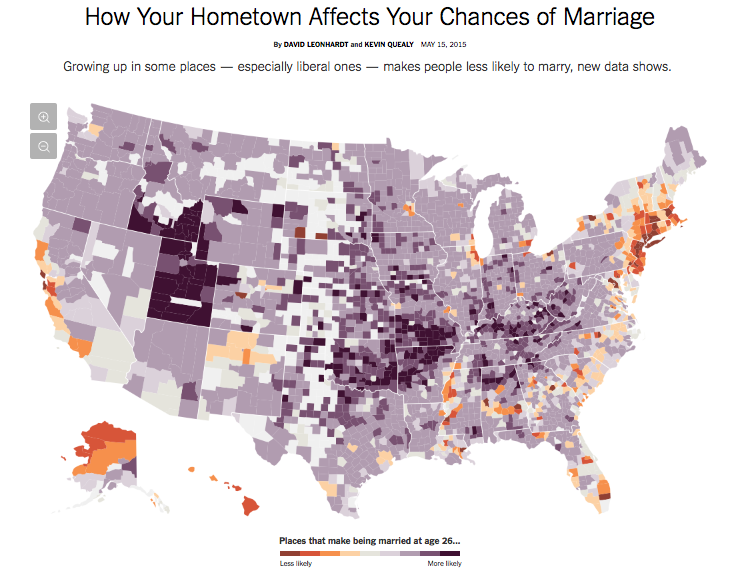
This map tells a clear and compelling story about geographic difference that easily intersects with what we already know about the religious and socio-economic status of places such as Utah and New York. Imagine how less the impact if that data had been presented in a table?
Evergreen Content
Perhaps the biggest opportunity presented by the new generation of maps is to create an “evergreen” asset. In other words, to create a living map, that changes over time.
A well-built map allows updates and additions and continues to reflect the world, even as it changes. An inspiring example of this principle is the crowdsourced map by Open Street Maps, developed to help fight the spread of Ebola in West Africa.
View Larger Map
At the outset of the Ebola crisis, the Humanitarian Open Street Map Team decided that rather than make do with Google Maps, which lacked detail on crucial villages, they would quickly build a map that could accept contributions from people on the ground in West Africa. The result is a map that grows more rather than less accurate over time, without additional expense.
The Future of Maps
Many businesses and organizations are collecting location-based data, but few have realized the potential for maps to turn that data into a powerful story. We don’t believe it will be long before many more people realize that we have arrived at the intersection of data stories and map design and that a powerful storytelling tool lies straight ahead.
Want to tell a story with your very own interactive map?
Head straight to our inbox at hello@datalabsagency.com
or simply click Contact Us in our website navigation to access our online form.