


Five Common Mistakes People Make in Data Visualization

The best way to learn is to make mistakes.
That still rings true in terms of designing data visualization. Even the most experienced data viz designers make the most mundane mistakes! Here we highlight the top five mistakes made – done in a conscious effort so we can all avoid them.
1. Data not adding up
Might seem like such a no-brainer in the field of data visualization, but it no doubt happens – especially when designers are dealing with big chunks of data that need to be simplified. When dealing with percentages (which a lot of pie charts and bar graphs are), the number should always add up to 100.

Consider the example above, taken from FOX News. Do the numbers make sense to you? No, because they do not add up to 100 percent, but rather 193 percent. Not only is it confusing for viewers watching, but it also does not reflect well on FOX News, which broadcasted this data. Even though it should have gone unsaid, be sure to double-check your numbers when generating charts.
2. Attempting too much
The first part of the job for data visualizers is to simplify and summarise the data they have. A lot of the time, it is indeed tempting to include as much information as possible in one infographic. Ironically, it usually results in the opposite intended effect because the main points will get buried in white noise and the viewer just ends up getting confused.
Data needs to be organized in terms of hierarchy – from highest to lowest priority. Be picky when considering what essential information to include. If it doesn’t highlight or bring forth the main points, then it doesn’t need to be included!
3. Visual clutter
The second part of the job in data viz is designing. In saying this, there is a fine line between making visual design choices that distract from the main point vs. making choices that adds value to the data being presented.
At its worst, adding eye candy just for the sake of it is a disservice to users trying to understand the data, especially when the information is quite complex.
In the graph above, the addition of the world map makes for a nice aesthetic addition, yet it is quite difficult to compare the patterns when the bar graphs are placed in this seemingly arbitrary way. Placing the bars next to each other would make it easier for viewers to compare the different data.
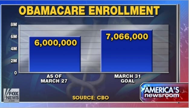
4. Inaccurate scales

When you want to represent data that is easy to read, it is important to create scales that make sense. Inaccurate scales can result in a misrepresentation of data. In short, scales should reflect the date accurately.
Not to pick on FOX News (again), this graph is lacking the Y-axis, even with a grid in the background that is pretty much rendered useless. As a result, the sizes of the bars are inaccurate, with seven million looking almost three times of six million.
Here is the same chart, corrected:
FOX News salvaged itself by adding a zero-baseline Y-axis and correcting the bar graph sizes, portraying a more accurate picture.
4. Choosing the wrong format of data visualization
The whole point of data viz is to make data easily digestible through presenting them in a visual format. Therefore, it is very important to look at the data and consider carefully what sort of visualization would illustrate it best.
In the case of the graph above, it would be better if the percentages are arranged in descending order, so that viewers can faster and more easily decipher the data. A bar graph is also arguably not the best visual representation for this type of data. Despite the unpopular opinion on pie charts, it is a better option than bar graphs for this type of data. Just be careful when using a pie chart – it is usually a good option only if the percentages are divided into big fractions.
With this being said, forget about the more traditional charts and graphs. There are so many ways data visualization designers can go crazy in being creative and take their data towards. Think outside the box!
—
The best mistakes make the best lessons. However, your company can avoid going through mistakes and learn straight from us – because we’ve personally witnessed all of them!