

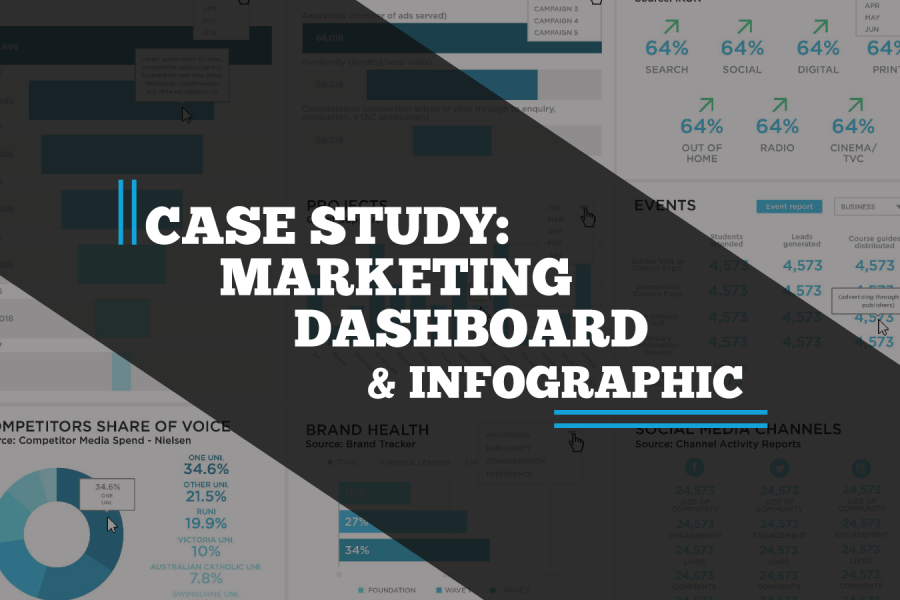
A case study on a Tableau dashboard, infographic and data design project for the marketing team at Victoria University.
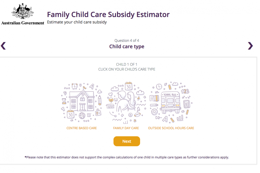
The Datalabs Agency was engaged to help Australia's Department of Education provide a clean and simple user interface in which parents and carers of children could estimate the amount of money they may be entitled to receive.
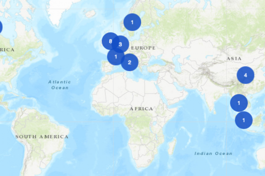
An Interactive Mapping Project for the University of Melbourne’s Business School. This interactive map shows former students, faculty/alumni, programs, and partnerships that potential students could engage with around the world.
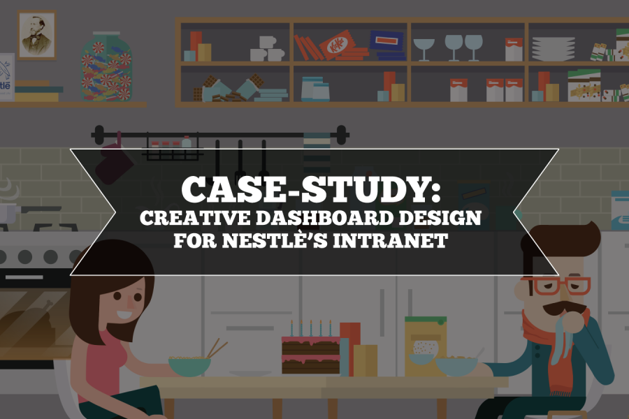
Nestlé's aim was to develop an easy-to-use, visually engaging experience that would help to make Nestlé employees’ jobs easier, and therefore, more enjoyable. The Datalabs Agency designed and developed a fun Intranet portal in response.

The Department of Education and Training needed a clean and simple user interface to assist in the communications strategy for the Australian Government’s New Child Care Package. This interactive tool was a hit with parent's in need of some numbers.
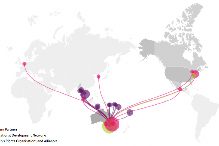
Looking for what data visualization can do for your website? Check out this live example of an interactive map developed for International Women's Development Agency.

With an interactive map now live on their website, Rewilding Australia has increased the amount of interactive media on its site tenfold. Check out the cartographic experience.
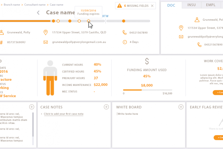
Our client engaged Datalabs to design a best-in-class dashboard and user interface for their frontline staff’s main workstation. Check out the infographic look in this data visualization case study.

The Datalabs Agency was commissioned to turn the list of the University of Melbourne’s partners and connections around the world into an interactive map that would sit on the home page of their site.
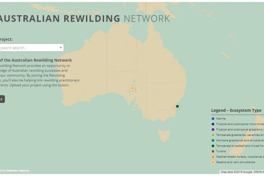
Mapping Intelligence: Helping Wildlife in Australia About the Rewilding Mapping Project The interactive map is designed with d3 and Google Maps Showcases the current projects the organization is working on
Three Interactive Data Maps Data-driven, Interactive & Animated If you’ve ever spoken to onto the DL team about a project there’s a fair chance we’ve tried to get a map
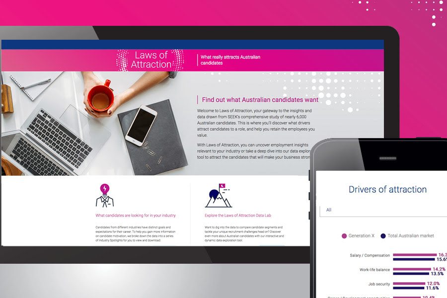
SEEK Laws of Attraction Find out what Australian candidates really want What attracts people to apply for a job or work for a company has changed. Where salary and job