


Your Guide to Marketing Conferences in 2018 It’s going to be a big year…
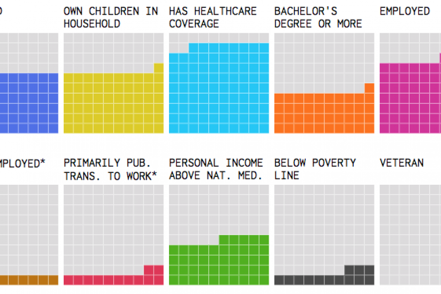
Our Top 5 Interactive Visualizations Want to be inspired? Here are the best interactive data visualizations we have ever seen… Humans are visual creatures. We respond to visual data better

The Importance of Color in Data Design Let’s talk about color. How important are colors in data visualisation design? A science and art unto itself, colors play a major part
Ever wish you could hire just one person for all your topiary, robotics, sculpture, and projection art needs? Yea, we had the same wish. 🙂

The Art of Photography and The Science of Data Visualization In design, it is always good to be visual. “Our brain processes images 60,000 times faster than reading text.” –
The Use of Hierarchy in Data Visualization A Good Design is More Than Creative, It Has to be Strategic. An experienced designer should have a decent understanding of the human
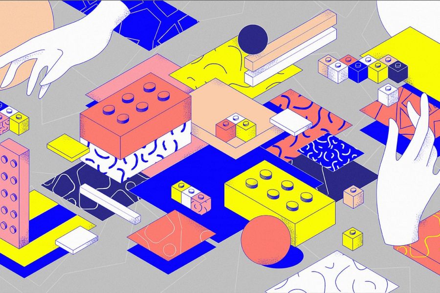
Vectors Graphics are Obviously Superior for Illustrated Campaigns (Compared to pixels) Here is why. When creating illustrations for campaigns, there are several points to be considered in terms of what

Tableau Launches Four New Exciting Features If you haven’t figured it out, we are OBSESSED with data visualization, dashboarding, and data discovery. One of our favorite BI tools, Tableau, recently

Five Common Mistakes People Make in Data Visualization The best way to learn is to make mistakes. That still rings true in terms of designing data visualization. Even the most
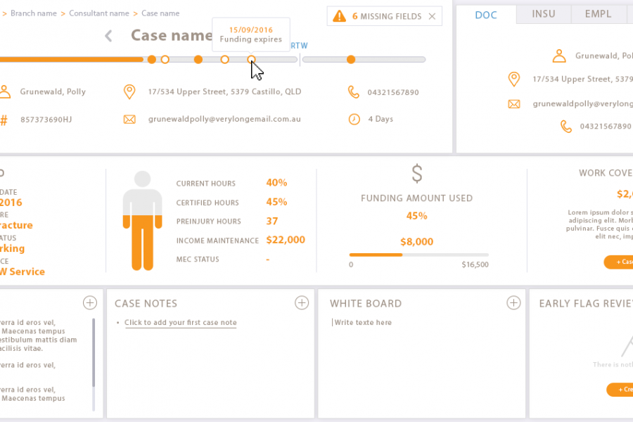
Our client engaged Datalabs to design a best-in-class dashboard and user interface for their frontline staff’s main workstation. Check out the infographic look in this data visualization case study.
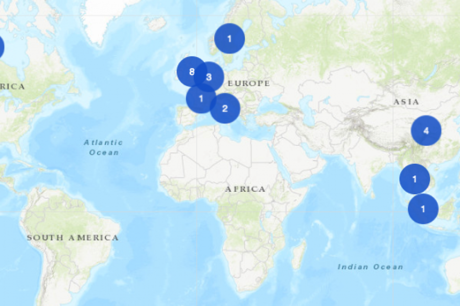
The Datalabs Agency was commissioned to turn the list of the University of Melbourne’s partners and connections around the world into an interactive map that would sit on the home page of their site.
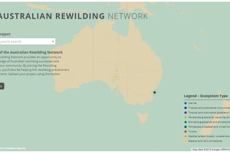
Mapping Intelligence: Helping Wildlife in Australia About the Rewilding Mapping Project The interactive map is designed with d3 and Google Maps Showcases the current projects the organization is working on