


The Use of Hierarchy in Data Visualization
A Good Design is More Than Creative, It Has to be Strategic.
An experienced designer should have a decent understanding of the human eyes’ natural tendencies. Rather than seeing blocks of data, the eye generally sees information in a visual way. This is why as kids, the first books we read would contain more pictures and words with a large print. Other types of books such as comics are heavier in images rather than texts; visuals taking centre stage in telling sequence of events, and texts only serve as an accompaniment. This results in content that is easy-to-read and faster to digest for the human brain.
In short, content must be organized based on priority, or put in a “hierarchy” from highest priority to lowest. Designers must have a keen eye on organising content, with the aim of directing viewers’ eyes so that information of the utmost priority is seen first. So how do we do that exactly?
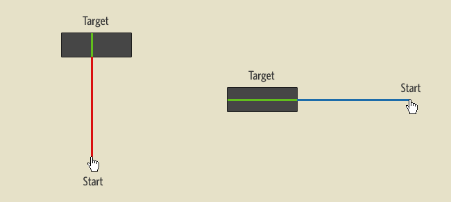
Hierarchy Patterns
When presented a fresh page, there are two common patterns in which the human eye will scan and read the page — the Z pattern and the F pattern.
When to use which?
- Z pattern is most commonly used when there is a low level of text content. Users would scan the page from top left to top right, glances down through the content, moving to the bottom left to the bottom right. To maximise the use of this pattern, the designer can place the most important content within the “Z” shape.
- F pattern is usually utilised for text-heavy content or video content. Users would begin scanning the page from top left to top right, then keep going down from left side to the right side of the page, over and over again, looking for visual elements that would help them understand the written content. This pattern continues until they reach the bottom of the page, creating a heat map that looks like the letter “F”.
Hierarchy Principles
Regardless of which pattern you go for, it is important to know what and how to emphasise the elements that are on top of the hierarchy list. In design, especially data visualisation, all aspects cannot be emphasised. In order for an element to stand out, others must fade into the background. Subtleties such as what size, colours, shapes, or what information to include and — perhaps more importantly — exclude, affects the hierarchy of design.
Let’s break it down, shall we?
1. Size
Just like a newspaper headline, the larger the element, the more it will attract attention. The more attention it attracts, the more viewers will interact with it because it’s the first thing they see.
In web design, Fitts’s Law states that bigger-sized objects are easier to engage with because less effort is required from users to click on them. In regards to text and typography, Smashing Magazine calculates some average sizes appropriate for headings and body copy:
- Heading → 18-29 pixels
- Body copy → 12-14 pixels
2. Colour
As we have explained thoroughly in this blog post, different colours have different psychological links to them that affect viewers’ perception of the objects. Bright colours are naturally more attention-grabbing, followed by rich darker colours and lighter tints. Muted, subdued colours lay at the bottom of the colour hierarchy.
3. Layout and alignment
Layout and alignment play a major key in visually telling users what is most important. For example, having a body of text and a sidebar next to it will lead users’ eyes through the text, then the sidebar as follow-up CTA (this is especially true in web design). Objects placed at the top or smackdab in the middle also tend to garner most attention at first glance.
4. Repetition
Repeating styles tells viewers that the content is a unit. For instance, this blog post is written in a cohesive style. Say, we disrupt the organised layout and use red text on this paragraph, it would break the repetition and instantly draw attention on the element that is different — that is, the red text. Another example is the use of hyperlinks. Links are usually underlined, and you know right away that it is clickable.
5. Proximity/spacing
The placement of design elements tells users how likely they are to be related. For instance, this list has a header/title, and each of the points is separated by a row of whitespace. This proximity or distance shows those list items are separate but are not unrelated to each other.
6. Texture and style
Using various styles and textures can help visually diversify content hierarchy. Using different fonts in a project, or textured backgrounds that juxtapose each other can lead users’ eyes to the most dominant of the elements.
7. Contrast
Contrast refers to the value difference between colours. The starkest contrast you could do between two colours is black and white. Strong contrast can emphasise important elements, while weak contrast will make elements blend together. Strong contrast might be eye-catching and needed to determine hierarchy, but in turn, weak contrast is less confronting, often utilised by designers to create a more harmonious design that users may want to look at longer.
___
Relatively an undervalued aspect of design, hierarchy is an important tool if you are looking to deliver key information to viewers upon first glance. Remember, a good design requires not only creativity but also the strategy behind it.