


Do You Know What Your Digital Marketing System Looks Like?
(Like, physically, looks like?)
Imagine a Network of Veins, Valves, and Organs
— all labeled for clarity, informing everyone who works in your marketing team what things are and how much is flowing through the system.
A digital marketing system is very much like the body’s circulatory system. It exists. It’s tangible. And it’s quite complex. So how many modern marketers really know what their marketing system looks like?
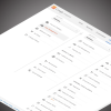
Most companies report on their marketing efforts with Excel spreadsheets, PDFs, and the occasional dashboard. Fields of numbers and pie charts are usually the visual vocabulary used to show what’s happening.
Lead generation marketing might use a funnel diagram to communicate quantity and the stage of the lead’s engagement. Marketing automation software might add a ‘score’ metric — a simple, arbitrary number — for where a potential client or customer is in their journey with your company.
However, these pie charts, funnels, and automated scores are often siloed, kept in different reports, accessed by different marketers; and even when all the reports are shown next to each other, these visual metrics don’t communicate much more than they did individually. You’re still only looking at several pieces of the puzzle.
But Here’s Where Data Visualization Can Help
…and more specifically where data visualization of your digital marketing system could solve big problems, increase your return-on-marketing-investment and communicate your team’s successes and challenges to your Chief Marketing Officer and other executives.
A marketing system visualization for your company could be designed in a number of ways, but let’s stay with the metaphor of the body’s circulatory system for now. Google Analytics lists 7 channels right out of the box: Organic Search, Referral, Direct [Traffic], Email, Social, Generic Paid Search, and Display. These channels, or veins, have data flowing through them: the number of visitors arriving at your website or mobile application. These visitors then find their way through your sitemap, moving through pages like blood cells through capillaries. Then they leave.
But … Have they purchased a product or service from you? Have they left your site content or frustrated? What content did they consume? How do these channels compare with one another?
These Questions (and More) Can Be Answered Visualizing Your Marketing System.
With all your marketing data consolidated in one place, the possibilities for developing more targeted visualizations that answer specific questions are multiplied.
And what’s more: all these answers can be visually designed to sit alongside the history of your visitors’ actions. Not separated in a PDF or spreadsheet. Cause and effect can appear in tandem, putting key insights right in front of you, in a simple and intuitive format.
Data from each channel can be effectively displayed in a single visual, rather than require manual comparison from separate reports that were likely built in different formats. Marketers no longer need to dig so deep to get the insights they need – they instantly see the big picture.
… Which they can then share with their executives. Think of the efficiency in solving some of modern-day marketing’s big problems: communicating the right information to the right stakeholders – and making sure they can comprehend it (after all, not everyone is trained in marketing analysis). Imagine having one visual to present to C-Suite executives, showing where the marketing effort is going; one diagram that shows gaps in technology and reporting, a diagram that can slot straight into a business case asking for more funding or resources, and one overall roadmap of your marketing system that brings everyone in your team onto the same page. Finally, everyone involved in your marketing efforts can visually recognize the trends, insights – and, most importantly, the relationships between these – that a few tables from three different reports couldn’t quite get across.
A Picture Speaks a Thousand Words, Right?
Get your team and stakeholders on board and uncover the insights that individual spreadsheets and charts can’t grasp. Communicate and understand your data as a whole – and make better marketing decisions because of it.
Gathering all your data in one place is an effort in itself. Understanding what that data is telling you is the next step. What better way to understand the insights in your marketing data than to actually see it.
And once you see what your marketing system looks like, you’ll wonder how you ever marketed without it.
Ready to find out what your marketing system really looks like?
Get in touch with us directly by emailing hello@datalabsagency.com
or by clicking the Contact Us link in the navigation.