


We’ve curated a list of gold-standard interactive data visualizations which we hope will inspire you to try it for yourself. May your data never be boring.

What Is The Business Case for Infographics? How You Prove The Value In Better Communication, Information Design & Reporting Your business has data and information. And your business needs to
Brand Guidelines for Data: The Data Visualization Format of the Year (First Place) Formatting All Data Visualization with Best Practice Principles In 2023, the visual branding of data has only
The Key to Data Storytelling: Creating Captivating Dashboards & Infographics “Those who tell stories rule society.” – Plato In the past, the role of a data scientist or analyst is simple

Animation & Motion Graphics are Great for Conveying Insights & Complex Ideas How can such complex, abstract, and intangible information be conveyed in an easy-to-understand and interesting manner? The answer:

SEEK Laws of Attraction Find out what Australian candidates really want What attracts people to apply for a job or work for a company has changed. Where salary and job

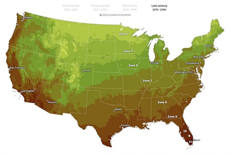
Data Stories & Map Design A look at how maps can help tell your data story Humans have used maps to share information about the world around us for over

What Makes A Great Year in Review? A list of our most favorite digital annual report content elements for 2017 Almost everyone produces a Year-In-Review and most of those still
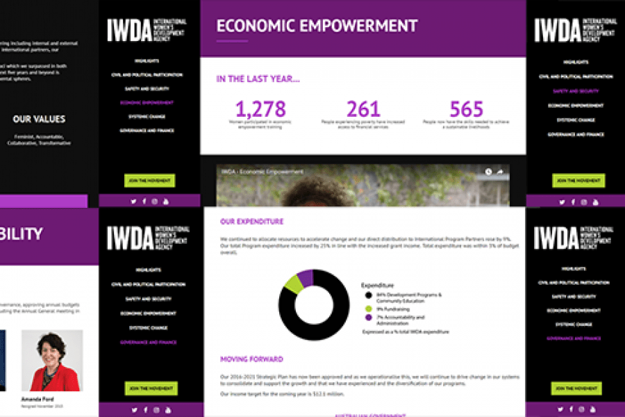
Considering going digital with your annual report? Do it! Here's an example of what interactivity and a non-profit organization's 'year in numbers' looked like after they ditched paper and went digital.

Examples of Digital Annual Reports That Don’t Suck A handful of forward-thinking companies and non-profits have begun to turn the routine production of a digital annual report into an opportunity