

Xero Infographic Report Designed by Datalabs
At Datalabs, we create data visualisations for a range of clients and business types.
We love what we do, but we can’t help but get even more excited for clients whose software or products make Datalabs possible!
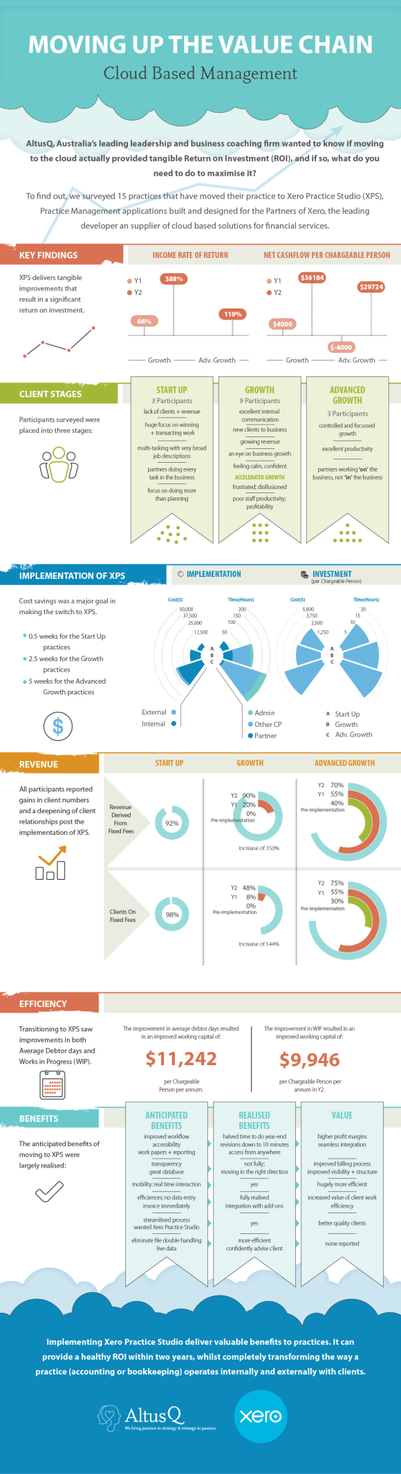
Recently, we had the honour of completing designs for Xero and Altus Q’s. They asked us to develop an infographic, using their aggregated data on the implementation of cloud-based management, and how it affected businesses return on investment (ROI).
Beautiful accounting makes for beautiful infographic reports. And this one is a beauty!
Our Premium Infographic Design Package was chosen to complete the project.
This generally includes:
- 6 – 9 data modules
- Icon-driven content
- Choice of JPEG or PDF format
The design reflects the brand identity of Altus Q and Xero, utilising their colours and iconography in the charts shape and shades. The purpose of the infographic required a clear comparison in ROI. Therefore comparative pie charts and tables were employed.
The audience of the infographic were businesses that are considering the move to cloud-based management. In this infographic example, they employed data from well-known accounting software company, Xero services. Xero has an excellent reputation for high-quality services, for the best financial outcomes. The language of the infographic is of a generally simple standard but requires a business level understanding of financial terms.
This high-resolution infographic has been spread through Altus Q and Xero media channels, via print or digital. The engaging format will draw potential client leads, as it is easy to use and engages directly with the target audience needs.
If you would like to develop a similar project, or perhaps can see elsewhere how your business could benefit from data visualisation – give Datalabs a call today!