hello@datalabsagency.com
logo
Datalabs Agency
En
  • De
  • Ar
0
logo
  • Data Training
    • Our Six Main Workshops
      • Introduction to Data Visualization: Tools & Techniques Workshop
      • Designing Great Business Dashboards Workshop
      • Infographics & Report Design Workshop
      • Creative Data Presentations with PowerPoint
      • Visual Storytelling for Government Workshop
      • Creative Power BI Dashboard Design
    • Online Courses
      • An Introduction to Data Visualization & Storytelling
      • Designing Great Dashboards
  • Data Design
    • Style Guides
      • Power BI Style Guides
      • Tableau Style Guides
    • Animated Data Videos
    • Maps & Cartography
    • Interactive Infographics
    • Power BI Dashboards Designs
    • Tableau Dashboards Designs
    • Infographic Reports
    • Interactive Data Visualizations
    • Digital Annual Reports & Microsites
  • Case Studies
  • Shop
    • Ecommerce Products
      • Power BI Templates
      • Power BI Theme and Style Guide
      • An Introduction to Data Visualization and Storytelling Course
      • Designing Great Dashboards Course
      • Data Visualization Consultant
  • Login
  • Contact
    • About
      • Otto Ottinger
      • Blog
Data Visulization Conferences 2016 0
Data Visualization Conferences 2016
27 November 2015
Data Visualisation Dashboard 0
Dashboard Examples
17 December 2015
Articles
More Common Types Of Data Visualization
December 9, 2015 by Datalabs in Articles

8 More Common Types of Data Visualization

Following up on our previous list of 15 Types of Data Visualization, which you can find here, we’ve come up with 8 more types of visualizations that we love and use in our work. This new list has examples of traditional ‘data visualizations’ and some that are more visual storytelling, UX, or design orientated. Either way, we think there are some cool and useful examples of data visualization here.

Gantt Chart

Gantt Chart
Gantt Chart

The go-to data visualization tool for project management for over 100 years (seriously…), the Gantt Chart uses a horizontal bar chart to track tasks of events within a schedule or timeline, with start and end times as linear events.
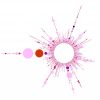
Word Cloud

Word Cloud

Uses size and prominence to visualize the most used word/s in a group. Great for those looking to find patterns quickly within text or keyword research for your digital marketing.

Bubble Cloud/Chart

Bubble Chart Example
Bubble Chart

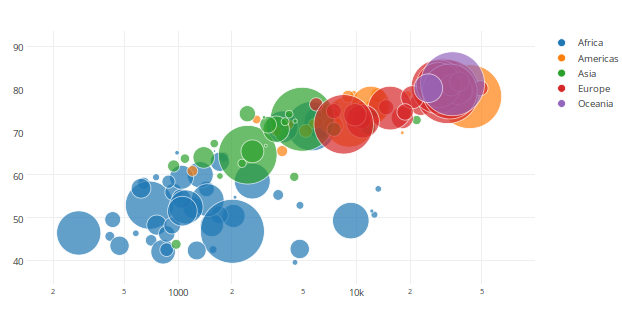
Is a type of chart developed to display data by location on an axis and add a third variable in the size of the bubble, similar to a scatter chart. The difference being the size of the bubble also determines a value.  Also, just saying the bubble cloud seems to make people happy.

Radar/Spider Chart

Radial/Spider Chart
Radial Chart

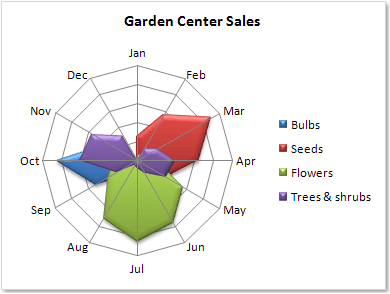
Used to plot values along with a series of separate axes, starting at the center and working outwards to represent relative value. Usually, it’s used when more than five values need representations and visualization within one chart.  Often used for sports statistics, budgets.

Customer Journey Map

Customer Journey Map Example
Customer Journey Map

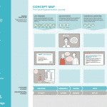
Bridging the gap between data visualization, user experience, and design. It can be data-driven, either quantitatively or qualitatively but more often blends the two with examples of real customer experience and storytelling. Its design can be a temporal graph with an x/y axis or take a more ‘story’ led design with the use of flowcharts, storyboards, or blueprints.

Area Chart

Area Chart Example
Area Chart

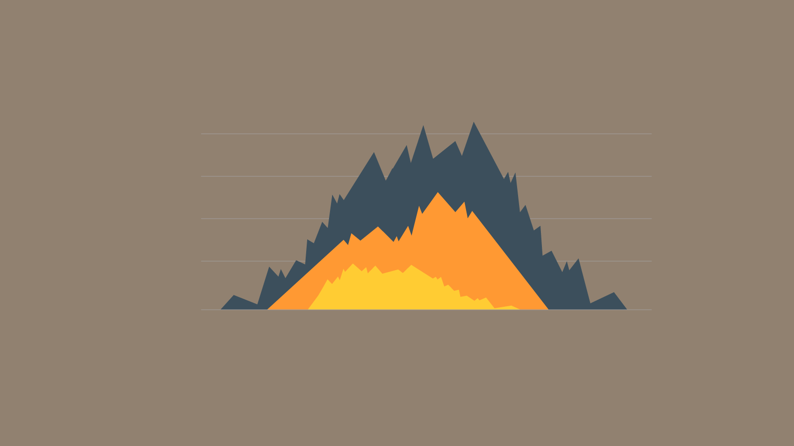
Similar to a line chart, it allows you to represent more than one value on a line while the transparent shading and colors allow you to see the other data lines, allowing for easier comparison between data, as all values are visible.

Sankey Diagram

Sankey Diagram Example
Sankey Diagram

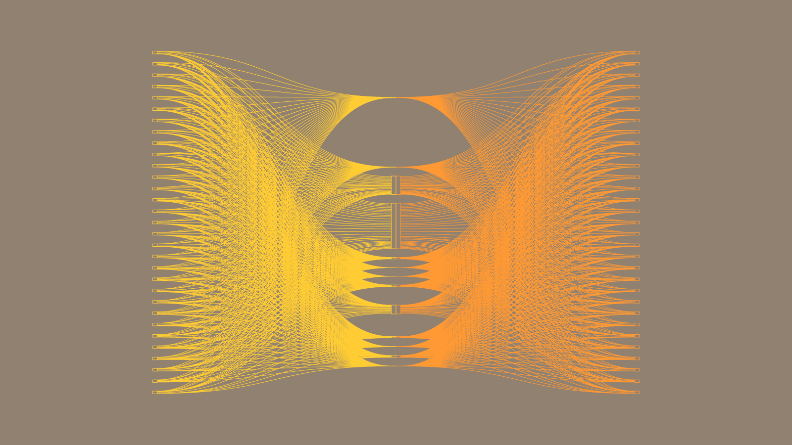
is a type of flow chart that uses arrows to proportionally show a flow and quantity. It’s used to visualize flow/s within a system – think energy flow within an engine.

Venn Diagram

Type of Data Visualization: A Venn Diagram
Venn Diagram

Shows a logical relationship between different ideas or data sets. The circles are used to represent ideas or data and the convergence of the circles represents the crossover or similarities of the idea or data.

Thanks for reading, if you liked this one feel free to sign up to our newsletter below for updates on our blog and thing that we think you might like. Not that we wouldn’t mind if you share it on social media too.

0 Comments
  • chart types
  • data visualization
  • tips and tricks
8 Like!
Share
Datalabs

Data Visualization Training: Workshops & Courses

Shop Online for Data Visualization

  • Image of a man using our Power BI templates to design a report
    Power BI Templates
    Select options
  • Image of our custom Power BI Theme on a computer
    Power BI Theme and Style Guide
    Select options
  • An Introduction to Data Visualization and Storytelling Course
    An Introduction to Data Visualization and Storytelling Course
    Add to cart
  • Photo of a data visualization consultant advising clients and helping solve design issues.
    Data Visualization Consultant
    Buy product
  • Designing Great Dashboards Course
    Designing Great Dashboards Course
    Add to cart

Style Guides for Data?

A photo of our data viz style guide for Microsoft Power BI

Data Visualization & Storytelling Group Workshops

Contact Us

  • This field is for validation purposes and should be left unchanged.

From Our Blog

  • 8 Incredible Examples of Interactive Data Visualization
  • Data Analytics Conferences 2024 & 2025
  • Data Visualization & Design Conferences 2024 & 2025
  • Case-study: Intranet Dashboard Design for Nestlé
  • Dashboard Tips: 3 Alternatives To Using A Data Table
  • Data Visualization Training
  • Brand Guidelines for Data
  • Online Courses & Products
© 2024 Data Arts Pty Ltd
logo

We noticed you're visiting from United Kingdom (UK). We've updated our prices to Pound sterling for your shopping convenience. Use United States (US) dollar instead. Dismiss