Excel Data Visualization Artwork Project.
Creating beautiful, artistic work exclusively in Excel.
We were tasked by a digital agency to create something different for their client, using only the Microsoft product suite (particularly Excel and Powerpoint). The final product needed to be unique, engaging, 3D, and entirely different from what you might expect to create with Microsoft.
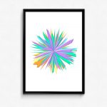
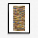
The brief was open to using a data visualization framework, as Excel is a common tool in the field, but needed to break away from the standard of ordinary usage of charts, filters, colours and design, The images are data-driven – they are real Excel charts, but layered and overlaid to them look unlike something produced by Excel.
How We Made Them
We used only the standard charts available in excel, creating huge data sets that allowed us to be able to change the traditional look and feel of the chart – breaking or deconstructing it. In some of the examples, you can see the elements of a basic Excel chart (pie, line, bar, bubble, etc), but they have been manipulated into beautiful forms. Using excel in this way is exciting, and we are absolutely excited about it!
The final delivery was done in Excel, which could be then exported into Powerpoint.


