

To design for specific dashboard users and audiences, you need a process. The Datalabs Agency uses a 12-step process to design its dashboards. 12 sequential steps or tasks that we teach in our “Designing Great Dashboards” course. In the course, we touch on each task individually. Some tasks in the process you’ll use every time you design a dashboard. Others you may do instinctively. Some you may not use at all. It’s up to you.
Define Your Dashboard Audience
The first task in our dashboard design process is defining your audience. This is a task we would describe as a soft art. It’s about empathy and understanding at a good foundational level, what the end-user of your dashboards needs to understand, how they think, and maybe what pressures they’re under. You don’t always get access to these end users — they might be a CEO or a vice president or your boss’s boss.
But before you do anything, here are a couple of questions to think about. These are some of my favorite questions to ask dashboard users.
- How long will they look at your dashboard?
- What is important to them?
- What’s interesting or exciting to them?
- What decisions will they make from your dashboard?
- How will they feel about the insights that are in your dashboard?
- What action will they take after using your dashboard?
This list will help you get a better perspective or profile on your audience. (This and other materials are available as a download in this course.)
So think deeply about what your audience cares about and tick the boxes where appropriate. Pretty simple, but you’d be surprised at how often the step is skipped.
These eight attributes describing your audience shouldn’t be the be-all and end-all. Stay curious. Ask more questions about your audience. Gather other influences on how to develop audience profiles. The best insights about a person I found have come from casual interviews. Understanding the context and maybe the ability to ask follow-up questions makes life as a data visualizer so much easier and makes the resulting dashboards so much better.
Dashboard Users and Their Seniority
Let’s look at one of the attributes of the dashboard audience. So let’s look at seniority. For simplicity’s sake, we’ve reduced seniority to three levels: low, medium, and high.

And from a data visualization perspective, and from our own experience, the seniority of your audience will impact the design choices you’ll make down the line. The higher up the food chain you go, the more important it is to get a good sense of the true insights that need to be shown.
Now, what does your audience do? Maybe it’s their job title. Maybe it’s a description of their function in the organization. In this image (below), we plotted seniority using the audience column and listed their title or function. And in the last column, we’re plotting time. You see, we’re tying the seniority of our audience to how long they can spend looking at your work.
Great dashboard design isn’t about you and what you want to show. It’s about them. Your audience. They are surely time-poor, especially up at the top — those busy senior executives, the CEO, or maybe even the Queen of England.
Other Attributes of Dashboard Users
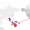
What division is your audience in? Apart from the difference in layouts and metrics across different divisions, consider the brand elements of a division dashboard: colors, icons, and titles must be considered to differentiate it from other dashboards.
Now, are you designing for an individual or a group individual? For an individual’s dashboard, we’d suggest interviewing them to assist you in tailoring the dashboard specifically to their needs. If it is a group that you are designing for, identify the most common needs among the group. This takes discipline. Everyone cannot have everything in the dashboard. This is a common challenge in designing dashboards for large groups of stakeholders. We’d suggest working out the commonalities in requirements and the similar questions your stakeholders want answered. This will assist in forming what goes in and what doesn’t.
Is your audience familiar or unfamiliar with the dashboard subject? Visualizing data for an unfamiliar audience can include longer, more descriptive titles, popup boxes, links to further information, simple charts, and high-level overview insights. If your audience is familiar with your dashboard’s data, you can possibly use shorter titles and more complex charts.
A deep-level analysis used by an analyst familiar with the data can include, dare we say it, a dreaded table of data.
Dashboard Users: Internal or External Audience?
What would be the differences between an internal and an external dashboard?
With an internal dashboard, staff might already know the company terms and the point of the dashboard. In an external dashboard, however, you need to be more descriptive with titles and clearer with charts, meaning not to use very complex charts, but more simple charts with fewer metrics. With an external public-facing dashboard, you must be even more clear. Think of adding information boxes, and extra tooltips. Also, avoid using jargon or acronyms.
Another question we like to ask: Is your audience familiar with dashboard functionality?
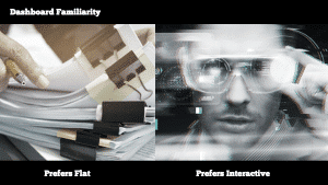
If they are used to and prefer flat reporting, let’s say they’re used to viewing information with, say, PowerPoint and print reports. If that’s the case, don’t have a complicated dashboard with too many filters and interactions.
For busy audiences that are unfamiliar with dashboard software, say Power BI or Tableau, instead of allowing the user to drill into other supportive dashboards, your more simple dashboard could instead provide contact details for other staff to assist if they prefer. However, do keep in mind: that you’re not designing an infographic. Dashboards should be interactive. Interactive dashboards have more ability to have filters to slice and dice the data. They can tell the most stories. Use the format of BI dashboards for all they’re worth and resist ‘dumbing down’ interactivity for the sake of one or two stakeholders who resist learning anything new.
Is Your Dashboard Audience Quick-glancing or Long-lingering?
Another question we often ask clients: How much time does your audience spend on your dashboard? Is it a quick glance? Are they just monitoring data over a cup of coffee in the morning? If it’s only a minute or so, that forces the dashboard to have fewer charts and to really highlight insights using large numbers and indicators. Focus on showing the user if the data says that they’re on track or becoming a problem. (Later in the “Designing Great Dashboards” course, we focus on effectively using color for quick-glance users.) If your dashboard audience is expecting a lengthy analysis, give them what they want — more data to analyze. Perhaps through charts like scatter plots and dare I say again, sortable tables.
Next question: Is your audience only passively looking at your dashboard, perhaps receiving access to your dashboard via email? Or are they actively seeking your dashboard out?
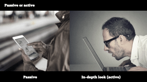
If your audience will approach your dashboard passively, think of designing a dashboard to show alerts. Are we on track or are we not? You as a designer need to set it up to present the insights to the users and not have them search too hard for themselves. If it’s an in-depth look and your dashboard user is actively seeking this dashboard out, set it up for the user to find the insights themselves and allow them to action them easily. Also, have the dashboard change frequently by constantly having the data updated.
Think of Your Dashboard Users First
In summary, a great place to start with any dashboard design is to think of your audience and their needs first. So now it’s time for you to give it a try with your next dashboard design. Take a good look at our audience checklist and of course, sign up for our “Designing Great Dashboards” course to really learn best practice design skills.
See our online dashboard course...
Learn to Create Dashboards
The majority of mistakes analysts and business intelligence developers make are “pre-tool”. That is: the mistakes and errors in judgement happen before anyone opens up Power BI or Tableau. Get the online course training that shows you the Datalabs Agency method for designing creative dashboards. No software required!