


From the dreaded pie chart to the often-misunderstood Sankey diagram, we'll geek out on more data viz guidance, updating this list of categories and types. So bookmark this page and sign up for our data visualization newsletter to keep your data design brain well fed.
10 Data Viz Guys & Gals to Follow on Instagram Want constant #inspo on your #insta? Follow these awesome data visualizers to keep you motivated. 1. Mona Chalabi Mona Chalabi

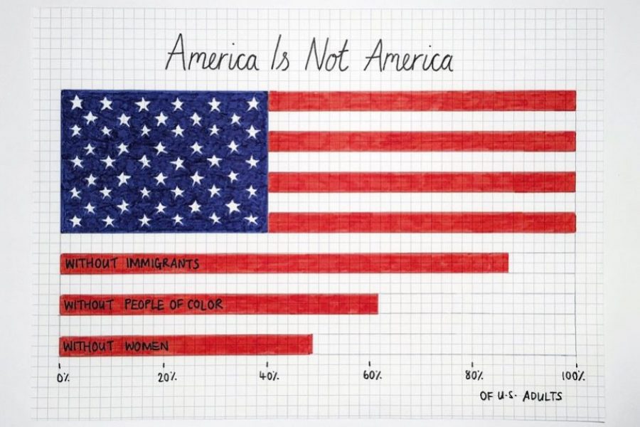
There are some tricks to making your data viz understandable and memorable, that is, by using repetition, alignment, and symmetry to your advantage.
See 3 great tips for designing dashboards. Learn the strategic approach to visualizing your data through dashboard systems designed for humans.
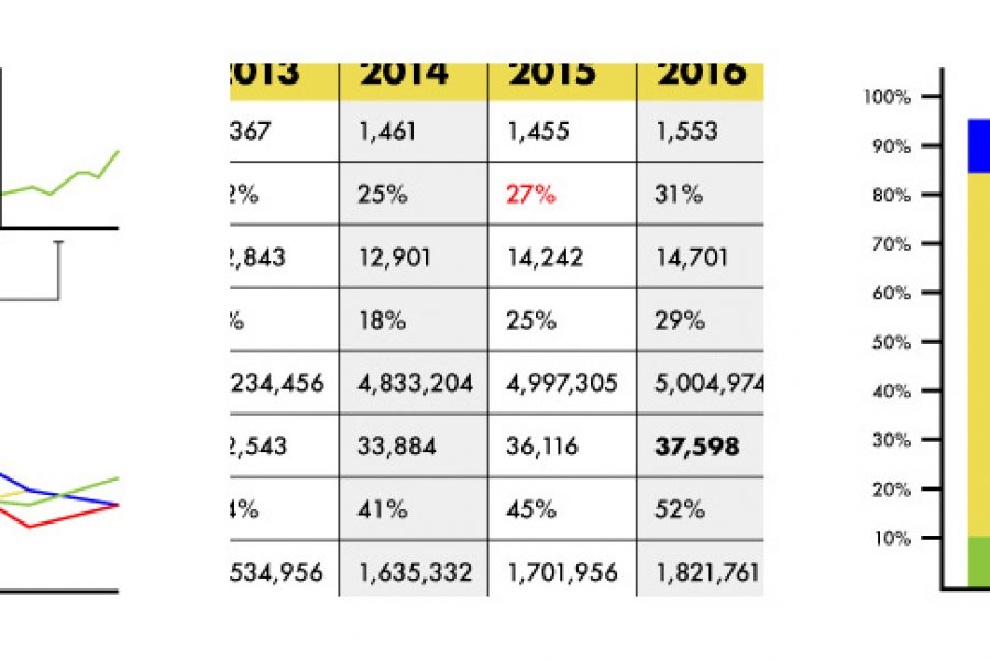
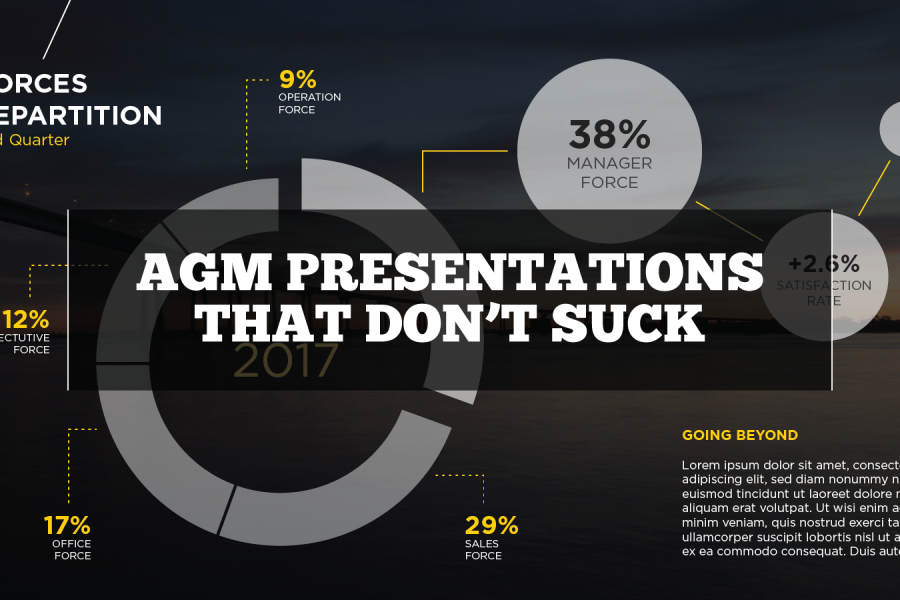
Stop using tables in your reporting. Seriously, there are better ways to visualize data. Here are three: »

The Use of Repetition, Alignment, & Symmetry in Data Visualization Design shows in clear examples how these design principles can be use in data viz and infographics. Learn something new.

See the 2024/2025 guide to the best data visualization conferences in North America, Australia, Asia, and Europe. Use this year's conference guide as a travel planner. So get out, travel, meet new people, and learn more about what makes data visualization such a creative and interesting area to work in.

The Data Analytics Conferences Guide 2024/2025 is your one-stop shop for conferences you actually want to go to. These are great conferences in cool cities.

We’ve curated a list of gold-standard interactive data visualizations which we hope will inspire you to try it for yourself. May your data never be boring.
Looking for a freelance infographic designer to hire? See our work here at Datalabs. About the Infographic Designer role: Our Infographic Designers are the agency’s creative visualisers and graphic designers,