


How to Tell a Story With Data Visualization Ideas and examples you can use in your organization to create a data-driven narrative The idea of collecting and storing massive amounts

What is a microsite & what are they used for? A look at what makes a good microsite, how they differ to a website & some great examples. In previous
Data Visualization and the Big Three Strategy Consulting and Big Four Accounting Firms How does a creative data visualization and visual analytics agency get along with the ‘suits’? Combing through

Telling Stories With Data: From Simplification to Persuasion and Reporting. The Most Common Questions From Our Data Visualization Workshops. We can run our Data Visualization Workshops anywhere in the world,
Case Study: A Long Infographic Report Design We recreated a long research report with an infographic style, using charts and graphs to convey the data they’d collected, over the period

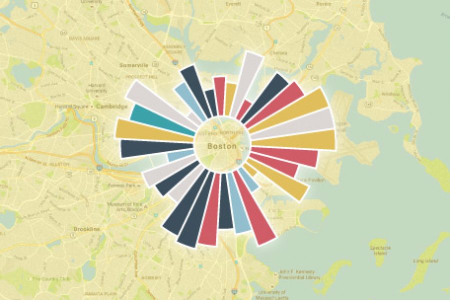
Excel Data Visualization Artwork Project. Creating beautiful, artistic work exclusively in Excel. We were tasked by a digital agency to create something different for their client, using only the Microsoft product
Empowering Employees to Make Better Decisions Through Visual Analytics. “Seeing is believing, but sometimes the most real things in the world are the things we can’t see”, – The Polar

See Tableau dashboards examples in the wild. We've tracked down the best example of dashboard design done in Tableau. Get inspired.
8 More Common Types of Data Visualization Following up on our previous list of 15 Types of Data Visualization, which you can find here, we’ve come up with 8 more
What Makes for Great Data Visualization and Why? Data visualization can be a powerful way to communicate. When done right, it delivers information with both the weight of respected research,
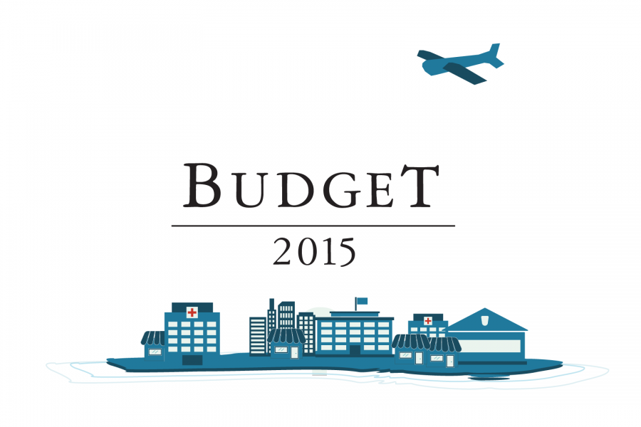
Datalabs is proud to show our work with the Federal Department of the Treasury for the 2015 Budget. Datalabs was hired in April to animate three videos, visualising the overview
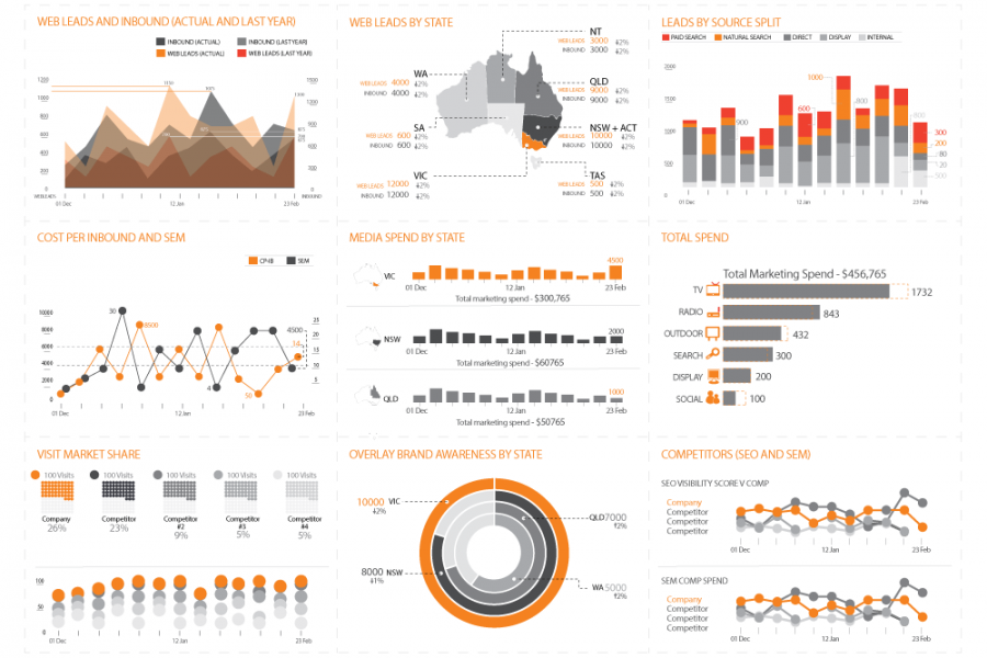
With Datalabs’ help, at a Chief Marketing Officer’s level, reporting is now a unified dashboard — simple and insightful. An online healthcare and insurance company came to Datalabs with a