

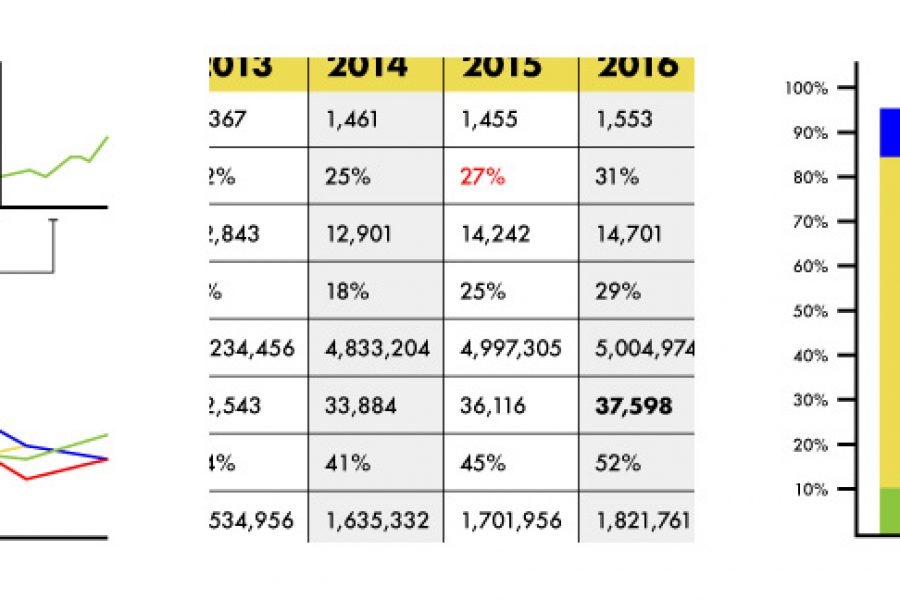
Stop using tables in your reporting. Seriously, there are better ways to visualize data. Here are three: »

Data Visualization Websites — 101 of the Best Resources Ideas, inspiration blogs, people, tools, and more! We’ve searched and searched to bring you 101 data visualization websites that showcase the

There are some tricks to making your data viz understandable and memorable, that is, by using repetition, alignment, and symmetry to your advantage.

The Use of Repetition, Alignment, & Symmetry in Data Visualization Design shows in clear examples how these design principles can be use in data viz and infographics. Learn something new.
Brand Guidelines for Data: The Data Visualization Format of the Year (First Place) Formatting All Data Visualization with Best Practice Principles In 2023, the visual branding of data has only

The Use of Hierarchy in Data Visualization A Good Design is More Than Creative, It Has to be Strategic. An experienced designer should have a decent understanding of the human

Vectors Graphics are Obviously Superior for Illustrated Campaigns (Compared to pixels) Here is why. When creating illustrations for campaigns, there are several points to be considered in terms of what
What Makes for Great Data Visualization and Why? Data visualization can be a powerful way to communicate. When done right, it delivers information with both the weight of respected research,