

The Department of Education and Training needed a clean and simple user interface to assist in the communications strategy for the Australian Government’s New Child Care Package. This interactive tool was a hit with parent's in need of some numbers.
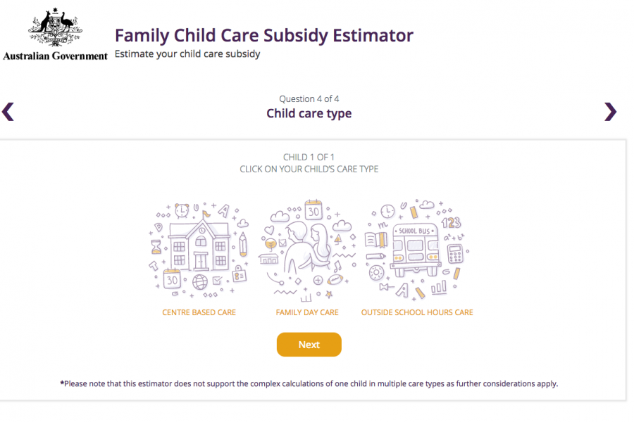
احتاجت وزارة التعليم والتدريب إلى واجهة مستخدم نظيفة وبسيطة للمساعدة في استراتيجية الاتصالات الخاصة بحزمة رعاية الطفل الجديدة للحكومة الأسترالية. حققت هذه الأداة التفاعلية نجاحًا كبيرًا مع الآباء الذين يحتاجون إلى بعض الأرقام.
Das Ministerium für Bildung und Ausbildung benötigte eine saubere und einfache Benutzeroberfläche zur Unterstützung der Kommunikationsstrategie für das neue Kinderbetreuungspaket der australischen Regierung. Dieses interaktive Tool war ein Hit bei den Eltern, die ein paar Zahlen brauchten.
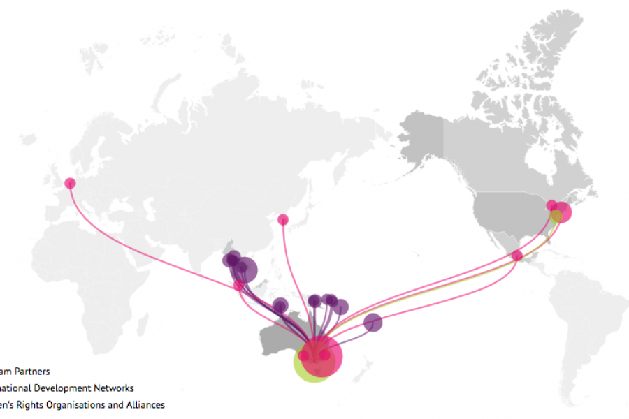
Looking for what data visualization can do for your website? Check out this live example of an interactive map developed for International Women's Development Agency.
هل تبحث عن ما يمكن أن يفعله تصور البيانات لموقعك على الويب؟ تحقق من هذا المثال الحي لخريطة تفاعلية تم تطويرها للوكالة الدولية لتنمية المرأة.
Sie möchten wissen, was die Datenvisualisierung für Ihre Website leisten kann? Sehen Sie sich dieses Live-Beispiel einer interaktiven Karte an, die für die International Women's Development Agency entwickelt wurde.
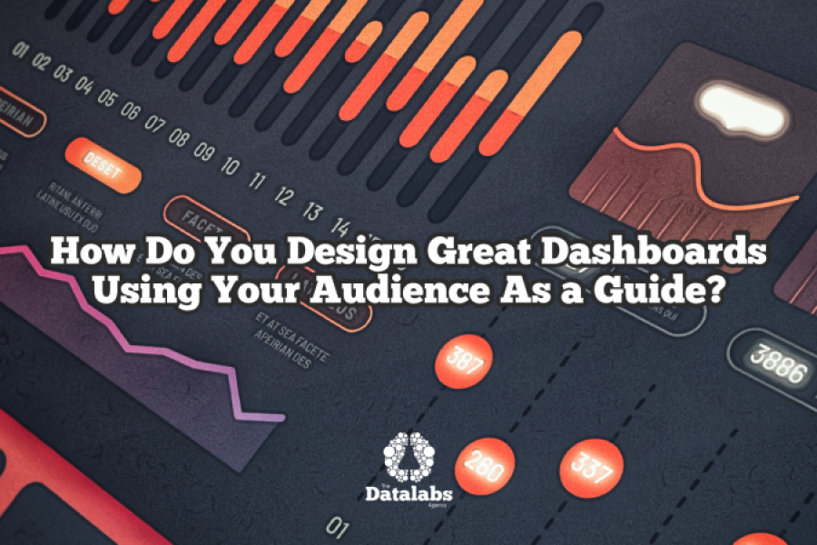
To design for specific dashboard users and audiences, you need a process. The Datalabs Agency uses a 12-step process to design its dashboards. 12 sequential steps or tasks that
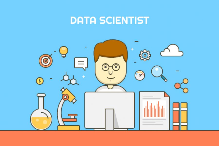
How Do Professional Data Visualizers Design Business Intelligence Dashboards? Most professionals aren’t trained data visualizers. You might be a business analyst, data scientist, or an expert in another field who

All chief executives have one thing in common – they need more TIME. There never seems to be enough hours in a day! Between meetings, conference calls, replying to emails

What is Explainable Artificial Intelligence (XAI)? A New Design Frontier in Machine Learning As smart algorithms, artificial intelligence and machine learning applications are finding its way into our daily lives,
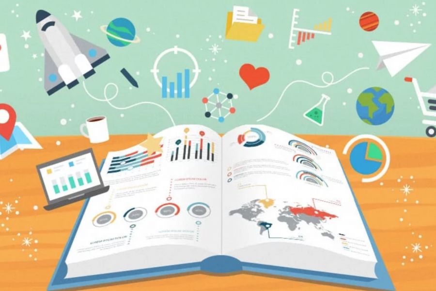
The Key to Data Storytelling: Creating Captivating Dashboards & Infographics “Those who tell stories rule society.” – Plato In the past, the role of a data scientist or analyst is simple
Design Thinking Meets Data Science The term “Big Data” has gained lots of attention in recent years. Want to know what the sexiest job of the 21st century is? It’s