

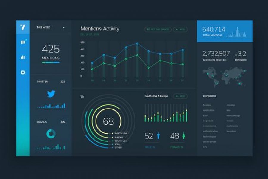
See 3 great tips for designing dashboards. Learn the strategic approach to visualizing your data through dashboard systems designed for humans.

Six Reasons to Gift Skills Training to Your Employees The Benefits to Both Individuals and Businesses as a Whole At the Datalabs Agency, we’re firm believers in hiring great people
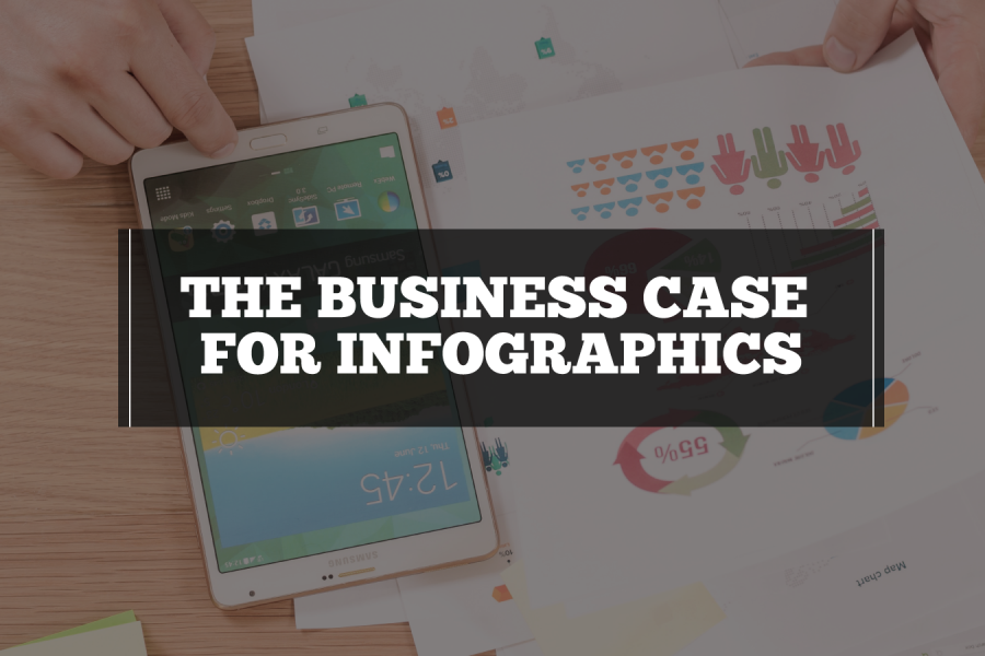
What Is The Business Case for Infographics? How You Prove The Value In Better Communication, Information Design & Reporting Your business has data and information. And your business needs to

Monash Heath wanted a time-based interactive data visualization to show the pathway of a patient’s journey through the healthcare system. We used Adobe Illustrator, Excel, HTML, JavaScript, and CSS to come up with this digital experience.
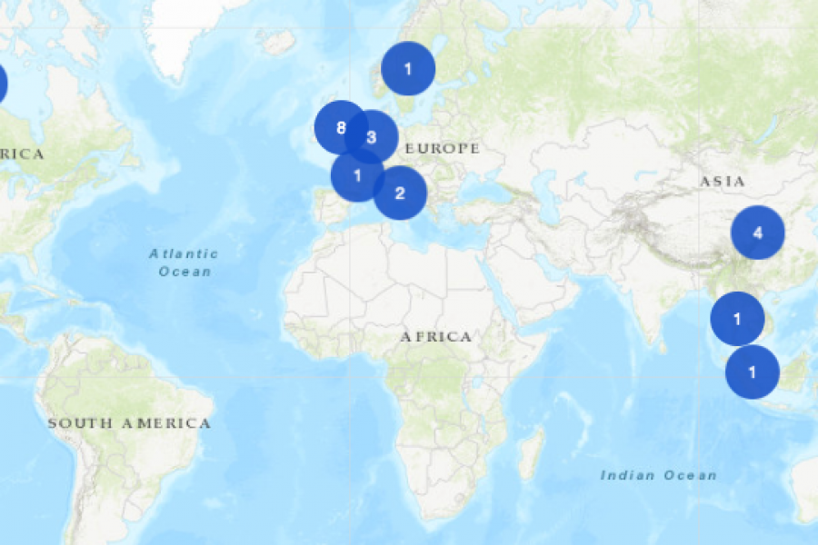
The Datalabs Agency was commissioned to turn the list of the University of Melbourne’s partners and connections around the world into an interactive map that would sit on the home page of their site.

From the dreaded pie chart to the often-misunderstood Sankey diagram, we'll geek out on more data viz guidance, updating this list of categories and types. So bookmark this page and sign up for our data visualization newsletter to keep your data design brain well fed.
10 Data Viz Guys & Gals to Follow on Instagram Want constant #inspo on your #insta? Follow these awesome data visualizers to keep you motivated. 1. Mona Chalabi Mona Chalabi

The Use of Repetition, Alignment, & Symmetry in Data Visualization Design shows in clear examples how these design principles can be use in data viz and infographics. Learn something new.
Brand Guidelines for Data: The Data Visualization Format of the Year (First Place) Formatting All Data Visualization with Best Practice Principles In 2023, the visual branding of data has only

Looking for a freelance infographic designer to hire? See our work here at Datalabs. About the Infographic Designer role: Our Infographic Designers are the agency’s creative visualisers and graphic designers,