


We’ve curated a list of gold-standard interactive data visualizations which we hope will inspire you to try it for yourself. May your data never be boring.
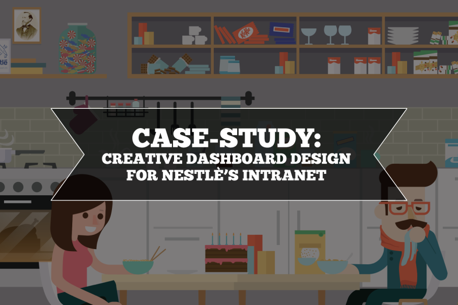
Nestlé's aim was to develop an easy-to-use, visually engaging experience that would help to make Nestlé employees’ jobs easier, and therefore, more enjoyable. The Datalabs Agency designed and developed a fun Intranet portal in response.
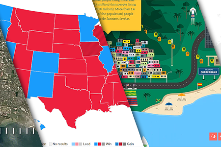
The Data Visualization Format of the Year (Runner Up): The Interactive Map With best-practice examples You may have already seen that this year’s best data visualization format winner was declared:
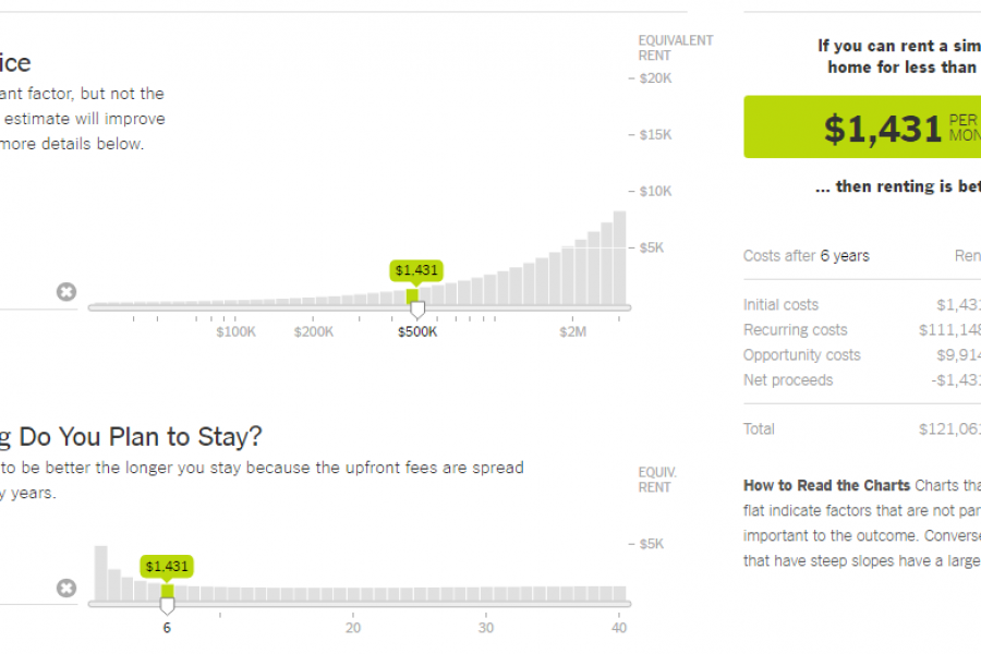
The Data Visualization Format of the Year: The Interactive Calculator A Great Example to Show You How It’s Done This year has seen some great data visualizations. From interactive maps,

Data Visualization Websites — 101 of the Best Resources Ideas, inspiration blogs, people, tools, and more! We’ve searched and searched to bring you 101 data visualization websites that showcase the
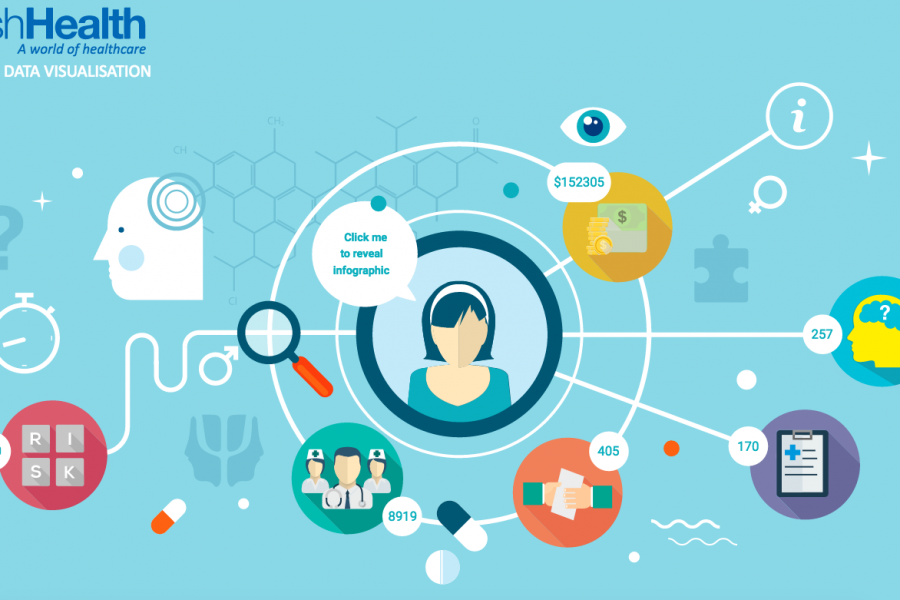
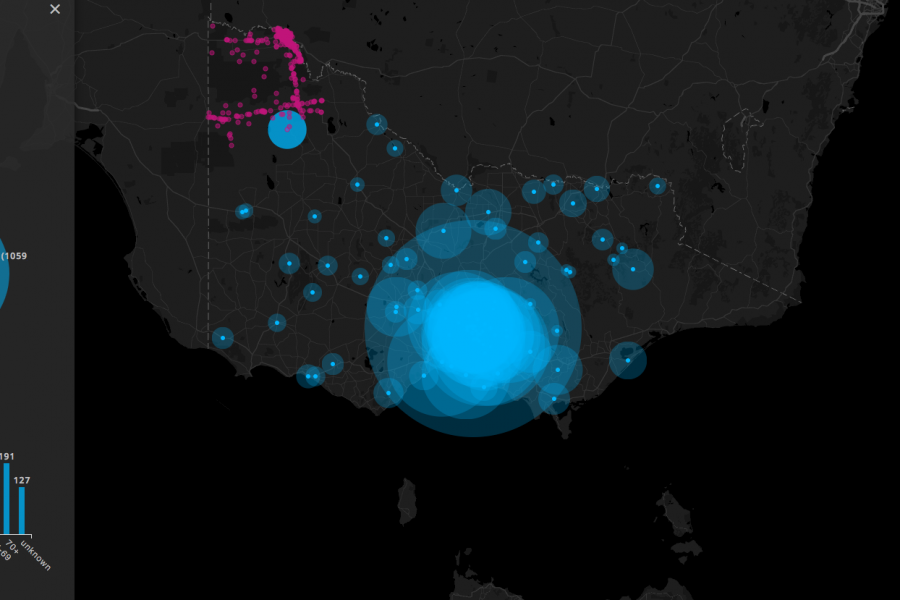
Monash Heath wanted a time-based interactive data visualization to show the pathway of a patient’s journey through the healthcare system. We used Adobe Illustrator, Excel, HTML, JavaScript, and CSS to come up with this digital experience.
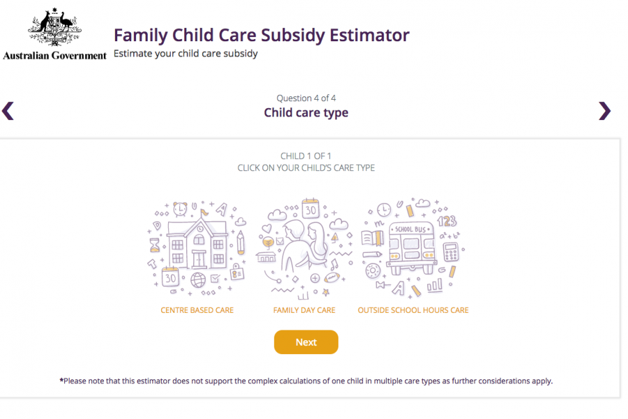
The Datalabs Agency was engaged to help Australia's Department of Education provide a clean and simple user interface in which parents and carers of children could estimate the amount of money they may be entitled to receive.

The Department of Education and Training needed a clean and simple user interface to assist in the communications strategy for the Australian Government’s New Child Care Package. This interactive tool was a hit with parent's in need of some numbers.
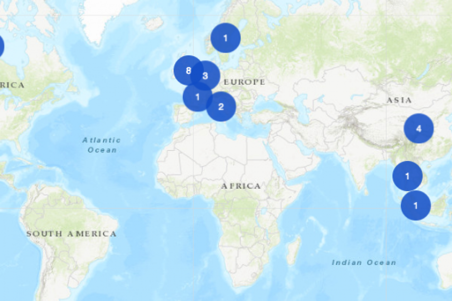
Looking for what data visualization can do for your website? Check out this live example of an interactive map developed for International Women's Development Agency.
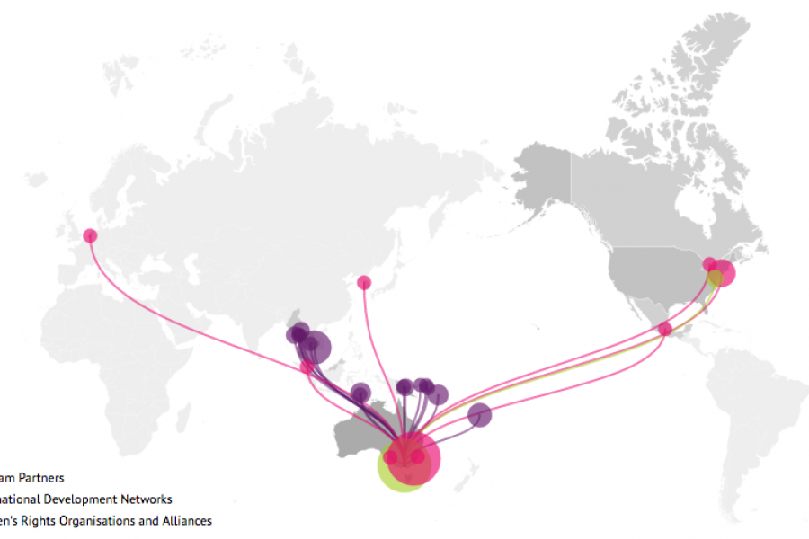
The Datalabs Agency was commissioned to turn the list of the University of Melbourne’s partners and connections around the world into an interactive map that would sit on the home page of their site.
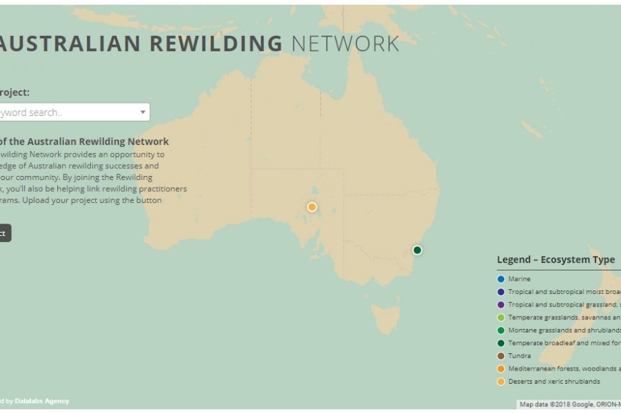
Mapping Intelligence: Helping Wildlife in Australia About the Rewilding Mapping Project The interactive map is designed with d3 and Google Maps Showcases the current projects the organization is working on
Three Interactive Data Maps Data-driven, Interactive & Animated If you’ve ever spoken to onto the DL team about a project there’s a fair chance we’ve tried to get a map