




Updated September 2026
A Curated List of Data Visualization Examples and Ideas That Inspire
An interactive experience blows away legacy methods like Excel and Powerpoint, software that companies, non-profits, and governments have relied on for too long to communicate their data.
Interactive data visualization is not just beautiful, it’s often the most engaging, memorable, and effective communication tool you can choose. Why? Because allowing your audience to take their own journey through the data empowers them to educate themselves. They’re more likely to stay engaged and more likely to remember what they’ve learned.
As leaps and bounds are made in software and web technologies, there is an ever-increasing number of applications for interactive data visualization — from presenting research results to crafting executive presentations.
We’ve curated a list of gold-standard interactive data visualizations which we hope will inspire you to try it for yourself. May your data never be boring.
The Nine Examples at a Glance
| Example | What it covers | How you interact |
|---|---|---|
| Google, “Our AI Journey” | Two decades of machine-learning milestones | An animated timeline you scroll through |
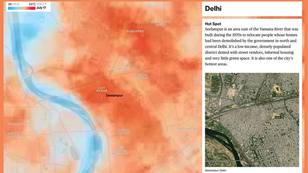
| Bloomberg | Summer heat, city by city | A heat map you search by location |
| Panorama | Progress against Swedish climate targets | Charts built into a written story |
| Voices from the Frontlines | Climate displacement and social justice | 3D maps you move through |
| World Economic Forum | Energy transition, innovation, ASEAN and AI | A topic-by-topic click-through |
| New York Public Library | The public image collection of the NYPL | Filter by century, genre, collection or color |
| The New Yorker | One month of Citi Bike trips in New York | A map animated over time |
| Mailchimp | Its own annual report | A microsite built around the numbers |
| Washington Post | US school shootings since 1999 | A visual analysis kept updated |
AI & Interactive Experiences
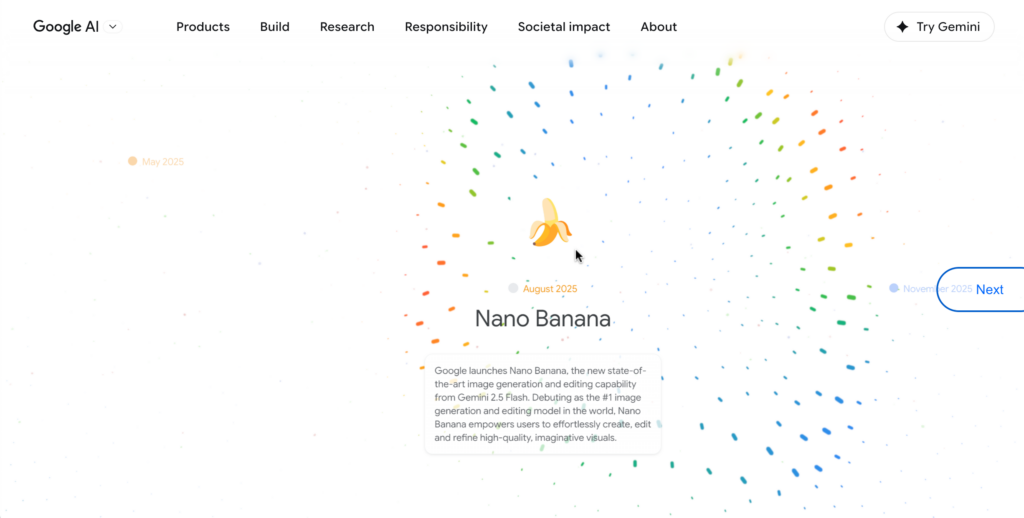
Google’s “Our AI Journey” is a masterclass in using interactive data visualization to tell a corporate story that could easily have been a boring press release — instead it becomes a genuinely compelling scroll through two decades of machine learning milestones, animated with precision and restraint. The scroll-driven timeline format is one of the most effective interactive data visualization techniques available to designers right now, giving the user a sense of control over a narrative that’s actually been carefully choreographed for them. For data visualization designers and BI consultants looking for inspiration on how to communicate a long-form data story without losing your audience, this is a benchmark example of interactive storytelling done at scale. If you’re an organisation sitting on years of data, impact metrics, or milestone history and presenting it in a static PDF or PowerPoint, Google’s AI Journey is your argument for doing something better.
Interactive Science Data Visualization
Bloomberg
Climate Data Visualizations
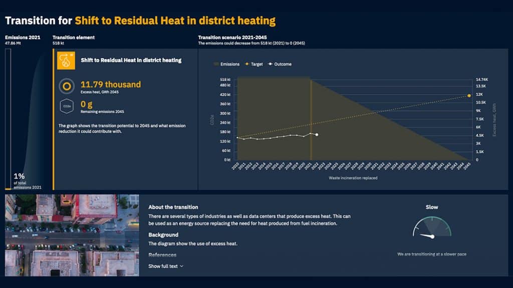
Panorama — A Pathway to Sweden’s Climate Goals
Examples of Interactive Data About Human Rights & Migration
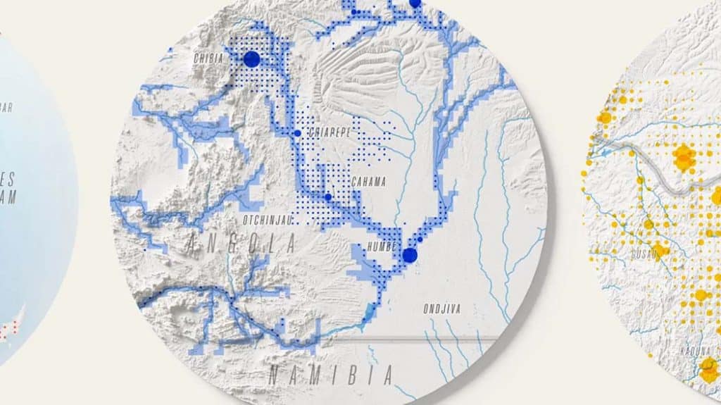
Voices from the Frontlines
Economics & Technology Interactive Data Visualizations
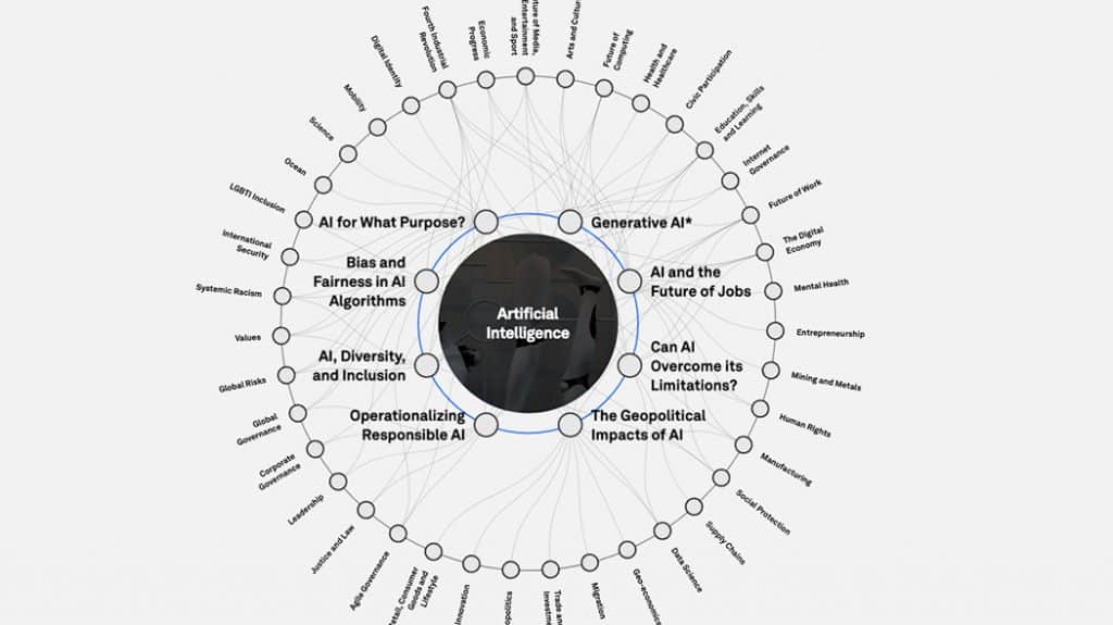
World Economic Forum
Examples of Interactive Data About History & Library Collections
New York Public Library

Interactive Visual Content for Media
The New Yorker
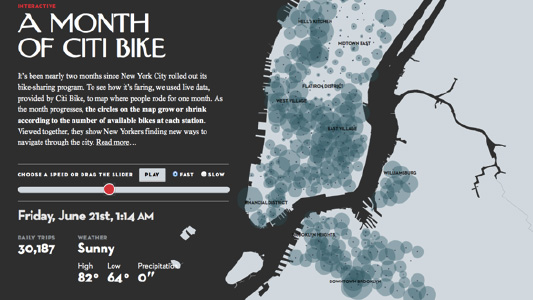
When New York City rolled out its bike-sharing program, the New Yorker used live data, provided by Citi Bike, to map where people rode in the city for one month. The interactive visualization tells a fascinating story about how New Yorkers find new ways to navigate through the city as the month progresses.
Interactive Annual Reports
Mailchimp
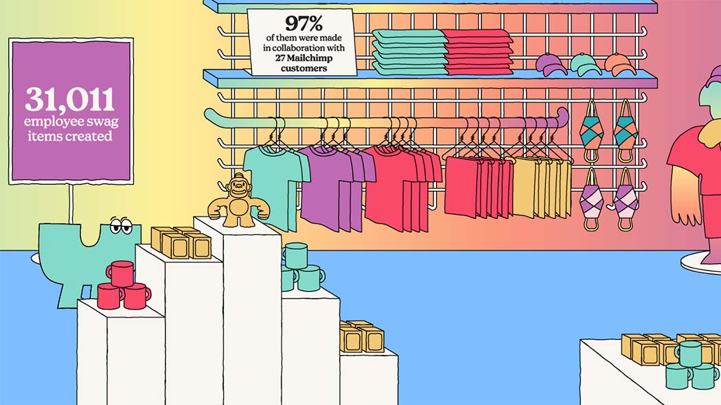
Mailchimp’s Annual Report microsites have been generating admiration on blogs and social media for years. They’re often pointed to as a model for how to do Annual Reports. The reason? They’re masters at interactive data visualization. They don’t try to hide the numbers out of fear of boring their audience, they show off their data with clever interactions and quirky imagery. This year’s report is no different. As huge fans of using great illustrators, we applaud this company for its style and technical innovation. Plus, there’s always a boldness to a left-to-right scrolling site. Kudos, Mailchimp! Check out their latest below.
Examples of Interactive Data in News & Current Events
Washington Post
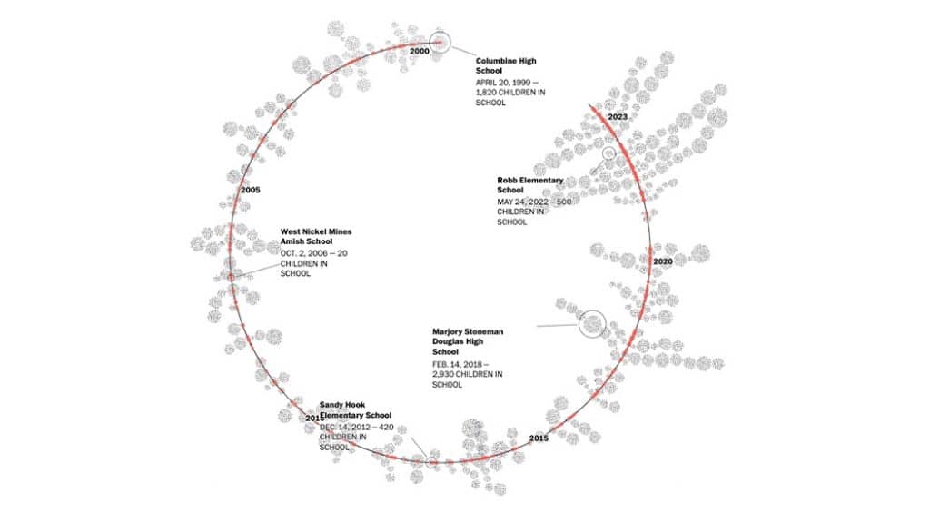
Unfortunately, this interactive makes our list. Updated by the crew at the Washington Post, this visual analysis shows the school shootings in America since the Columbine High School massacre in 1999. In a country where gun violence regularly makes headlines, using data to tell this story has allowed the Post to cut through political rhetoric, and present the facts. Seeing is believing, unfortunately.
These examples are just the tip of the iceberg. Interactive data visualizations have the potential to transform how you communicate data across the board. Here are just a few of the other possibilities for this powerful communication tool:
- Sales Presentations
- Training Modules
- Product Collateral
- Shareholder Presentations
- Educational Content
- Press Releases and PR Content
Interested in your own interactive data visualization, digital annual report, or microsites? Find out more.
Talk to us about the incredible data visualizations we can make for you!
Get in touch with us directly by emailing hello@datalabsagency.com
or by clicking the Contact Us link in the navigation.
Questions & Answers
What makes a data visualization interactive?
The reader chooses their own path through the data — filtering, zooming, following one thread — instead of being shown a single fixed view. That shift from being told to finding out is what separates an interactive piece from a chart in a slide.
Why use an interactive piece instead of a chart in a deck?
Because people remember what they discover. Letting an audience travel through the data themselves keeps them engaged longer and makes the finding stick in a way a static slide rarely does.
Where do the examples on this page come from?
They range across Google and Bloomberg, climate work such as Panorama’s pathway to Sweden’s climate goals, and human-rights reporting. The common thread is that each one gives the reader something to do.
Can an annual report be built this way?
Yes — that is exactly what an interactive annual report is: the same story as the PDF, built for the web so a reader can move through it.
Can The Datalabs Agency build one of these?
Yes. The Datalabs Agency is a Melbourne-based data visualization consultancy founded in 2012 that delivers corporate training workshops (Power BI, Tableau, data storytelling), dashboard design, and BI style guides for clients including Mercedes-Benz, Adidas, and UPS. This kind of work is scoped as an interactive data visualisation project.

