

Data Visualization Brand Guidelines for Tableau, Microsoft Excel, Highcharts & Infographics As we have seen on projects time and time again, data scientists and data designers have two separate capabilities.
Animation & Motion Graphics are Great for Conveying Insights & Complex Ideas How can such complex, abstract, and intangible information be conveyed in an easy-to-understand and interesting manner? The answer:

The Art of Photography and The Science of Data Visualization In design, it is always good to be visual. “Our brain processes images 60,000 times faster than reading text.” –
The Use of Hierarchy in Data Visualization A Good Design is More Than Creative, It Has to be Strategic. An experienced designer should have a decent understanding of the human
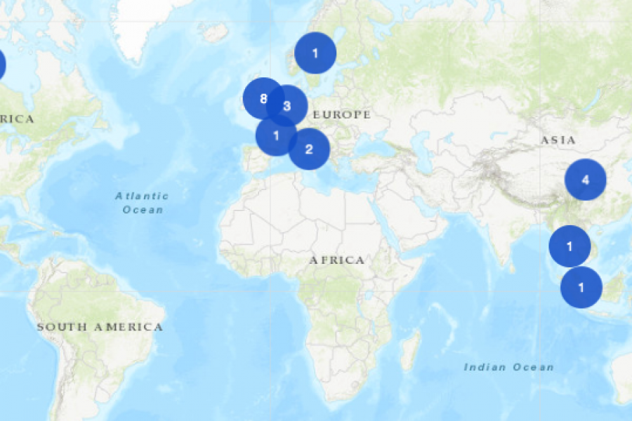
The Datalabs Agency was commissioned to turn the list of the University of Melbourne’s partners and connections around the world into an interactive map that would sit on the home page of their site.
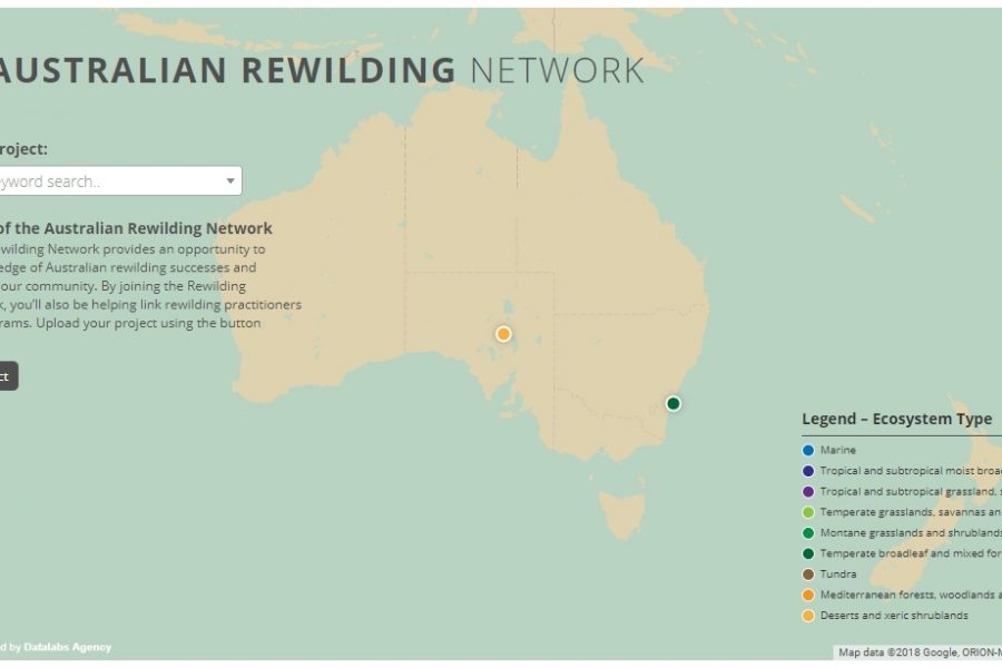
Mapping Intelligence: Helping Wildlife in Australia About the Rewilding Mapping Project The interactive map is designed with d3 and Google Maps Showcases the current projects the organization is working on
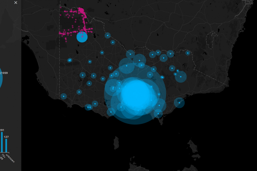
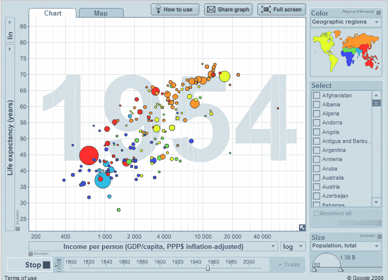
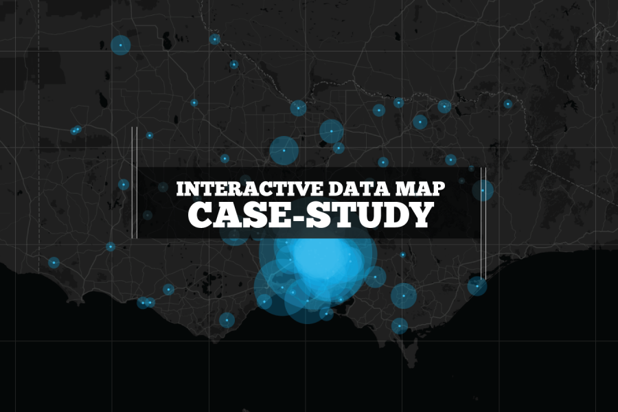
Three Interactive Data Maps Data-driven, Interactive & Animated If you’ve ever spoken to onto the DL team about a project there’s a fair chance we’ve tried to get a map
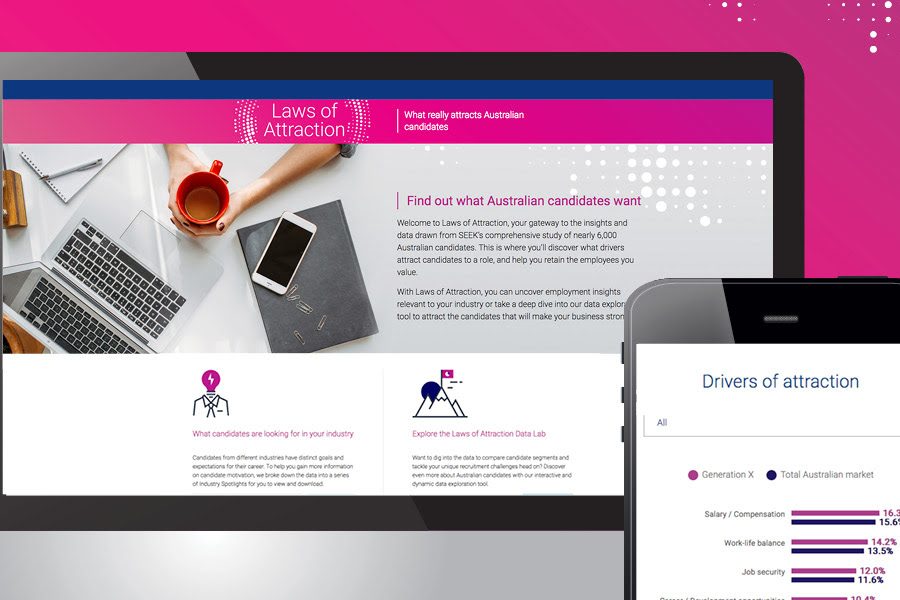
SEEK Laws of Attraction Find out what Australian candidates really want What attracts people to apply for a job or work for a company has changed. Where salary and job
We built this interactive map as a use-case for interactive/explorable maps. It's UI and easy-of-use is a case study of how data visualization can make better sense of geographical data. Certainly better than a table in a spreadsheet!
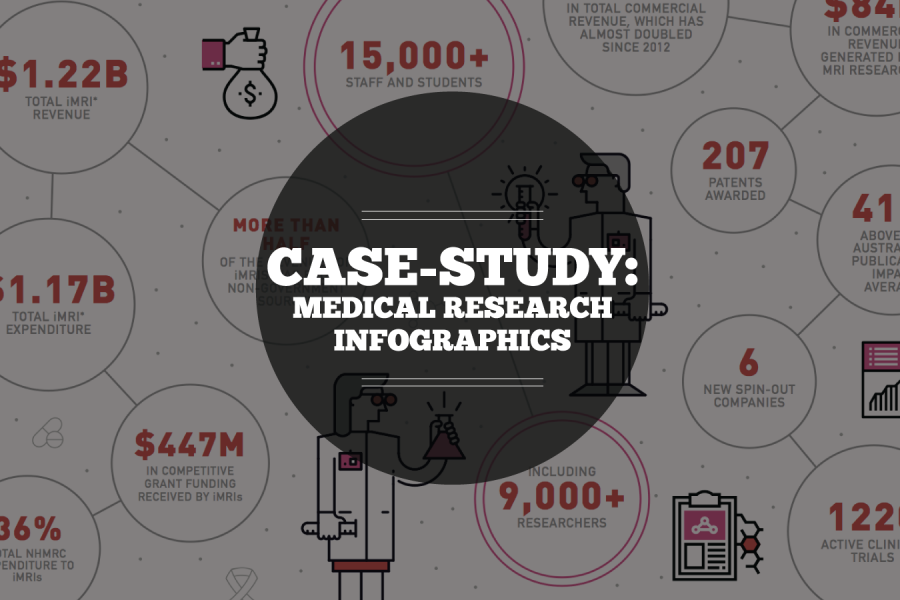
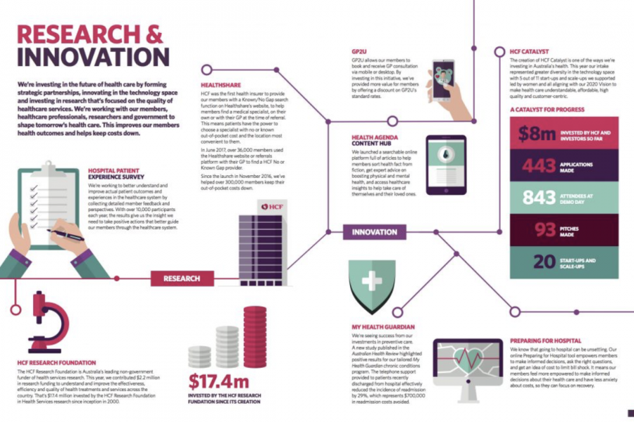
Case Study: Medical Research Infographic Who: Association of Australian Medical Research Institutes What: Summary Report Infographic When: August 2016 Why: The team at the Association of Australian Medical Research Institutes
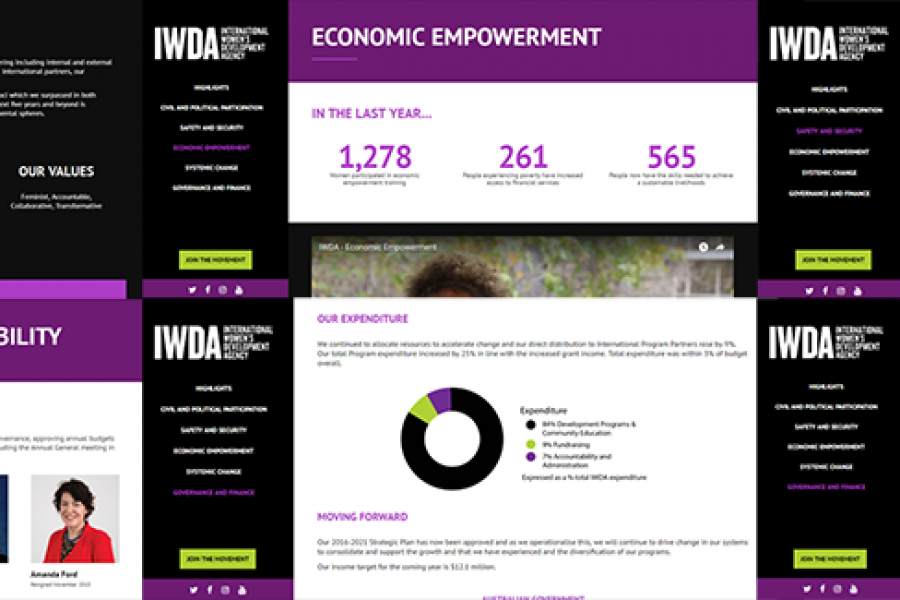
Considering going digital with your annual report? Do it! Here's an example of what interactivity and a non-profit organization's 'year in numbers' looked like after they ditched paper and went digital.
هل تفكر في التحول الرقمي مع تقريرك السنوي؟ افعلها! في ما يلي مثال على الشكل الذي بدا عليه التفاعل و "عام الأرقام" لمنظمة غير ربحية بعد أن تخلوا عن الورق وانتقلوا إلى النظام الرقمي.