



Bookmark this curated list of 101 data visualization websites — covering charts, code, maps, inspiration, tools, and free resources for designers and coders alike.


We’ve curated a list of gold-standard interactive data visualizations which we hope will inspire you to try it for yourself. May your data never be boring.

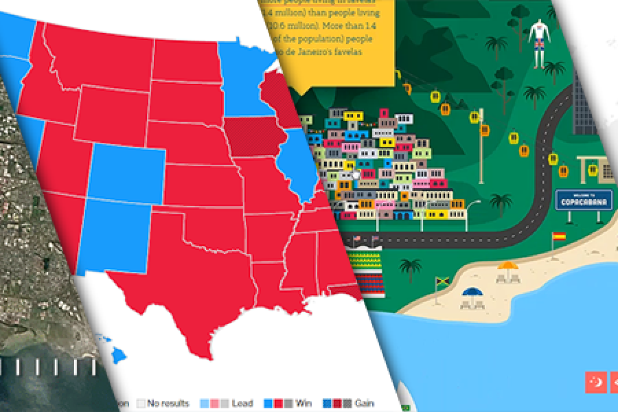
The Data Visualization Format of the Year (Runner Up): The Interactive Map With best-practice examples You may have already seen that this year’s best data visualization format winner was declared:

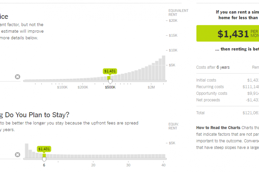
The Data Visualization Format of the Year: The Interactive Calculator A Great Example to Show You How It’s Done This year has seen some great data visualizations. From interactive maps,

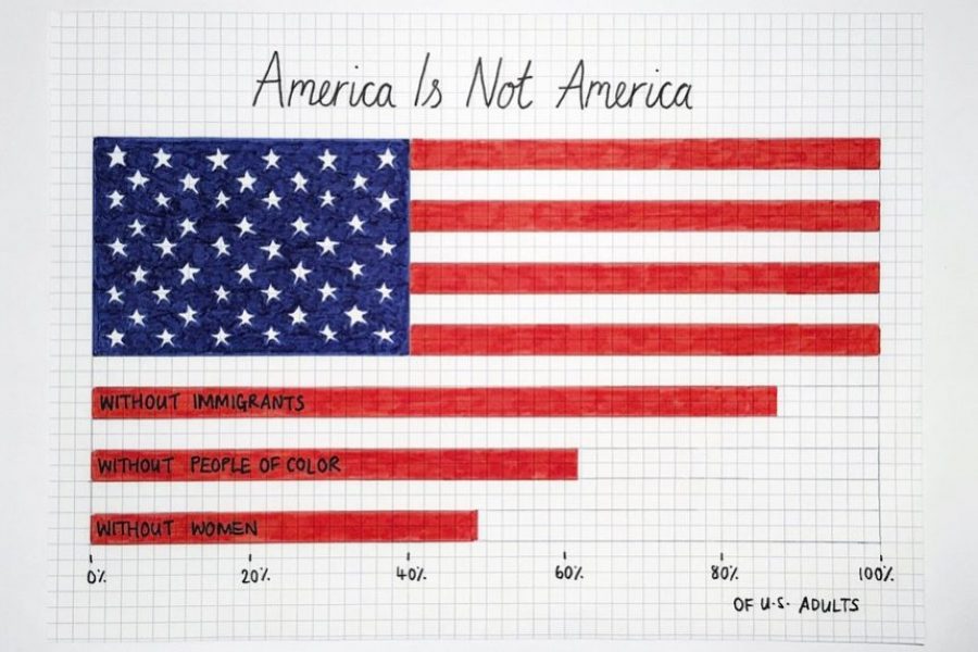
10 Data Viz Guys & Gals to Follow on Instagram Want constant #inspo on your #insta? Follow these awesome data visualizers to keep you motivated. 1. Mona Chalabi Mona Chalabi

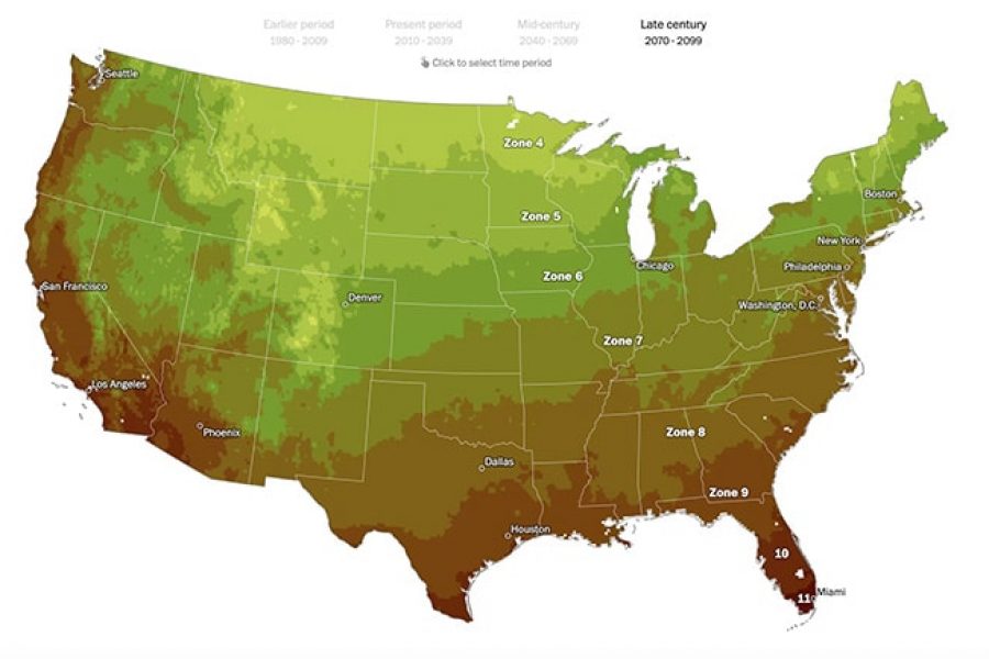
Questions & Answers What is information visualization? It is the visual representation of abstract data — relationships, structures and patterns — rather than a single series plotted on a pair

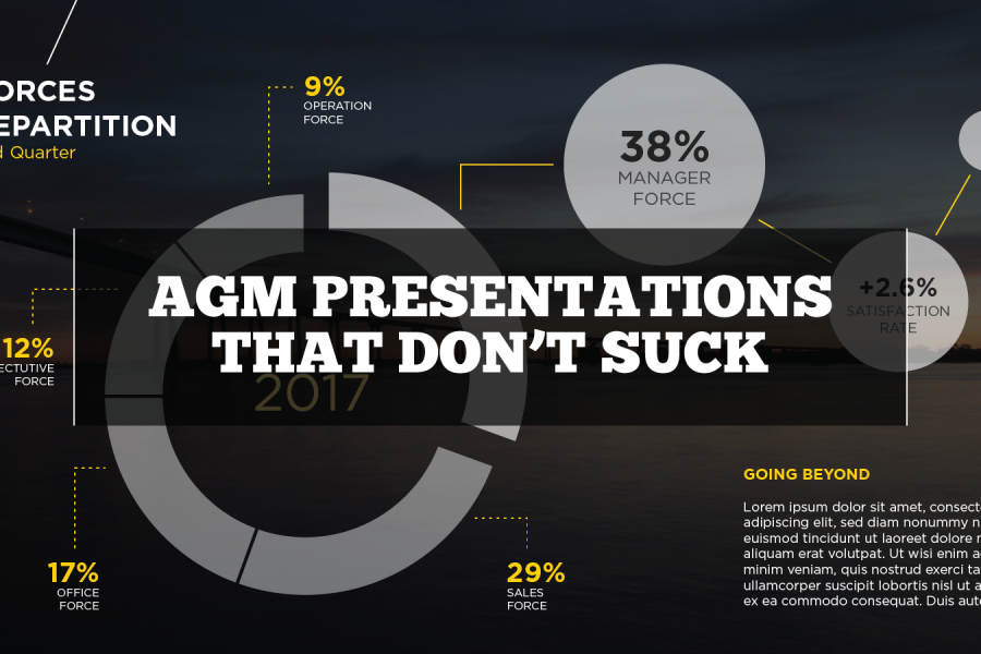
Questions & Answers Why are so many AGM presentations bad? Four reasons come up over and over: no time, no design resources, “it has always been done this way”, and

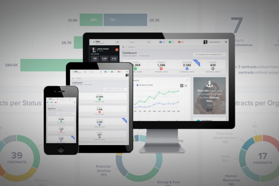
6 of the Best Marketing Dashboards … And Why Your Business Needs One! Tired of tiny details and endless numbers on your marketing strategy report? Tired of constantly opening new tabs


What is a microsite & what are they used for? A look at what makes a good microsite, how they differ to a website & some great examples. In previous


See Tableau dashboards examples in the wild. We've tracked down the best example of dashboard design done in Tableau. Get inspired.
