

The Use of Repetition, Alignment, & Symmetry in Data Visualization Design shows in clear examples how these design principles can be use in data viz and infographics. Learn something new.

يوضح استخدام التكرار والمحاذاة والتماثل في تصميم تصور البيانات في أمثلة واضحة كيف يمكن استخدام مبادئ التصميم هذه في البيانات والرسوم البيانية. تعلم شيئا جديدا.
Die Verwendung von Wiederholung, Ausrichtung und Symmetrie im Datenvisualisierungsdesign zeigt anhand anschaulicher Beispiele, wie diese Designprinzipien in Datenvisualisierungen und Infografiken verwendet werden können. Lernen Sie etwas Neues.
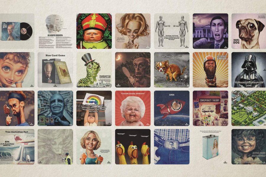
يسر وكالة Datalabs أن تعلن عن إطلاق استوديو الرسوم المتحركة الذكاء الاصطناعي تحت العلامة التجارية Oddtoe. كما قد يدرك الضيوف المنتظمون لموقع Datalabs ، يوفر Oddtoe الكثير من الأعمال الفنية المصورة وصور الوسائط الاجتماعية للوكالة.
Die Agentur Datalabs freut sich, den Start ihres KI-Animationsstudios unter der Marke Oddtoe bekannt zu geben. Wie regelmäßige Gäste der Datalabs-Website vielleicht erkennen, stellt Oddtoe einen Großteil der illustrierten Kunstwerke und Social-Media-Bilder für die Agentur zur Verfügung.
The Datalabs Agency is happy to announce the launch of its AI animation studio underneath the brand Oddtoe. As regular guests of the Datalabs website might recognize, Oddtoe provides much of the illustrated artwork and social media imagery for the agency.
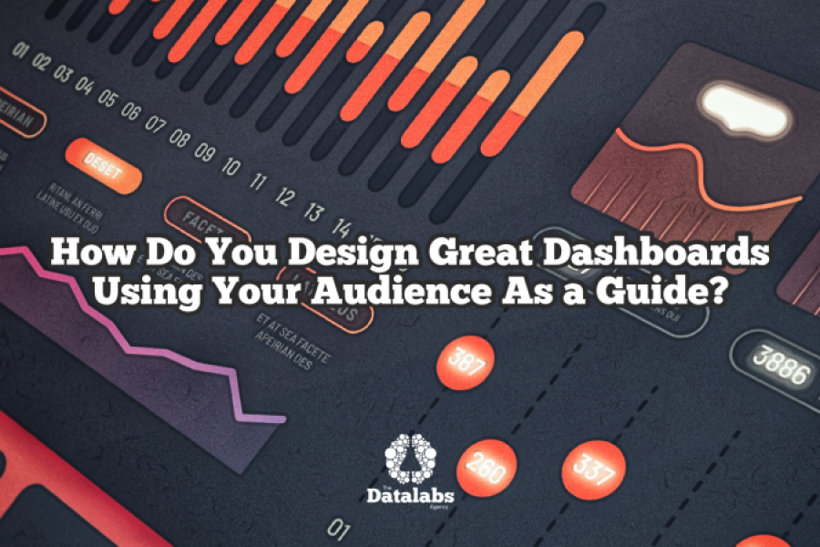
To design for specific dashboard users and audiences, you need a process. The Datalabs Agency uses a 12-step process to design its dashboards. 12 sequential steps or tasks that
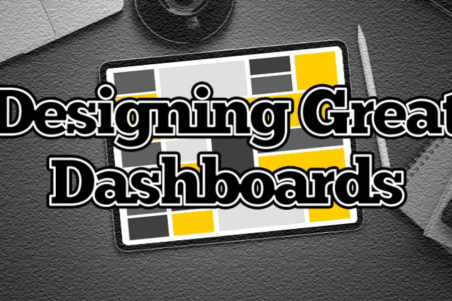
How Do Professional Data Visualizers Design Business Intelligence Dashboards? Most professionals aren’t trained data visualizers. You might be a business analyst, data scientist, or an expert in another field who
All chief executives have one thing in common – they need more TIME. There never seems to be enough hours in a day! Between meetings, conference calls, replying to emails

What is Explainable Artificial Intelligence (XAI)? A New Design Frontier in Machine Learning As smart algorithms, artificial intelligence and machine learning applications are finding its way into our daily lives,
The Key to Data Storytelling: Creating Captivating Dashboards & Infographics “Those who tell stories rule society.” – Plato In the past, the role of a data scientist or analyst is simple
Design Thinking Meets Data Science The term “Big Data” has gained lots of attention in recent years. Want to know what the sexiest job of the 21st century is? It’s