


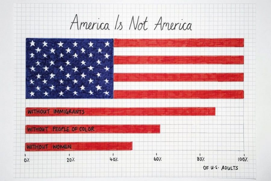
From the dreaded pie chart to the often-misunderstood Sankey diagram, we'll geek out on more data viz guidance, updating this list of categories and types. So bookmark this page and sign up for our data visualization newsletter to keep your data design brain well fed.
10 Data Viz Guys & Gals to Follow on Instagram Want constant #inspo on your #insta? Follow these awesome data visualizers to keep you motivated. 1. Mona Chalabi Mona Chalabi
Brand Guidelines for Data: The Data Visualization Format of the Year (First Place) Formatting All Data Visualization with Best Practice Principles In 2023, the visual branding of data has only

Looking for a freelance infographic designer to hire? See our work here at Datalabs. About the Infographic Designer role: Our Infographic Designers are the agency’s creative visualisers and graphic designers,
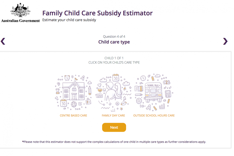
The Datalabs Agency was engaged to help Australia's Department of Education provide a clean and simple user interface in which parents and carers of children could estimate the amount of money they may be entitled to receive.
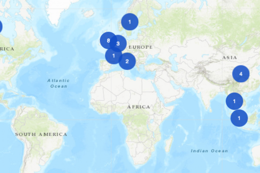
An Interactive Mapping Project for the University of Melbourne’s Business School. This interactive map shows former students, faculty/alumni, programs, and partnerships that potential students could engage with around the world.

The Department of Education and Training needed a clean and simple user interface to assist in the communications strategy for the Australian Government’s New Child Care Package. This interactive tool was a hit with parent's in need of some numbers.
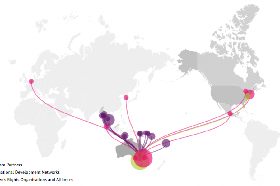
Looking for what data visualization can do for your website? Check out this live example of an interactive map developed for International Women's Development Agency.

The Art of Photography and The Science of Data Visualization In design, it is always good to be visual. “Our brain processes images 60,000 times faster than reading text.” –
The Use of Hierarchy in Data Visualization A Good Design is More Than Creative, It Has to be Strategic. An experienced designer should have a decent understanding of the human