

We’ve curated a list of gold-standard interactive data visualizations which we hope will inspire you to try it for yourself. May your data never be boring.
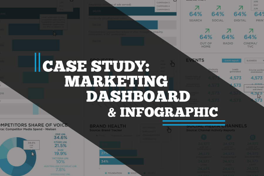
A case study on a Tableau dashboard, infographic and data design project for the marketing team at Victoria University.

Make your data viz understandable and memorable. Use the techniques of repetition, alignment, and symmetry to your advantage. See visual examples and skill up.

The difference between wasted training budget and transformed team capability comes down to seven key factors most organizations overlook. Learn what to demand from data storytelling trainers—from customization using your actual data to post-workshop support—before you make your next hiring decision.
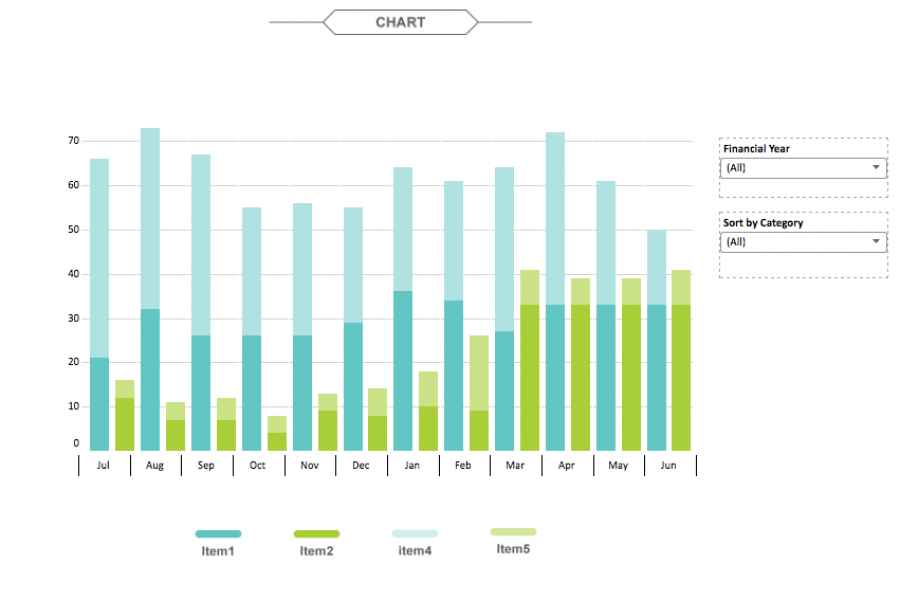
The aim for this project was to create an interactive dashboard, utilizing Tableau, to convey the data that had been collected over the financial year. Check out this financial firm's reporting suite.

لقد قمنا برعاية قائمة من تصورات البيانات التفاعلية ذات المعايير الذهبية والتي نأمل أن تلهمك لتجربتها بنفسك. قد لا تكون بياناتك مملة أبدًا.
Wir haben eine Liste interaktiver Datenvisualisierungen zusammengestellt, die Ihnen hoffentlich als Anregung dienen, es selbst zu versuchen. Mögen Ihre Daten nie langweilig sein.
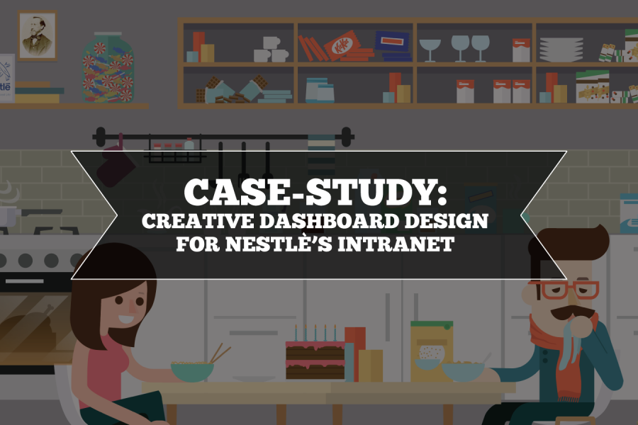
Nestlé's aim was to develop an easy-to-use, visually engaging experience that would help to make Nestlé employees’ jobs easier, and therefore, more enjoyable. The Datalabs Agency designed and developed a fun Intranet portal in response.
كان هدف نستله هو تطوير تجربة سهلة الاستخدام وجذابة بصريًا من شأنها أن تساعد في جعل وظائف موظفي نستله أسهل ، وبالتالي أكثر إمتاعًا. قامت وكالة Datalabs بتصميم وتطوير بوابة إنترانت ممتعة استجابة لذلك.
Ziel von Nestlé war es, ein benutzerfreundliches, visuell ansprechendes Erlebnis zu entwickeln, das den Nestlé-Mitarbeitern die Arbeit erleichtert und somit mehr Freude bereitet. Die Datalabs-Agentur entwarf und entwickelte daraufhin ein unterhaltsames Intranet-Portal.
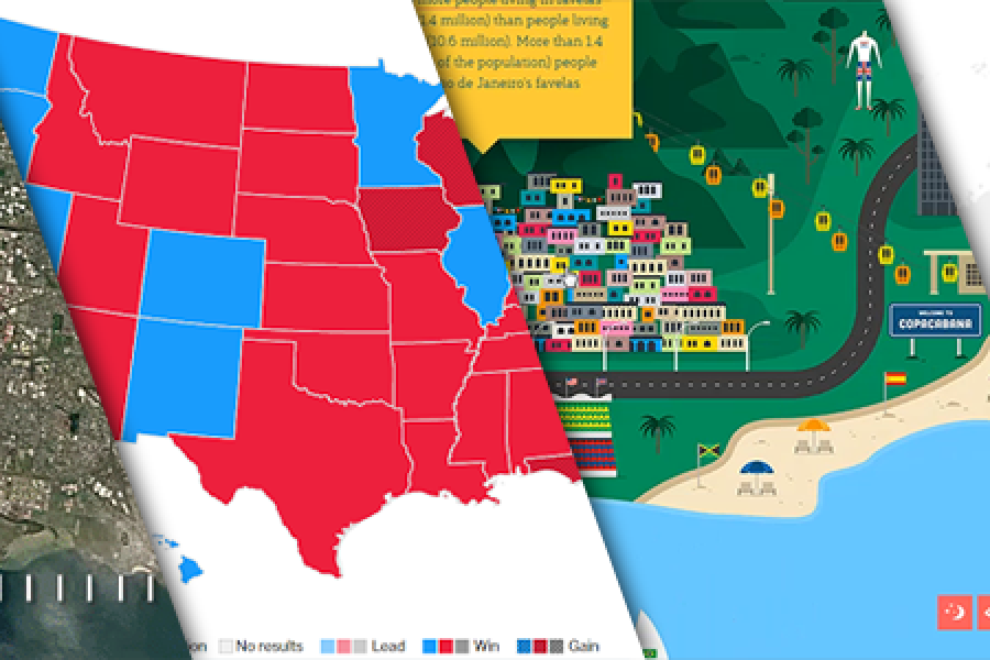
The Data Visualization Format of the Year (Runner Up): The Interactive Map With best-practice examples You may have already seen that this year’s best data visualization format winner was declared:
Das Datenvisualisierungsformat des Jahres (Zweitplatzierter): Die interaktive Karte Mit Best-Practice-Beispielen Vielleicht haben Sie schon gesehen, dass der Gewinner des diesjährigen Formats für das beste Datenvisualisierungsformat gekürt wurde: Der interaktive Rechner.